
With over 1.7 million people in Switzerland alone facing digital barriers, web accessibility is a fundamental right—not an afterthought. This article dives into the latest WCAG 2.2 standards, practical implementation tips for developers, and how inclusive design creates better experiences for all users.

Digital technology permeates every facet of modern life—from booking travel to accessing essential services. Yet for millions, poorly designed interfaces create exclusionary barriers. As highlighted by Swiss agency Atipik, accessibility isn't merely a 'nice-to-have'; it's a legal and ethical imperative. With 1.7 million people in Switzerland living with disabilities (FSO, 2022), and countless others facing temporary impairments like injuries or environmental challenges, the web must serve everyone. This demands a developer-first approach grounded in robust standards and practical action.
The WCAG 2.2 Blueprint: Building for All Users
In December 2024, the World Wide Web Consortium (W3C) released WCAG 2.2, the global benchmark for digital accessibility. This framework ensures interfaces—whether websites, apps, or public kiosks—are perceivable, operable, understandable, and robust. Let's break down these principles:
- Perceivable: Content must be detectable by all senses. Avoid relying solely on color for critical information—supplement with icons or underlines.
- Operable: Ensure full keyboard navigability. Every interactive element should be reachable via
TabandShift+Tab, with no dead ends. - Understandable: Prioritize clarity and predictability. Form errors, for instance, need explicit, actionable messages.
- Robust: Guarantee compatibility across devices and assistive technologies, like screen readers.
Conformance escalates across three levels:
- Level A: The baseline—failing this excludes users (e.g., missing video captions).
- Level AA: The global standard, requiring color contrast ratios of 4.5:1 for normal text and 3:1 for large text. This is mandated in Switzerland's eCH-0059 regulation, which also demands accessibility statements and sign-language translations for public services.
- Level AAA: The gold standard, with stricter contrast (7:1 for normal text), though often impractical for all content.
Practical Steps Every Developer Can Take Today
Accessibility starts with small, actionable checks—no expertise required. Here are three immediate wins:
Audit Color Contrast: Poor contrast hinders readability for users with visual impairments. Tools like Figma's Color Contrast Checker simplify validation. For example:
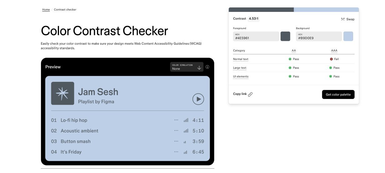 Normal text requires 4.5:1 contrast (AA) or 7:1 (AAA).
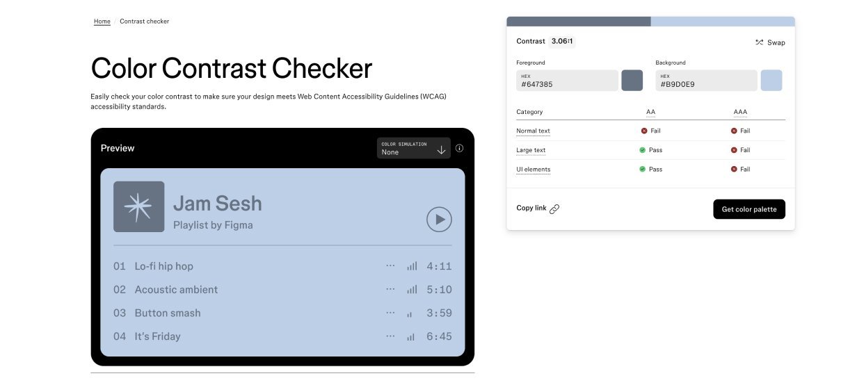 Large text (18pt+) needs 3:1 (AA) or 4.5:1 (AAA).
Test Keyboard Navigation: Ensure all interactive elements are accessible via
Tab. Logical flow is critical—chaotic navigation frustrates screen-reader users. Tip: If tabbing feels disjointed, screen readers will struggle.Craft Meaningful Alt Text: Describe an image's purpose concisely in HTML (
alt="..."). Avoid vagueness; focus on context. Decorative images? Use empty alt text (alt="").
Real-World Lessons from Industry Leaders
Analyzing top sites reveals both wins and gaps:
- Patagonia: Excels in keyboard navigation and modal management but lacks alt text and auto-playing banners.
- Eventbrite: Strong contrast and icon labels, yet its homepage banners and tab panels need optimization.
These examples underscore a universal truth: Accessibility isn't a checkbox—it's a mindset. By embedding WCAG principles early, developers don't just comply with standards; they build more resilient, user-friendly products. Inclusive design broadens your audience, enhances SEO, and mitigates legal risks. Ultimately, creating an accessible web means honoring our shared responsibility: technology that empowers, without exception.
Source: https://www.atipik.ch/en/blog/an-accessible-web-is-a-web-for-everyone
Comments
Please log in or register to join the discussion