By mining 290 newsletters with SpaCy, the Gmail API and Seaborn, a data‑driven narrative emerges: WeWork’s hype fades, GameStop explodes, SPACs surge, and fraud chatter spikes. This article walks through the pipeline, the visual insights, and what they reveal about market sentiment and media focus.
From Inbox to Insight
Matt Levine’s Money Stuff is a weekly digest that has become a barometer for Wall Street buzz. In a recent exploratory study, a developer‑turned‑analyst sifted through 290 emails (Oct 2019‑Jul 2021) to quantify the newsletter’s topical focus. The result? A heat‑mapped timeline that charts the rise and fall of industry giants, meme‑stocks, and regulatory chatter.
The Data‑Science Pipeline
The process can be broken down into four stages:
- Harvesting – Using the Gmail API, the author downloaded the raw email bodies.
- Parsing – SpaCy’s
en_core_web_smmodel extracted named entities (e.g., WeWork, GameStop, SEC). - Aggregating – Counts were grouped by month and entity, then normalized to account for varying article lengths.
- Visualizing – Seaborn’s heatmap and Matplotlib bar charts turned numbers into stories.
Below is a concise code snippet that captures the core of this pipeline:
import spacy, pandas as pd
from googleapiclient.discovery import build

# 1. Pull emails
service = build("gmail", "v1", credentials=creds)
messages = service.users().messages().list(userId='me', labelIds=['INBOX']).execute()

# 2. Extract text and entities
nlp = spacy.load("en_core_web_sm")
records = []
for msg in messages['messages']:
    raw = service.users().messages().get(userId='me', id=msg['id']).execute()
    text = raw['snippet']
    doc = nlp(text)
    for ent in doc.ents:
        records.append({'month': msg['internalDate'][:6], 'entity': ent.text})

# 3. Aggregate
df = pd.DataFrame(records)
agg = df.groupby(['month', 'entity']).size().unstack(fill_value=0)

# 4. Visualize
import seaborn as sns
sns.heatmap(agg, cmap="YlOrRd")
The GitHub repo (https://github.com/polybuildr/money‑stuff) contains the full script and data.
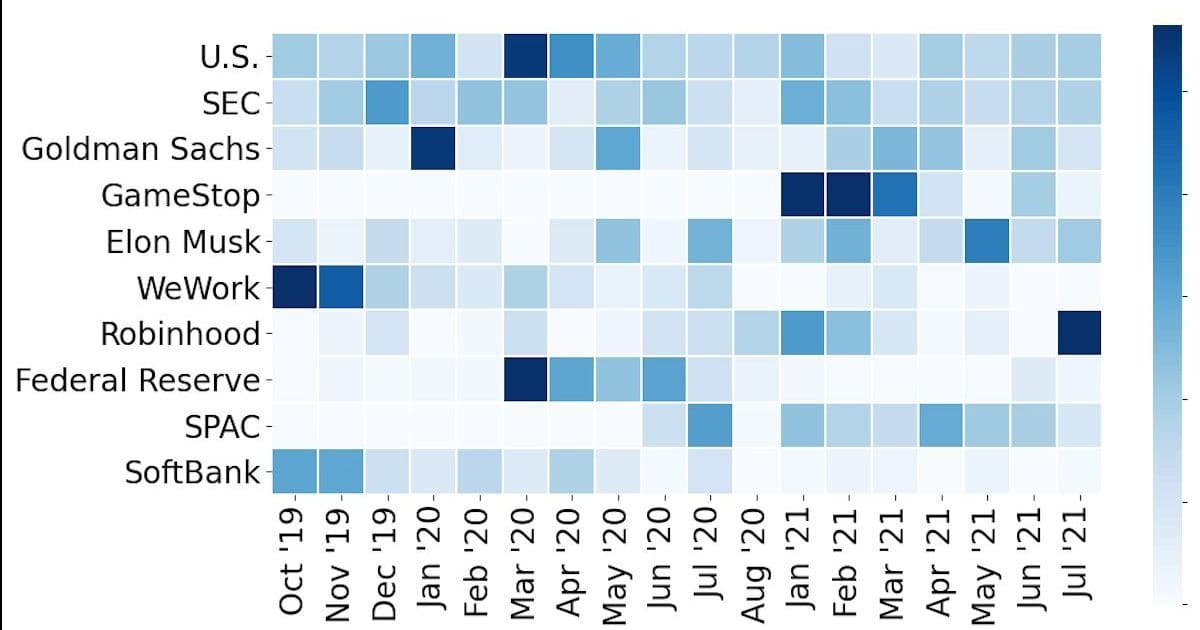
Heatmaps Tell a Story
The first heatmap ( ) shows the top ten topics each month. Notice how WeWork dominates the end‑2019 window, then recedes as its IPO fallout settles. GameStop is absent until January 2021, mirroring the meme‑stock frenzy that shook the market.
The second heatmap (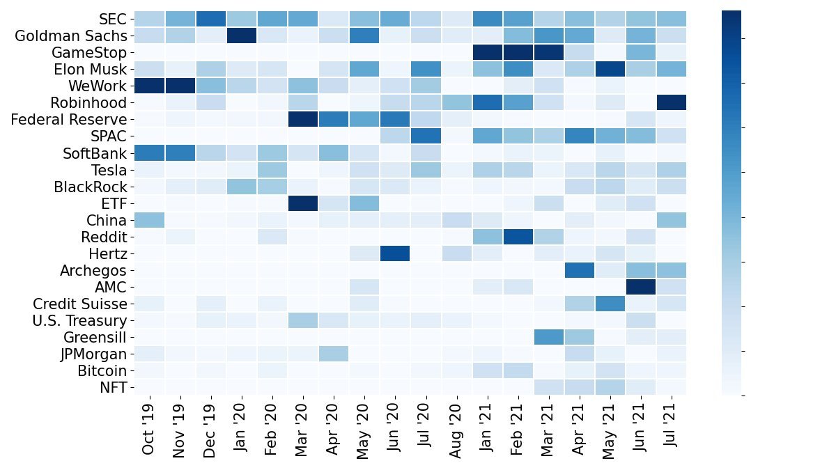 ) expands the view to 25 topics, revealing additional chatter such as Reddit, Hertz, and NFTs. These spikes align with real‑world events: the Hertz bankruptcy in 2020, the Reddit‑driven GameStop rally, and the NFT boom.
Fraud & Insider Trading – A Quantitative Lens
Beyond entity counts, the author tracked specific buzzwords. The bar chart (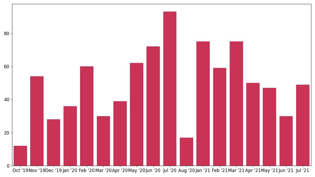 ) of “fraud” mentions shows a steady rise from 12 in Oct 2019 to 93 in Jul 2020, then a dip as the focus shifts to other topics.
Similarly, the insider‑trading chart (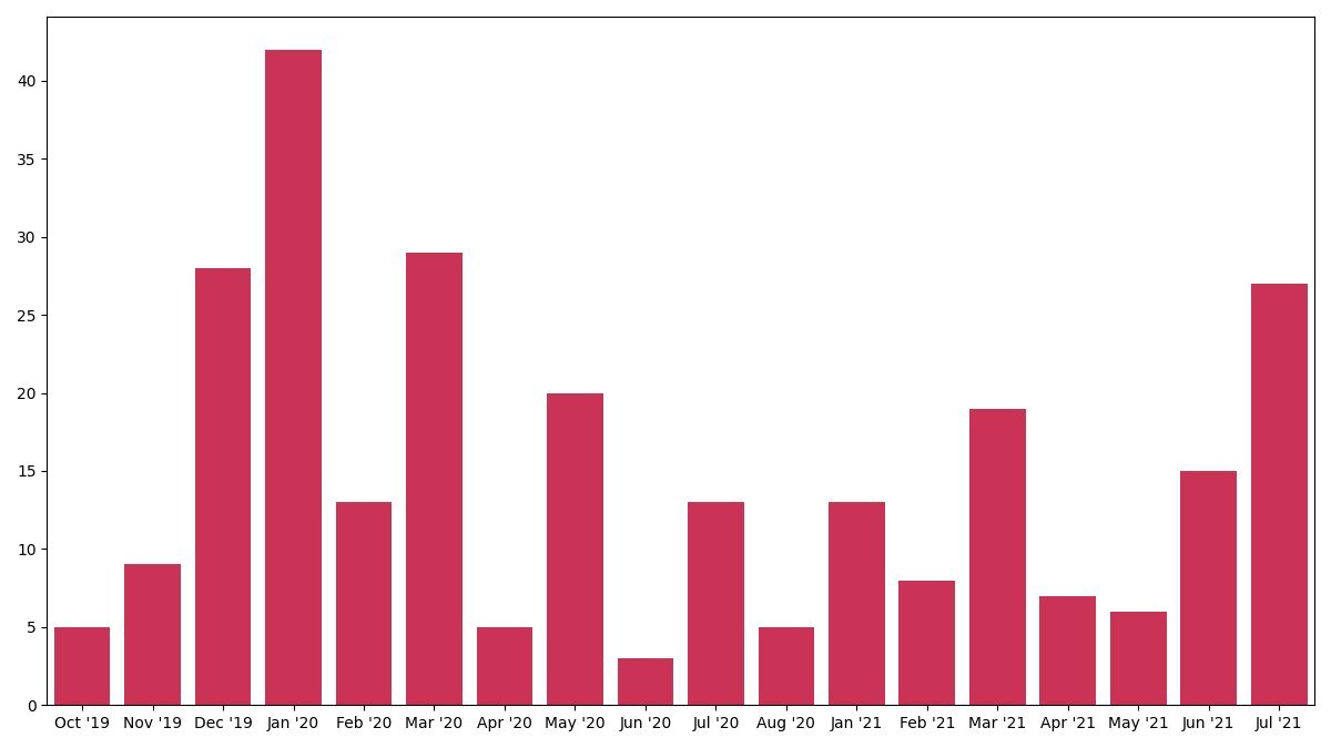 ) highlights peaks in Jan 2020 and Mar 2021, coinciding with high‑profile regulatory investigations.
These metrics hint at a newsroom’s editorial priorities: spikes in fraud language often precede major regulatory announcements.
What Does This Mean for Developers?
- Data‑Driven Storytelling: Even niche newsletters can be mined for market sentiment. Your own product updates or logs could be similarly analyzed.
- NLP Pipelines: SpaCy’s lightweight entity recognizer is surprisingly effective for finance‑heavy text. For deeper nuance, consider fine‑tuning on a custom corpus.
- Visualization: Heatmaps quickly surface temporal patterns. Pair them with time‑series plots for deeper trend analysis.
Closing Thought
By turning a weekly email into a heat‑mapped narrative, we see how the financial press oscillates between corporate drama and regulatory focus. For engineers building analytics platforms, this exercise demonstrates the power of combining simple NLP tools with clear visual storytelling. The next step? Apply the same pipeline to your own data streams and watch the hidden patterns emerge.
Comments
Please log in or register to join the discussion