New research reveals that simple 'yes/no' climate visuals resonate more powerfully than complex graphs. By framing data in binary terms—like whether a lake freezes—we can make abstract trends feel urgently personal. This breakthrough in science communication could transform how developers design climate dashboards.
For decades, the "Hockey Stick" graph stood as climate science’s most iconic visualization—a stark depiction of temperature anomalies in the Northern Hemisphere since the year 1000. 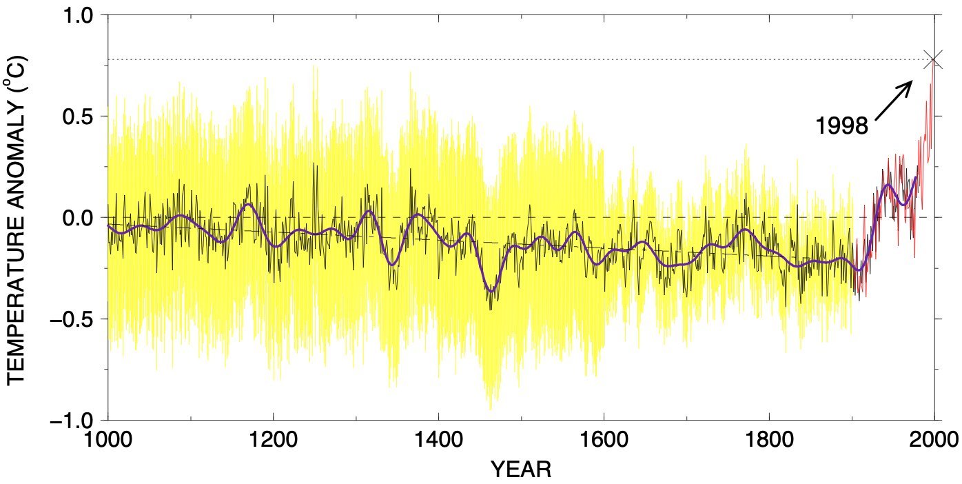 Yet as influential as it remains, new research suggests that such detailed technical charts may be less effective at conveying the climate crisis to the public than simpler, binary representations.
A study published in Nature Human Behavior by Rachit Dubey and Princeton researchers exposed over 2,000 participants to two types of visualizations depicting identical climate trends:
- Traditional temperature charts showing gradual warming
- Binary charts indicating whether a lake froze annually
Results were striking: Participants who saw the binary visualization consistently rated climate impacts as more severe and noticeable. The reason? A shift from "froze" to "didn't freeze" represents a threshold breach—a tangible rupture in normalcy that gradual slopes fail to capture.
"An upward slope on a temperature chart may seem gradual or unimportant. But a switch from 'lake froze' to 'lake didn't freeze' captures something that used to happen but no longer does. That feels different. Personal." — Dubey
This "binary data effect" explains why alternative visualizations are gaining traction:
- Climate Stripes: Ed Hawkins' color-coded bars replace complex axes with an unmistakable blue-to-red transition, implicitly framing temperatures as "normal" vs. "abnormal."
- Arctic Ice Snapshots: The Economist contrasted sea ice coverage in 1980, 2000, and 2019—using discrete comparisons to emphasize irreversible loss better than NASA’s declining trend lines.
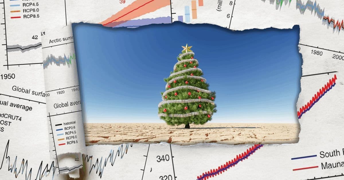
- Localized Yes/No Metrics: Graphics tracking "white Christmases" in specific cities or frozen lakes make abstract warming visceral through place-based binaries.
Implications for Technical Audiences: For developers and data engineers designing climate tools, this research underscores critical principles:
# Key design takeaways for effective climate visuals:
1. Prioritize threshold indicators over continuous variables
2. Anchor data in culturally familiar events (sports seasons, holidays)
3. Use categorical color coding (red/blue) to imply "breach"
4. Localize data to resonate with specific audiences
Tools like D3.js or Python’s Matplotlib could integrate these insights—transforming API-fed climate data into binary dashboards showing "days above 100°F" or "coral bleaching events." The goal isn’t dumbing down data but weaponizing cognitive psychology to convey urgency.
As the now-iconic xkcd climate timeline comic demonstrates, sometimes the most devastating statement is a line that suddenly veers off-course. When words fail, a lake that no longer freezes speaks volumes.
Comments
Please log in or register to join the discussion