Apple's Liquid Glass redesign in iOS 26 forces fundamental UI paradigm shifts. Discover how Droppath Route Planner tackled navigation bar conflicts, SwiftUI complexities, and Material Design adaptations while maintaining user experience continuity in this technical deep dive.
When Apple unveiled Liquid Glass as the cornerstone of iOS 26's visual overhaul, developers knew this wasn't just another coat of paint. The redesign reimagines interaction paradigms at a fundamental level—translucent elements, refined animations, and spatial relationships that demand app-wide reconsiderations. Pierre-Luc Beaudoin's detailed account of migrating Droppath Route Planner reveals both the philosophical and technical battles fought in adapting to Apple's new design language.
Controlled Migration: Learning from iOS 7's Trauma
Unlike the disruptive iOS 7 transition that caused widespread instability, Apple provided a structured opt-in pathway via UIDesignRequiresCompatibility. This allowed Droppath's team to incrementally adopt Liquid Glass without sacrificing stability. Early testing in Xcode 26 uncovered minor alignment quirks—like misplaced dialog titles—but avoided the emergency patches that plagued past redesigns.
Decoding Apple's Design Language
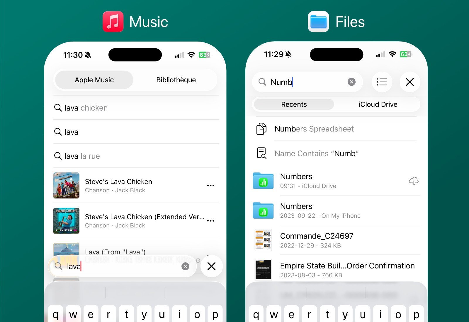
Reference apps became critical guides:
- Search Interfaces: Analyzing Music, Mail, and Files revealed divergent approaches. Files' placement of results below the search bar aligned best with Droppath's UX goals, rejecting Music's top-down layout as unnatural.
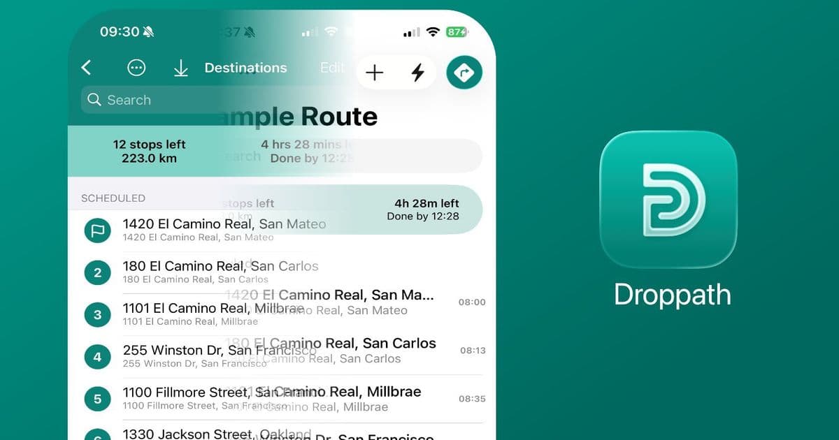
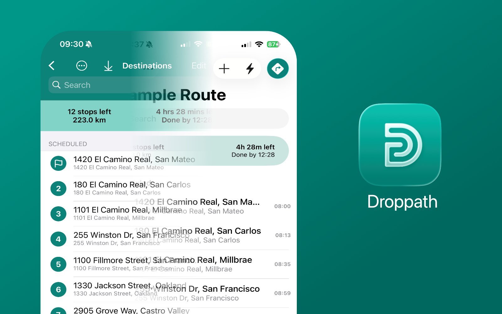
- Navigation Revolution: Vibrant colored nav bars clashed violently with Liquid Glass' translucent buttons. The solution? A shift to white navigation bars that harmonized with the new tab bar gradients.
Action Placement Reimagined
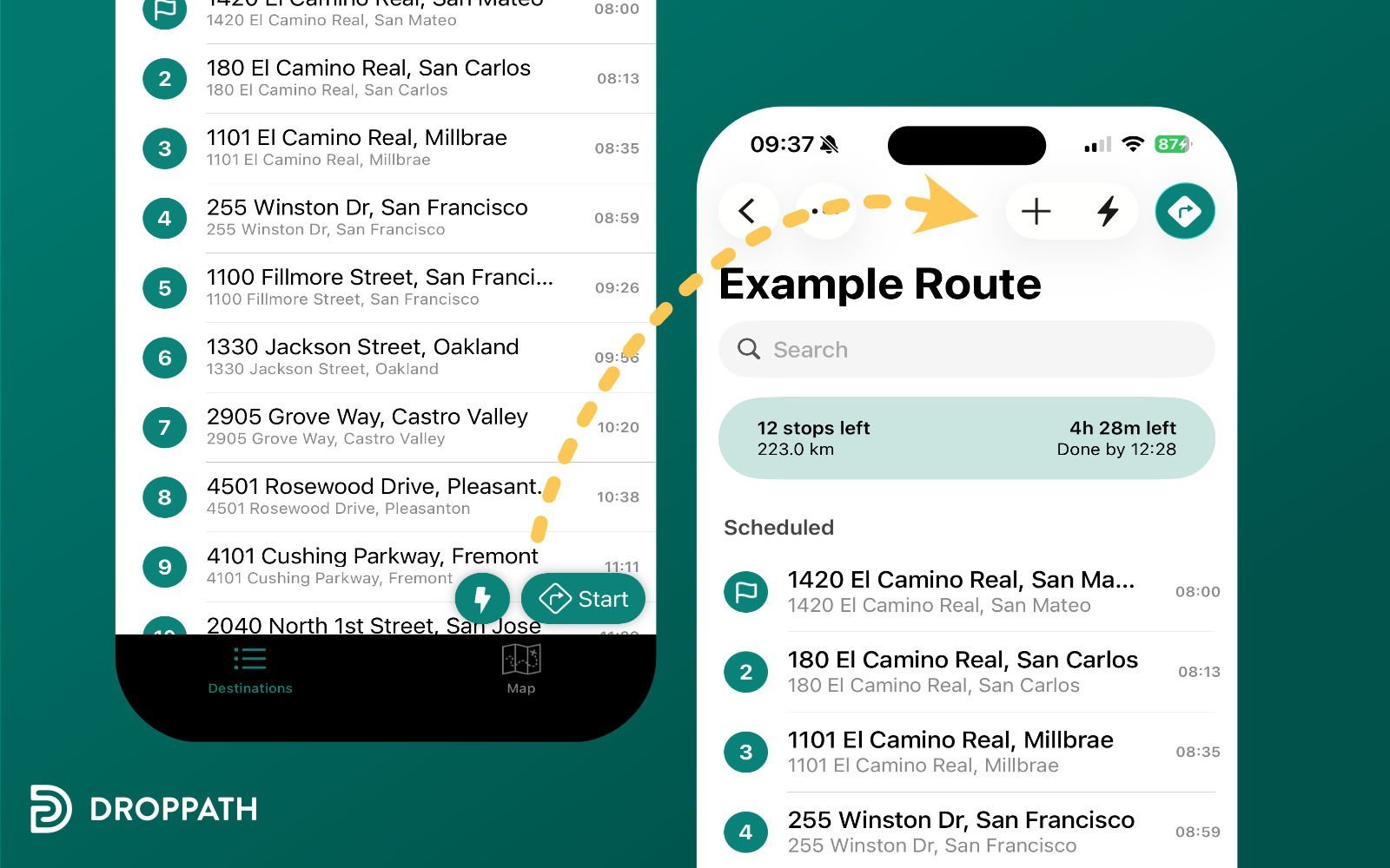
Liquid Glass' slimmer tab bars rendered Floating Action Buttons (FABs)—a Material Design staple—visually incongruous. "FABs appeared alien next to the refined tab bar," notes Beaudoin. The team relocated core actions into the navigation bar itself, grouping related functions while improving discoverability. Map view controls migrated to the top-right, creating a clear hierarchical flow.
The Tab Bar Conundrum
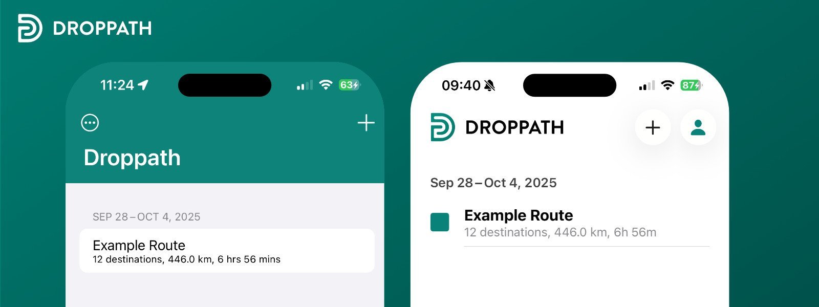
Droppath's dual-use tabs—switching between map/list views and folder navigation—defied iOS conventions. While Apple's Photos app uses central toggles and Files buries view switching in menus, Droppath retained its segmented tab approach. User analytics confirmed frequent mode-switching justified this non-standard pattern despite migration risks.
SwiftUI's Double-Edged Sword
Code integration posed thorny challenges:
.glassProminentStyleIfPossible()
Helper methods like this encapsulated style changes, but ~20 #available(iOS 26.0, *) checks still permeate the codebase. Custom sheet navigation—critical for Droppath's swipe-between-stops feature—required significant re-engineering to coexist with Liquid Glass animations. Toolbar positioning demanded custom implementations after default placements failed visually.
The Polyvalent Icon
Beyond code, branding evolved: An abstract "D"-shaped path replaced literal delivery box imagery. Using Apple's Icon Composer, the team subtly adapted it for Liquid Glass' layered aesthetics without overcomplicating the design.
The Responsiveness Imperative
The most visceral change? Interactivity. Non-updated buttons felt "static and unengaging" against animated Liquid Glass controls. Tab bar items now fluidly expand on tap—a microinteraction that exemplifies Apple's focus on tactile responsiveness.
Droppath's journey underscores that Liquid Glass isn't skin-deep; it demands rethinking spatial relationships, interaction models, and animation philosophies. For developers, the takeaway is clear: Future-proof with encapsulated style logic, but prepare for deep structural audits when Apple reshuffles the UI deck. As Beaudoin wryly notes, "With any luck, we won't face another sweeping UI transition of this scale for many years"—a sentiment every iOS engineer will echo.
Source: Droppath's Path to Liquid Glass
Comments
Please log in or register to join the discussion