WCAG contrast ratios ensure readability but often ignore real-world visual discomfort like eye strain and halation. Developer Jan Mittelman introduces an experimental Color Comfort Score to quantify ergonomic pitfalls in dark mode and saturated palettes. This could transform how designers and engineers approach inclusive UI.
Ever squinted at a sleek dark-mode interface only to feel your eyes ache? You're not alone. Despite passing stringent Web Content Accessibility Guidelines (WCAG) contrast checks, color combinations like pure white text on black backgrounds can cause physical discomfort—halation (a 'glowing' effect), eye strain in low light, or flickering during scrolling. For developers and designers, this gap between technical compliance and user comfort is a growing frustration, especially as dark mode surges in popularity.
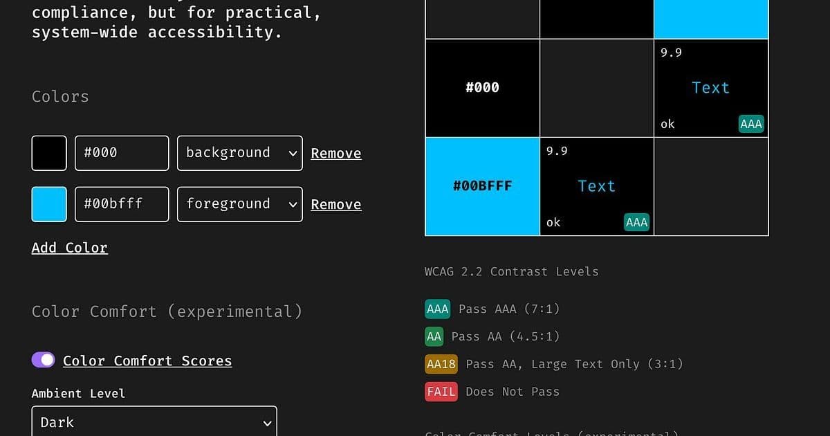
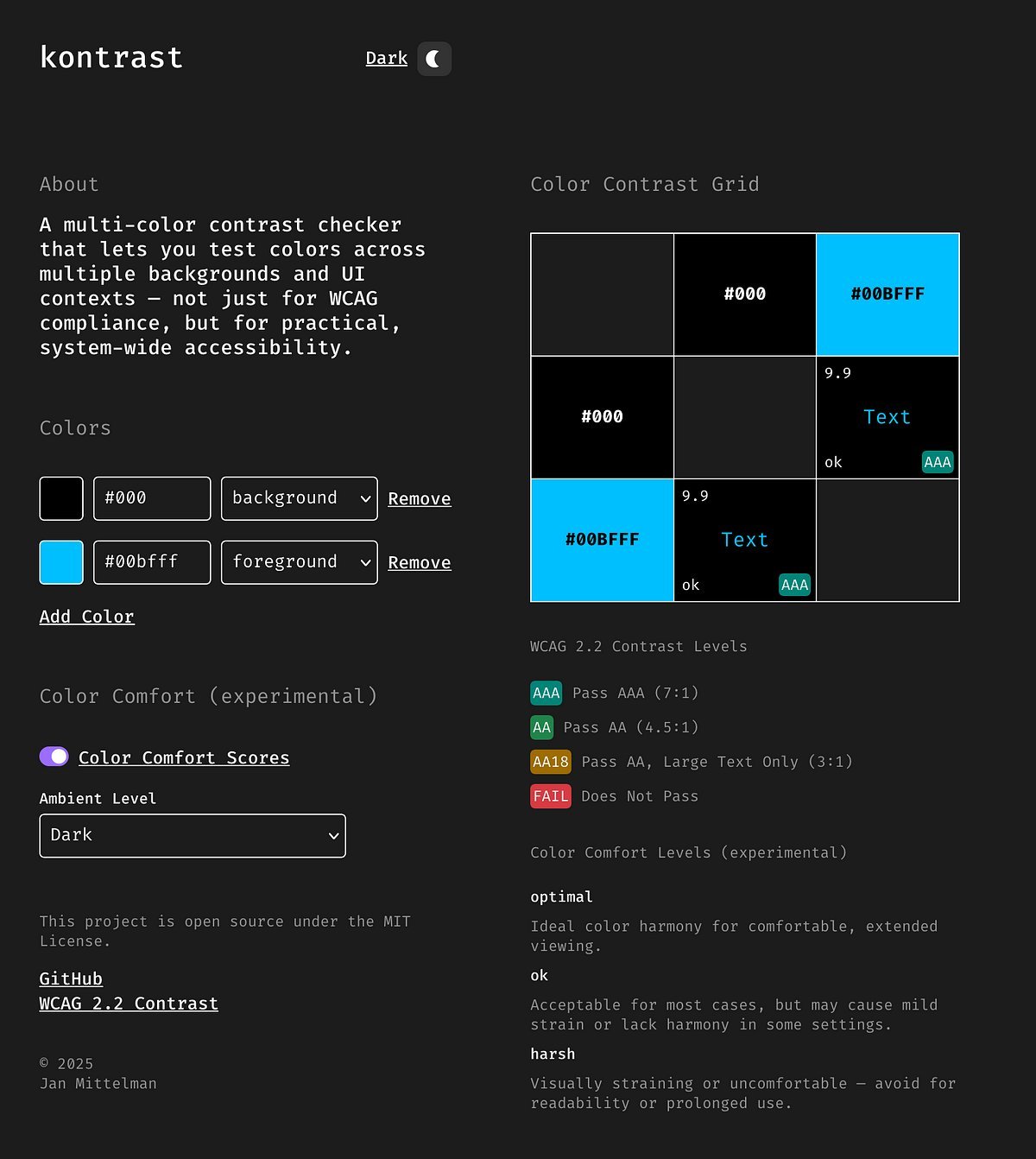
Jan Mittelman, a developer and accessibility advocate, encountered this disconnect firsthand. Tools like WCAG 2.2 (or its successor, APCA) focus on luminance contrast for readability but overlook perceptual factors. As he explains: "Some color combinations that pass perfectly still feel awful to look at—especially in dark mode or low-light environments." This led him to develop the experimental Color Comfort Score, a 0–100 metric blending six research-backed elements:
- Polarity awareness: Penalizes light-on-dark text, which strains eyes more than dark-on-light.
- Ambient light adaptation: Flags brightness mismatches between UI elements and room lighting.
- Color harmony: Downgrades saturated complementary hues (e.g., red/green) that cause visual vibration.
- Vibrating-edge detection: Identifies high-contrast, similarly-light colors that create noise.
- Blue light sensitivity: Reduces scores for bright blues in dark settings due to eye fatigue.
- WCAG contrast: Retains baseline readability as a foundational check.
The result? A simple scoring system:
- 80+ (Optimal): Ideal for extended viewing.
- 60–79 (OK): May cause mild fatigue.
- Below 60 (Harsh): High risk of glare or strain.
Consider these real-world examples Mittelman highlights:
"Pure white (#FFFFFF) on black (#000000) passes WCAG AAA with a 21:1 ratio but scores 'Harsh' due to glare. In low light, it’s like staring at a flashlight."
"Navy (#00008b) with dark orange (#ff8c00) passes WCAG (6.6:1) but earns 'Harsh' for vibrating edges—their similar lightness creates unsettling visual noise."
Developers can test combos via Mittelman’s open-source tool, which visualizes scores dynamically. While WCAG remains essential for accessibility compliance, this approach addresses ergonomic gaps affecting neurodiverse users, fatigue-prone workflows, and dark-mode adoption. As one designer noted: "We’ve all tweaked palettes by gut feeling—this quantifies the 'why.'"
Mittelman emphasizes the score is experimental and invites community feedback on edge cases or refinements. For tech teams, it signals a shift: true inclusivity means balancing regulatory checks with human-centered comfort. After all, the best interfaces shouldn’t just be readable—they should feel effortless.
Source: Adapted from Jan Mittelman’s original article.
Comments
Please log in or register to join the discussion