Mental health app design requires moving beyond traditional UX to create emotionally safe digital environments. This framework translates empathy into practical design tools across onboarding, interface design, and retention systems.
Mental health app design requires moving beyond traditional UX to create emotionally safe digital environments. This framework translates empathy into practical design tools across onboarding, interface design, and retention systems.
Building Digital Trust: An Empathy-Centred UX Framework For Mental Health Apps
Why Mental Health App Design Demands a Different Approach
Designing for mental health means designing for vulnerability. When a user opens a mental health app while feeling overwhelmed with anxiety, the stakes are fundamentally different than with a utility or entertainment app. Their emotional state isn't a secondary context—it's the environment your product operates in.
The margin for error is negligible. With over a billion people living with mental health conditions and persistent gaps in access to care, safe and evidence-aligned digital support is increasingly relevant. Empathy-Centred UX becomes not a "nice to have" but a fundamental design requirement.
The Three Pillars of Empathy-Centred UX
Throughout my career as a product designer, I've found that trust is built by consistently meeting the user's emotional needs at every stage of their journey. This framework translates these insights into practical tools organized around three core pillars:
1. The Onboarding Conversation: From Checklist to Trusted Companion
Onboarding is "a first date" between a user and the app—and the first impression carries immense stakes. In mental health tech, with up to 20,000 mental-health-related apps on the market, designers face the challenge of integrating onboarding's primary goals without making the design feel too clinical or dismissive for someone seeking help.
Recognition and Relief
At Teeni, an app for parents of teenagers, onboarding required acknowledging the emotional load of parenting teens and showing how the app could share that load. Interviews surfaced a recurring feeling among parents: "I'm a bad parent, I've failed at everything."
My design solution provided early relief and normalization through a city-at-night metaphor with lit windows. Directly after the welcome page, users engage with three brief, animated, and optional stories based on frequent challenges of teenage parenting. This narrative approach reassures parents that they are not alone in their struggles, normalizing and helping them cope with stress and other complex emotions from the very beginning.
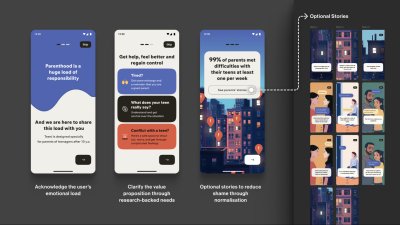
Note: Early usability sessions indicated strong emotional resonance, but post-launch analytics showed that the optionality of the storytelling must be explicit. The goal is to balance the storytelling to avoid overwhelming the distressed parent, directly acknowledging their reality: "Parenting is tough. You're not alone."
Progressive Profiling
To tailor guidance to each family, we defined the minimal data needed for personalization. On the first run, we collect only the essentials for a basic setup (e.g., parent role, number of teens, and each teen's age). Additional, yet still important, details (specific challenges, wishes, requests) are gathered gradually as users progress through the app, avoiding long forms for those who need support immediately.
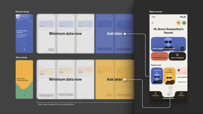
The entire onboarding is centered around a consistently supportive choice of words, turning a typically highly practical, functional process into a way to connect with the vulnerable user on a deeper emotional level, while keeping an explicit fast path.
Your Toolbox:
- Use Validating Language: Start with "It's okay to feel this way," not "Allow notifications."
- Understand "Why", not just "What": Collect only what you'll use now and defer the rest via progressive profiling.
- Prioritise Brevity and Respect: Keep onboarding skimmable, make optionality explicit, and let user testing define the minimum effective length.
2. The Emotional Interface: Maintaining Trust in a Safe Environment
A user experiencing anxiety or depression often shows reduced cognitive capacity, which affects their attention span and the speed with which they process information. This means that high-saturation palettes, abrupt contrast changes, flashing, and dense text can feel overwhelming.
Low-Arousal Design Strategy
When designing a user flow for a mental health app, I always apply the Web Content Accessibility Guidelines 2.2 as a foundational baseline. On top of that, I choose a "low-stimulus," "familiar and safe" visual language to minimize the user's cognitive load and create a calm, predictable, and personalized environment.
For Bear Room, an app focused on instant stress relief, I tested a "cosy room" design. User interviews revealed that the prevailing design language of many mental health apps appeared misaligned with the needs of our audience. Participants grappling with conditions such as PTSD and depression repeatedly described competing apps as "too bright, too happy, and too overwhelming," which only intensified their sense of alienation instead of providing solace.
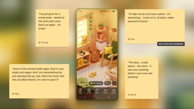
The resulting interface is a direct antithesis to digital overload; it gently guides the user through the flow, keeping in mind that they are likely in a state where they lack the capacity to concentrate. The text is divided into smaller parts and is easily scannable. The emotional support tools—such as a pillow—are highlighted on purpose for convenience.
The interface employs a carefully curated, non-neon, earthy palette that feels grounding rather than stimulating, and it rigorously eliminates any sudden animations or jarring bright alerts that could trigger a stress response.
Personal Objects and Sensory Grounding
To foster a sense of personal connection and psychological ownership, the room introduces three opt-in "personal objects": Mirror, Letter, and Frame. Each invites a small, successful act of contribution, drawing on the IKEA effect.
For instance, Frame functions as a personal archive of comforting photo albums that users can revisit when they need warmth or reassurance. Users can replace the placeholder with an image from their collection—a loved one, a pet, or a favorite landscape—displayed in the room each time they open the app. This choice is voluntary, lightweight, and reversible, intended to help the space feel more "mine" and deepen attachment without increasing cognitive load.
Visual Metaphors and Micro-interactions
In Food for Mood, I used a visual metaphor: colored bubbles representing goals and emotional states (e.g., a dense red bubble for "Performance"). This allows users to externalize and visualize complex feelings without the cognitive burden of finding the right words.
Adding tactile micro-interactions like bubble-wrap popping in Bear Room can offer users moments of kinetic relief. Integrating deliberate, tactile micro-interactions provides a focused act that can help an overwhelmed user feel more grounded. It offers a moment of pure, sensory distraction for a person stuck in a torrent of stressful thoughts.

Note: Make tactile effects opt-in and predictable. Unexpected sensory feedback can increase arousal rather than reduce it for some users.
Voice-First Design
When a user is in a state of high anxiety or depression, it can become an extra effort for them to type something in the app or make choices. In moments when attention is impaired, voice input can offer a lower-friction way to engage and communicate empathy.
In both Teeni and Bear Room, voice was integrated as a primary path for flows related to fatigue, emotional overwhelm, and acute stress—always alongside a text input alternative. Simply putting feelings into words (affect labelling) has been shown to reduce emotional intensity for some users, and spoken input also provides a richer context for tailoring support.
Your Toolbox:
- Accessibility-Friendly User Flow: Aim to become your user's guide. Only use the text that is important, highlight key actions, and provide simple, step-by-step paths.
- Muted Palettes: Align palette with purpose and audience; if you use muted palettes, verify WCAG 2.2 contrast thresholds and avoid flashing.
- Tactile Micro-interactions: Use subtle, predictable, opt-in haptics and gentle micro-interactions for moments of kinetic relief.
- Voice-First Design: Offer voice input as an alternative to typing or single-tap actions in low-energy/high-pressure states.
- Privacy by Default: Ask for explicit consent to process personal data. State clearly how, where, and for how long data is processed, and that it's not sold or shared—and honor it.
3. The Retention Engine: Deepening Trust Through Genuine Connection
Encouraging consistent use without manipulation often requires innovative solutions in mental health. The app faces an ethical dilemma: its mission is to prioritize user wellbeing, which means it cannot indulge users simply to maximize their screen time.
The "Key" Economy
In search of reimagining retention mechanics away from punitive streaks and towards a model of compassionate encouragement, the Bear Room team came up with the idea of the so-called "Key" economy. Unlike a streak that shames users for missing a day, users are envisioned to earn "keys" for logging in every third day—a rhythm that acknowledges the non-linear nature of healing and reduces the pressure of daily performance.
Keys never gate SOS sets or essential coping practices. Keys only unlock more objects and advanced content; the core toolkit is always free. The system's most empathetic innovation lies in the ability for users to gift their hard-earned keys to others in the community who may be in greater need.
This intends to transform the act of retention from a self-focused chore into a generous, community-building gesture. It aims to foster a culture of mutual support, where consistent engagement is not about maintaining a personal score, but about accumulating the capacity to help others.
Community-Driven Support
Within Bear Room, users can write and receive supportive letters anonymously to other users around the world. This tool leverages AI-powered anonymity to create a safe space for radical vulnerability. It provides a real human connection while completely protecting user privacy, directly addressing the trust deficit.
It shows users they are not alone in their struggles, a powerful retention driver.
Crisis Management Tools
The "Teenager Translator" in Teeni became a cornerstone of our retention strategy by directly addressing the moment of crisis where parents were most likely to disengage. When a parent inputs their adolescent's angry words, the tool instantly provides an empathetic translation of the emotional subtext, a de-escalation guide, and a practical script for how to respond.
This immediate, actionable support at the peak of frustration transforms the app from a passive resource into an indispensable crisis-management tool.
Your Toolbox:
- Reframe Metrics: Change "You broke your 7-day streak!" to "You've practiced 5 of the last 10 days. Every bit helps."
- Compassion Access Policy: Never gate crisis or core coping tools behind paywalls or keys.
- Build Community Safely: Facilitate anonymous, moderated peer support.
- Offer Choice: Let users control the frequency and type of reminders.
- Keep an Eye on Reviews: Monitor app-store reviews and social mentions regularly; tag themes, quantify trends, and close the loop with quick fixes or clarifying updates.
The Designer's Responsibility: Balancing Business and Wellbeing
Trust is the success component for a mental health app. Although it is not easy to measure, our role as designers lies precisely in creating a UX Framework that respects and listens to its users and makes the app fully accessible and inclusive.
The trick is to achieve a sustainable balance between helping users reach their wellness goals and the gaming effect, so they also benefit from the process and atmosphere. It is a blend of enjoyment from the process and fulfillment from the health benefits, where we want to make a routine meditation exercise something pleasant.
Our role as product designers is to always keep in mind that the end goal for the user is to achieve a positive psychological effect, not to remain in a perpetual gaming loop.
When this balance is struck, the result is more than just better metrics; it's a profound positive impact on your users' lives. In the end, empowering a user's well-being is the highest achievement our craft can aspire to.
Comments
Please log in or register to join the discussion