Mastering CSS unit conversions is essential for creating responsive, accessible web experiences. LavX's CSS Unit Converter simplifies this complex process, helping developers build consistent interfaces across all devices.
The Critical Role of CSS Units in Modern Web Development
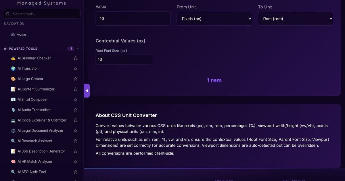
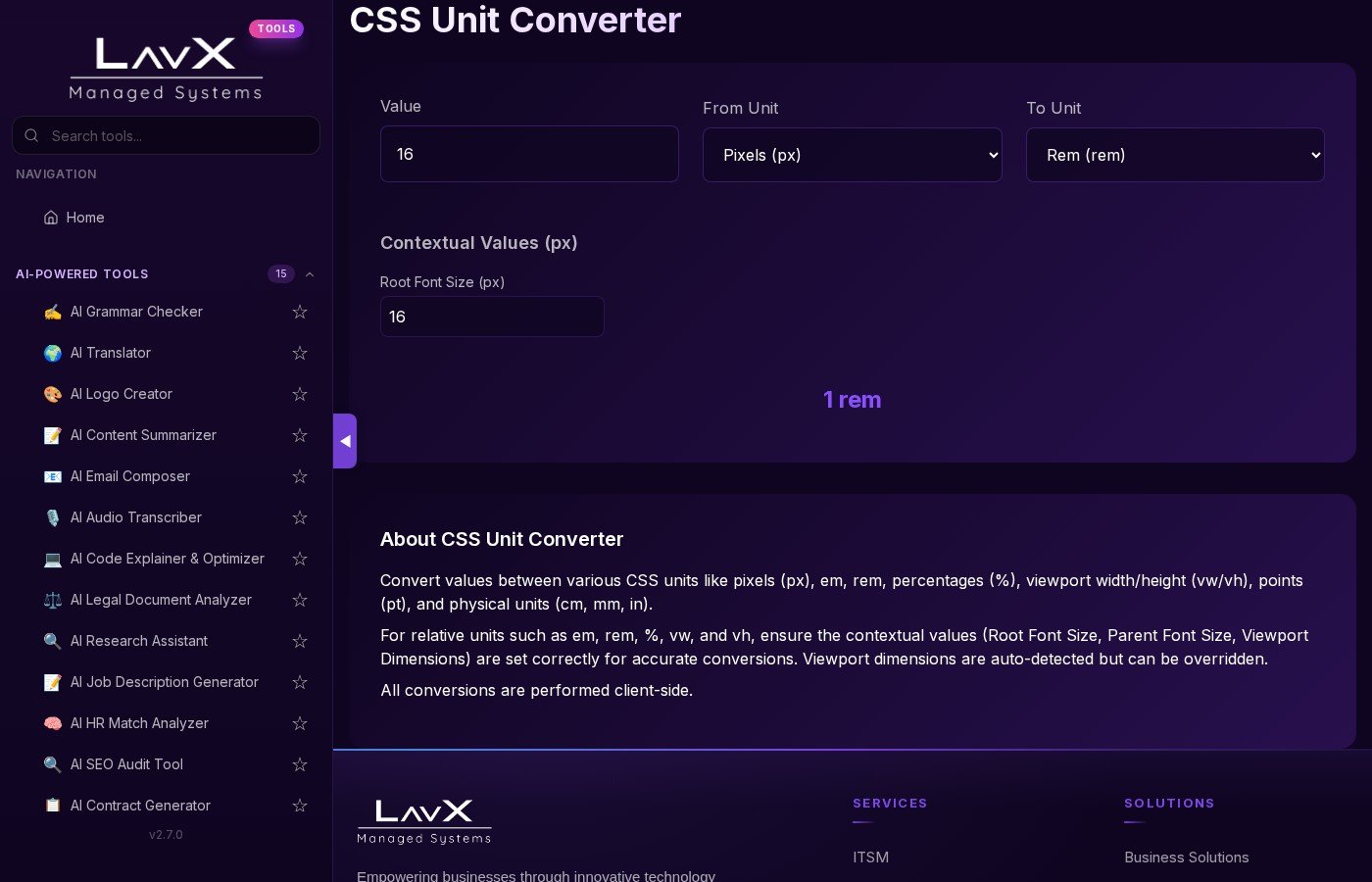
In today's multi-device world, CSS units are the unsung heroes of responsive design. They determine how elements scale, adapt, and maintain visual consistency across different screen sizes and resolutions. Understanding and converting between units like pixels (px), em, rem, percentages (%), viewport units (vw/vh), and physical units (pt, cm, mm) is fundamental to creating truly responsive web experiences.
Why CSS Unit Conversion Matters
Responsive design isn't just about media queries—it's about understanding how different units interact. When developers fail to properly convert between units, they encounter:
- Inconsistent spacing and sizing across devices
- Accessibility issues for users with different zoom levels
- Maintenance nightmares when updating design systems
- Performance bottlenecks from recalculating layouts
The CSS Unit Converter from LavX addresses these challenges by providing a centralized, reliable tool for converting between all major CSS units with proper context awareness.
How LavX's CSS Unit Converter Stands Out
Our converter goes beyond simple unit arithmetic. It understands the contextual relationships between units:
- Root font size awareness for accurate rem calculations
- Viewport dimension detection for vw/vh conversions
- Parent element context for em calculations
- Physical-to-digital precision for print-to-web design handoffs
This contextual intelligence ensures that conversions maintain the intended visual relationships across different contexts—a capability that generic unit calculators simply cannot match.
Integrating the CSS Unit Converter into Your Development Workflow
For development teams, the CSS Unit Converter serves multiple purposes:
- Design system implementation: Convert design mockups from design tools (which often use physical units) to CSS with pixel-perfect accuracy
- Responsive debugging: Quickly understand how viewport-based units will behave at different screen sizes
- Accessibility compliance: Ensure text scales properly by testing rem/em conversions against user preferences
- Cross-platform consistency: Maintain visual parity between web and mobile applications
The tool's client-side processing ensures that sensitive project data never leaves your environment, aligning with LavX's commitment to security and privacy.
The LavX Ecosystem: More Than Just a Converter
The CSS Unit Converter is part of LavX's comprehensive platform of development tools. When combined with our other utilities like the AI Code Explainer & Optimizer, JSON Formatter, and Git Cheatsheet, it becomes an integral part of a streamlined development workflow.
For engineering leaders, the CSS Unit Converter represents LavX's broader approach to developer productivity:
- Reliability: All calculations are performed client-side, ensuring accuracy and data privacy
- Automation: Reduces manual conversion errors that can lead to costly rework
- Security: No data transmission to external servers
- Integration: Seamlessly fits into existing development workflows and toolchains
Explore more of LavX's developer tools at https://tools.lavx.hu and discover how our platform can enhance your team's productivity and code quality.
Final Thoughts
In the ever-evolving landscape of web development, mastering CSS units is no longer optional—it's essential for creating experiences that work seamlessly across all devices. LavX's CSS Unit Converter provides the precision and context awareness needed to build responsive, accessible interfaces with confidence.
Comments
Please log in or register to join the discussion