
When AI coding assistants generate UI, they often default to generic, tired patterns. By feeding them a structured, three‑tier design system—primitives, semantic tokens, and component tokens—developers can coax consistent, brand‑aligned interfaces in a single prompt. This guide shows how to build that system, integrate it with Tailwind + shadcn/ui, and guard against drift with automated linting.
Design Systems That Speak AI
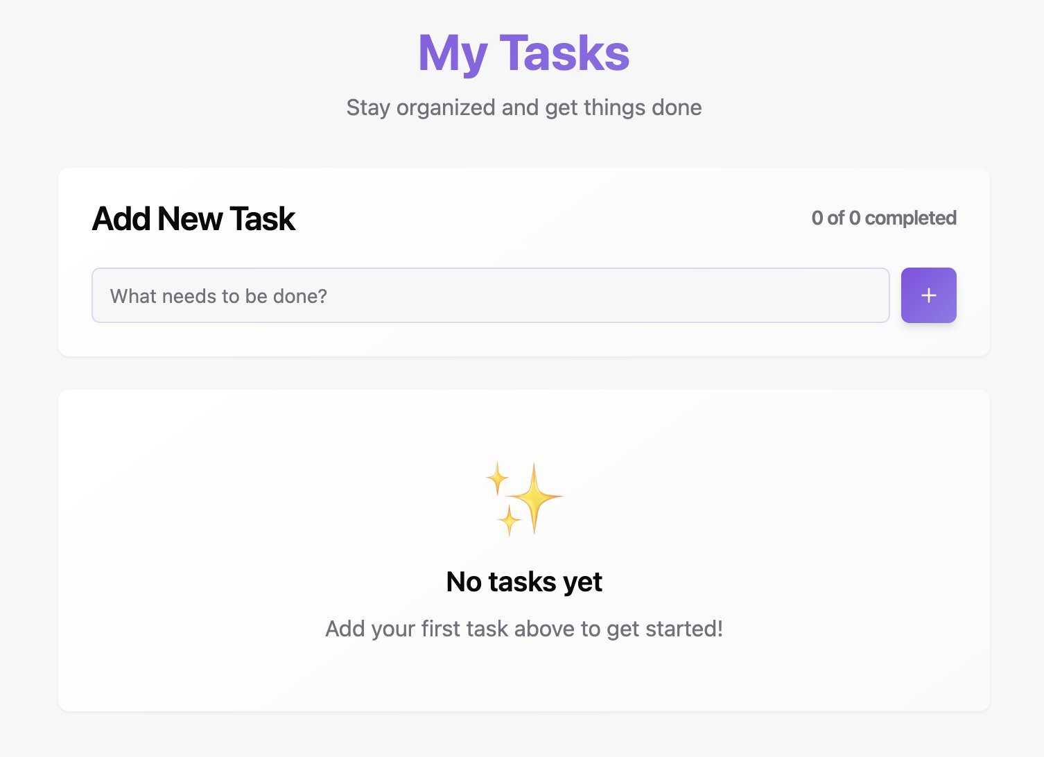
Every time a prompt asks an AI assistant to "build a dashboard" or "make a card look modern," the output lands on the same tired palette: purple‑to‑blue gradients, rounded corners, and a handful of arbitrary spacing values. The problem isn’t the AI model itself; it’s the lack of context. Without a well‑defined design system, the model simply regurgitates the most common patterns it has seen in its training data.
Why Context Matters
AI generates code by sampling from its training distribution. When you give it a vague prompt, it fills in the gaps with the most frequent choices—Bootstrap‑style grids, default Tailwind spacing, and the ubiquitous purple gradient. Each component becomes a patchwork of slightly different values, and the resulting UI feels cheap and inconsistent.
"Without tokens, primitives, or examples, it defaults to whatever patterns appear most frequently in its training set." – Source
The fix is to hand the model a vocabulary of constraints: a color palette, a spacing scale, and at least one example component. This is the essence of a design system that AI can understand.
The Three‑Tier Token Architecture
A robust system layers tokens to give AI both what to use and why.
| Tier | Purpose | Example |
|---|---|---|
| 1️⃣ Primitives | Raw values that never appear directly in components | --gray-900: #1b1b1b; |
| 2️⃣ Semantic | Purpose‑driven aliases that describe intent | --color-text-primary: var(--gray-900); |
| 3️⃣ Component | Context‑specific overrides for particular UI parts | --button-primary-bg: var(--color-brand); |
The hierarchy tells AI not just what values to use, but why. When it sees
--button-primary-bg, it knows the intent; when it sees#EC681E, it has to guess.
Minimal Viable Structure
/* Tier 1: Primitives */
--gray-900: #1b1b1b;
--gray-100: #f5f5f5;
--orange-500: #EC681E;

/* Tier 2: Semantic */
--color-text-primary: var(--gray-900);
--color-background: var(--gray-100);
--color-brand: var(--orange-500);

/* Tier 3: Component */
--button-primary-bg: var(--color-brand);
--button-primary-text: white;
Start with primitives and semantic tokens; add component tokens only when you hit ambiguity.
Organizing Tokens in Code
For larger projects, split the tokens into separate files that mirror the abstraction hierarchy:
src/
├── app/
│   └── globals.css          # Color primitives + semantic (CSS variables)
└── design-system/
    ├── foundations/
    │   ├── primitives.ts
    │   ├── semantic.ts
    │   ├── components.ts
    │   └── index.ts
The globals.css file handles colors via CSS custom properties, enabling theme switching without JavaScript. TypeScript files manage motion timing, spacing, and gradient strings, providing type safety for React components.
Example: Motion and Spacing Tokens
// primitives.ts
export const motionPrimitives = {
  ease: [0.16, 1, 0.3, 1] as const,
  duration: { instant: 0.2, short: 0.4, base: 0.6, long: 0.8 },
} as const;

export const spacingPrimitives = {
  scale: [0, 4, 8, 12, 16, 24, 32, 48, 64] as const,
} as const;
Tailwind Integration
Tailwind reads CSS variables via its config:
// tailwind.config.ts
export default {
  theme: {
    extend: {
      colors: {
        background: 'hsl(var(--background))',
        foreground: 'hsl(var(--foreground))',
      },
    },
  },
};
A component can now consume both systems:
import { motionTokens, gradientTokens } from '@/design-system';

<motion.div
  className="bg-background text-foreground p-6"
  style={{ background: gradientTokens['orange-purple'].text }}
  transition={{ duration: motionTokens.duration.base }}
/>
Why Tailwind + shadcn/ui is AI‑Optimized
shadcn/ui components expose a consistent set of CSS variables (--primary, --background, etc.) that Tailwind can map to utility classes. Because the variables are defined once in :root and overridden in .dark, AI can simply write bg-background or text-foreground—no need to think about light vs. dark mode.
"AI never writes bg-gray-900 for dark backgrounds. It writes bg-background — and the theme handles the rest." – Source
Using Tailwind’s self‑documenting classes also keeps the prompt surface small. In contrast, CSS‑in‑JS or styled‑components hide styles behind JavaScript abstractions, making it harder for AI to infer what classes to apply.
Prompting for Professional UI
A structured prompt template gives AI everything it needs:
## Context
- Design system tokens: [paste tokens.ts or link]
- Tailwind config: [paste relevant config]
- Visual reference: [screenshot or Figma link]

## Task
Build a [component type] that:
- Uses only colors from our token palette
- Follows our spacing scale (4/8/16/24/32px)
- Matches the visual reference layout

## Constraints
- No arbitrary Tailwind values
- Use semantic color tokens
- Follow existing component patterns in /components/ui

## Output
Single file with the component. Include all necessary imports.
Skipping any of the three pillars—tokens, config, visual reference—reverts the AI to its default training data, producing the same purple gradient and rounded corners.
Guardrails to Prevent Design Drift
AI can generate code quickly, but it can also regress quickly. Add automated checks:
- ESLint Tailwind plugin – flags arbitrary values.
- Pre‑commit hooks – run lint and type‑check before every commit.
- Visual regression tests – optional but useful for catching subtle layout changes.
// .eslintrc.json
{
  "rules": {
    "tailwindcss/no-arbitrary-value": "warn"
  }
}
These guardrails enforce consistency without manual review.
Putting It All Together
- Create a three‑tier token set (primitives, semantic, component).
- Adopt Tailwind + shadcn/ui for predictable patterns.
- Document the system in AI‑friendly skill files (short, copy‑pasteable examples).
- Enforce constraints with linting and pre‑commit hooks.
- Use the prompt template for every request.
The result is a design system that AI can understand and follow, turning a vague prompt into a polished, brand‑aligned UI in minutes.
Final Thought
Design systems are not overhead; they are the bridge between human intent and machine output. When AI receives a clear, structured vocabulary, it stops guessing and starts delivering professional interfaces—exactly what developers need to ship fast, reliable products.
Source: https://www.braingrid.ai/blog/design-system-optimized-for-ai-coding
Comments
Please log in or register to join the discussion