Dive into the intricate world of Chinese typography on the web, where ancient writing traditions meet modern CSS properties like writing-mode and text-orientation. Learn how developers can authentically render vertical scripts and tackle challenges in internationalization, font handling, and responsive design. This exploration reveals why supporting diverse writing systems is crucial for a truly global web.
The web’s dominance by Latin-based left-to-right layouts often overlooks the richness of global writing systems—but CSS is changing that. For Chinese, a logographic script with historical vertical orientation, rendering text authentically online presents unique technical hurdles. Drawing from Chen Hui Jing’s deep dive, we unravel how CSS Writing Modes Level 3 empowers developers to honor linguistic heritage while pushing web design forward.
The Historical Weight of Han Characters
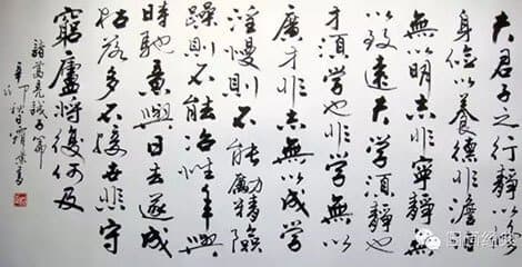
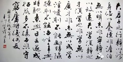
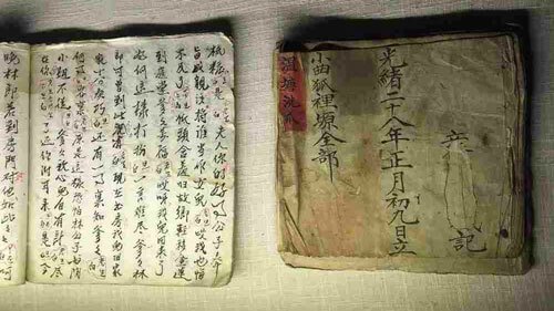
Chinese script, one of the world’s last widely used logographic systems, evolved from oracle bone carvings to digital glyphs. Traditionally written top-to-bottom and right-to-left, it shifted horizontally during the 20th century’s New Culture Movement for practicality—yet vertical layouts remain culturally significant in publications and art. 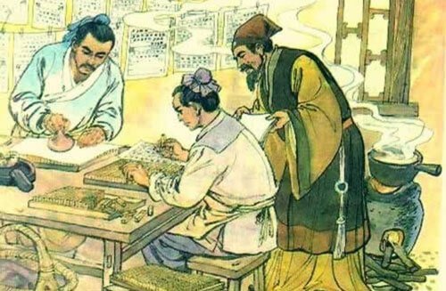
“Chinese is bi-orientational. It demands flexibility from web technologies to preserve its essence,” notes Chen. This duality challenges developers: How do we adapt rigid digital frameworks to fluid, context-dependent typography?
CSS Properties: Bridging Tradition and Technology
The CSS Writing Modes module provides the foundation. Key properties include:
writing-mode: Controls text flow direction. For vertical Chinese,vertical-rl(top-to-bottom, right-to-left) mirrors tradition, whilevertical-lrsuits modern adaptations..classic-chinese { writing-mode: vertical-rl; }
text-orientation: Ensures characters render upright in vertical flows.mixed(default) rotates non-CJK text, whileuprightkeeps all glyphs oriented correctly.text-combine-upright: Compresses numerals (e.g., dates) into single-character space—critical for formats like “民國101年.”
Browser support is robust except for fringe cases like sideways-lr (Firefox-only) and text-combine-upright: digits (unimplemented).
Typography Pitfalls and Font Realities
Chinese fonts pose logistical nightmares: file sizes balloon to megabytes due to ~20,000 glyphs per font. System defaults like “Microsoft JhengHei” or “黑體-繁” are pragmatic, but custom web fonts strain performance. Chen’s demo highlights critical nuances:
- Line height: Set to
2for readability, avoiding dense text blocks. - Punctuation: Traditional Chinese centers punctuation; Simplified skews left. Forcing
font-familyensures correct rendering. - Line length: 30–40 characters per line optimizes legibility vs. Latin’s 45–75.
body {
  font-family: "Microsoft JhengHei", "微軟正黑體", sans-serif;
  line-height: 2;
  text-align: justify;
}
The Demo: Lessons from a Mode Switcher Experiment
Chen’s interactive demo implements a layout toggler between horizontal and vertical orientations. Challenges emerged:
- Scrolling: Switching to
vertical-rlstarts users at the “end” of content, demanding manual rightward scrolling. - Art direction: Images require conditional logic—rotating, stacking, or using square crops—since
pictureelements don’t supportwriting-modequeries. Flexbox hacks likeflex-wrapenable responsive adaptations.
Why This Matters Beyond Aesthetics
Supporting Chinese typography isn’t niche—it’s a microcosm of web internationalization (i18n). With 1.3 billion speakers, neglecting Han scripts excludes vast audiences. Moreover, as Chen reflects, Western-centric design tools obscure global perspectives: “The onus is on developers to seek diverse viewpoints.”
Embracing CSS writing modes fosters inclusivity, whether for Arabic’s right-to-left flow or Mongolian’s top-to-bottom script. It’s a reminder that the web’s strength lies in its adaptability to human diversity, not technical convenience.
Further Exploration
- Specifications: CSS Writing Modes Level 3, Requirements for Chinese Text Layout
- Typography: 汉字标准格式 (Hanzi Standard Format)
- Cultural Context: Kendra Schaefer’s Chinese Typography Primer
Source: Adapted from Chen Hui Jing’s Chinese Web Typography, with technical analysis and additional insights.
Comments
Please log in or register to join the discussion