
Apple's latest macOS 26 Tahoe developer beta replaces the decades-old spinning hard drive icon with an SSD-inspired design, signaling the end of a visual relic from the HDD era. This subtle but symbolic update reflects the company's long transition to solid-state storage, though its timing sparks curiosity about why now.
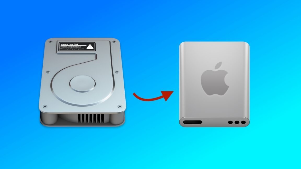
For over two decades, the Macintosh HD icon—a stylized spinning hard drive—served as a familiar anchor on macOS desktops, embodying an era when mechanical storage dominated computing. That era has officially ended. In the newest developer beta of macOS 26 Tahoe, Apple has swapped the classic HDD imagery for a sleek, abstract representation of a solid-state drive (SSD), closing a chapter that began with Mac OS X's public debut in 2000.
A Nostalgic Journey from Spinning Platters to Silicon
The original icon debuted in Mac OS X's third developer beta, featuring a metallic, pseudo-realistic hard drive that became an unintentional time capsule of early-2000s tech. It survived largely unchanged for years, receiving only minor facelifts: a Retina resolution boost in 2012 and a flatter, less textured redesign in 2014's Yosemite update, which aligned with Apple's iOS 7-inspired shift toward minimalism. Remarkably, it persisted through the Apple Silicon transition and even appeared in early Tahoe betas—until now.
What Changed and Why the Delay?
The new SSD-inspired icon adopts a simplified, geometric form, ditching the rotating disk for a design that hints at NAND flash chips (though, as the source wryly notes, actual Mac SSDs are just "chips soldered to a circuit board"). Accompanying updates refresh icons for external drives (orange with USB-C), network shares (blue with a globe), and disk images. Crucially, Apple also overhauled related system elements: Disk Utility now shows a wrench tightening a bolt, and installer apps inherit the new SSD motif.
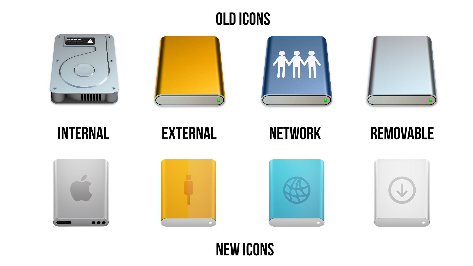
All of the system's disk icons get an update in the latest macOS 26 Tahoe developer beta. Credit: Apple/Andrew Cunningham
Why did this take so long? Apple shipped its first SSD-based Mac (the 2008 MacBook Air) 17 years ago and phased out spinning drives entirely by the late 2010s. The icon's invisibility on modern desktops—hidden by default since recent macOS versions—may explain the low priority. Still, the delay feels ironic for a company known for design-forward pivots.
Beyond Aesthetics: Symbolism in Silicon
This isn't just about pixels; it's a quiet acknowledgment of technological obsolescence. The old icon became a relic in a world where SSDs offer speed, reliability, and efficiency that HDDs can't match. Yet the update also highlights a quirk of digital abstraction: neither icon accurately depicts modern storage, serving instead as metaphors for an invisible technology. As mechanical drives fade into history, this visual reset underscores how progress often erases the artifacts of its own journey—leaving us to wonder what other digital ghosts linger in our interfaces.
Source: Ars Technica
Comments
Please log in or register to join the discussion