
Instagram’s long-awaited native iPad app arrived in fall 2025 with a Reels-first layout that diverged from its iPhone counterpart, but a May 2026 update scraps that experiment to mirror the phone app’s familiar feed-driven design, a shift that offers clear lessons for mobile developers building cross-device experiences.
Platform Update: Instagram’s iPad App Shifts to Unified Layout
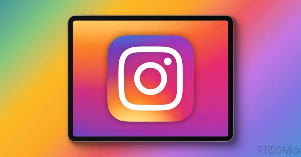
Instagram’s path to a native iPad app spanned 15 years, from the iPad’s 2010 debut to the fall 2025 release of a dedicated tablet app. That initial launch broke from the iPhone app’s familiar structure, prioritizing Reels content on the home screen, placing Stories in a top bar, and moving messaging to a single tap. Instagram positioned this as a design tailored to larger screen use, framing the iPad app as a lean-back entertainment tool rather than a scaled-up phone experience.
User feedback quickly indicated the experiment missed the mark. In May 2026, Instagram rolled out an update that abandons the tablet-specific layout in favor of a near-identical copy of the iPhone app’s structure. Three core changes define the update. The Home tab now displays a mix of posts from followed accounts and algorithmically suggested content, matching the iPhone’s primary feed. Reels are moved to a dedicated second tab in the bottom navigation bar, rather than occupying the entire home screen on launch. The Instagram-exclusive Following tab, which replicated the iPhone’s Home tab functionality under a different name, has been removed entirely to reduce user confusion.
The updated app requires iPadOS 18 or later, aligning with the minimum OS requirement of the initial fall 2025 release. This covers 92% of active iPad devices as of May 2026, per Apple’s device adoption metrics. For developers, this OS threshold means access to iPadOS 18’s SwiftUI updates for adaptive grids, which simplify scaling phone layouts to larger tablet screens.
Developer Impact: Trade-offs of Tablet-Specific vs. Unified Layouts
For mobile developers, especially those building cross-platform or iOS-native social media apps, this pivot offers concrete takeaways about tablet UI strategy. The initial Instagram iPad app attempted a custom tablet-first layout, diverging from the core phone experience. This required additional design and engineering resources: separate navigation flows, distinct content prioritization logic, and tablet-specific UI components. When user feedback indicated a preference for the familiar phone layout, Instagram had to allocate more resources to undo that work, standardize the experience across iPhone and iPad, and retire unused tablet-specific features like the Following tab.
From a technical implementation standpoint, aligning iPad and iPhone apps reduces long-term maintenance overhead. A single codebase for shared features, with conditional logic only for display size adjustments, is far easier to maintain than two separate UI paradigms. For developers using SwiftUI, Apple’s declarative UI framework, this alignment is straightforward: SwiftUI’s adaptive layouts automatically adjust to different screen sizes, so a single Home tab view can render correctly on both 4.7-inch iPhone screens and 13-inch iPad Pro displays with minimal additional code. For teams using UIKit, the effort is slightly higher, requiring manual adjustments to Auto Layout constraints or size classes, but still far less than maintaining two entirely separate navigation structures.
Cross-platform developers using tools like React Native or Flutter face similar trade-offs. Building a tablet-specific layout for these frameworks requires platform-specific code or custom layout logic, which increases testing burden across device sizes. Instagram’s shift suggests that for many consumer apps, users prioritize consistency over platform-specific customization, even on larger tablets. This is especially true for apps with frequent daily use, where muscle memory from the phone version translates directly to the tablet experience.
The update also reinforces Apple’s iPadOS Human Interface Guidelines, which recommend that apps adapt to larger screens without reinventing core functionality. While the guidelines encourage use of iPad-specific features like split view or multi-window support, they caution against diverging from established user expectations for core app flows.
Migration: How to Align Tablet and Phone Layouts
For teams currently maintaining separate tablet and phone layouts, Instagram’s experience outlines a clear migration path. First, audit user engagement data across device types. Instagram’s initial tablet layout likely saw low engagement on the custom Following tab, or high user confusion, driving the decision to retire it. Collecting similar data, such as tap-through rates on tablet-specific navigation items, time spent on Reels vs feed content, and user support tickets related to UI confusion, can justify a migration to a unified layout.
Next, prioritize shared components. Start by unifying core navigation structures: bottom tab bars, home feed rendering, and content detail pages should use the same logic across phone and tablet. For iPad, this means scaling up existing phone components rather than building new ones from scratch. SwiftUI developers can use size classes to adjust padding, font sizes, and grid column counts for larger screens, while keeping the same underlying view structure. UIKit teams can use trait collections to detect the current device's screen size and adjust constraints accordingly, without rewriting entire view controllers.
Finally, phase out tablet-specific features gradually. Instagram removed the Following tab entirely, as it duplicated existing functionality. Teams should identify similar redundant features in their own apps, deprecate them in a staged rollout, and communicate changes to users via in-app alerts or release notes. Testing is critical here: ensure that the unified layout works across all supported iPad models, from the 8th generation iPad to the latest iPad Pro, and across all supported iPadOS versions. Developers should check their own app’s minimum OS requirements against device adoption rates to avoid fragmenting their user base during migration.
For cross-platform teams, tools like React Native’s useWindowDimensions hook or Flutter’s MediaQuery class can simplify adaptive layout logic without requiring separate codebases for phone and tablet. This reduces the risk of inconsistencies that led to Instagram’s initial tablet app misstep, and cuts down on long-term maintenance work as new device sizes are released.
Comments
Please log in or register to join the discussion