Apple's iOS 26 delivered a seemingly minor update with major user impact: significantly larger alarm and timer dismissal buttons. This subtle design change addresses a universal pain point for groggy users struggling to silence their iPhones, proving that not every impactful software update needs AI or flashy features.
For countless iPhone users, the daily ritual of silencing a blaring morning alarm is a high-stakes interaction conducted in a bleary-eyed, half-asleep state. For years, a critical flaw existed in this moment: the dismiss button on the Clock app's alarm screen was frustratingly small. A slight miss meant the piercing siren continued unabated, turning a simple action into a daily annoyance. Apple's iOS 26 update, however, has quietly delivered a solution that resonates deeply with user experience: significantly larger dismissal buttons for alarms and timers.
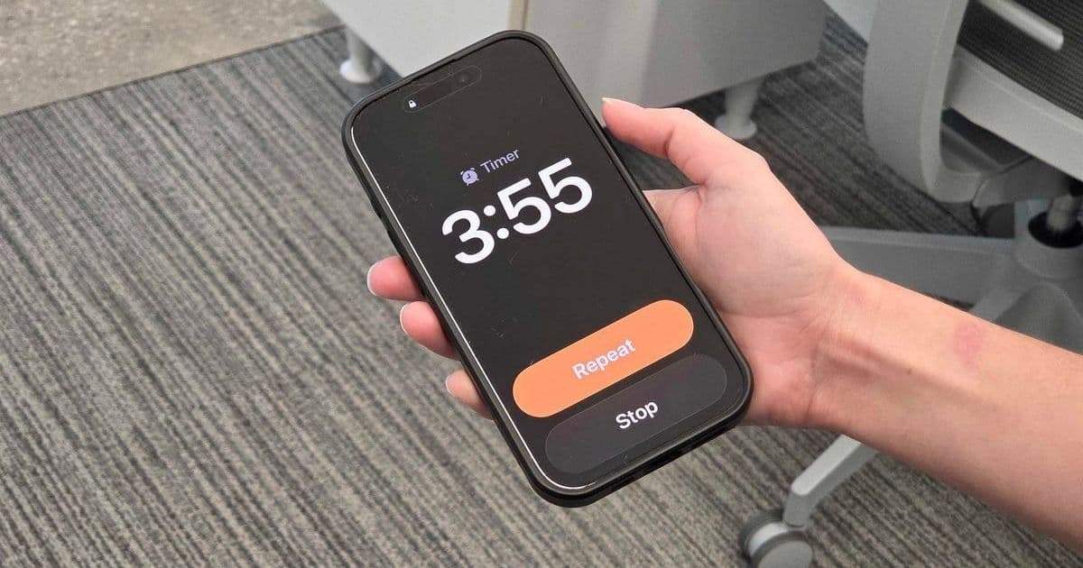
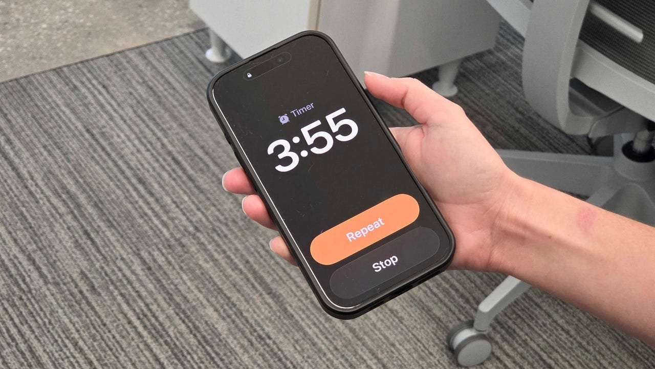 Caption: Hand holding an iPhone with an alarm going off (Nina Raemont/ZDNET)
This seemingly trivial design tweak solves a very real problem. As Nina Raemont details, attempting to hit the small 'Dismiss' or 'Stop' button immediately upon waking, often with diminished motor skills and urgency, frequently led to missed taps. The consequence? Prolonged exposure to the alarm sound, escalating frustration, and a disrupted start to the day. Given that surveys consistently show the vast majority of people, especially younger demographics, rely on their smartphones as their primary alarm clock, this friction point affected millions daily.
The previous interface, as shown below, featured relatively small text-based buttons ('Stop' and 'Snooze') positioned below the time display:
 Caption: The previous, smaller alarm dismissal interface on iPhone (Elyse Betters Picaro / ZDNET)
iOS 26 replaces this with much larger, more prominent buttons that dominate the lower portion of the screen. This increase in target area drastically reduces the chance of a missed tap, making the crucial act of silencing the alarm far more reliable under duress.
Why This Tiny Update is a Big Deal:
- Addressing Core User Needs: It targets a fundamental, frequent interaction point (turning off an alarm) occurring when users are least capable of precision (immediately upon waking). Good UX anticipates user state and context.
- Prioritizing Practicality Over Hype: In an era dominated by announcements of AI integrations and complex new features, this change highlights that refining core functionality and removing everyday friction remains paramount. Not every update needs to be revolutionary; iterative improvements to existing workflows are equally valuable.
- Consistency in Design Philosophy: Apple appears to be applying this 'larger targets' principle elsewhere in its ecosystem. Raemont notes a similar improvement in WatchOS 26's Workout app, where the 'Start' button now occupies more screen real estate, making it easier to activate during motion. This suggests a broader push towards enhanced touch target accessibility.
The Broader Implication: Balancing Innovation with Refinement
As Apple prepares to unveil its next generation of hardware and inevitably tout major software advancements like deeper AI integration, this alarm button update serves as a crucial reminder. While cutting-edge features capture headlines, the relentless refinement of fundamental interactions – the small details users encounter constantly – often has a more profound cumulative impact on satisfaction and usability. It underscores that truly user-centric design doesn't neglect the mundane in pursuit of the spectacular. The best software ecosystems evolve not just through leaps, but through countless thoughtful, almost invisible steps that make technology seamlessly serve human needs, especially the simple, daily ones like getting out of bed without a fight.
Source: Raemont, Nina. "The tiny iOS 26 update that made a big difference for me." ZDNet, 5 Sept. 2025, https://www.zdnet.com/article/the-tiny-ios-26-update-that-made-a-big-difference-for-me/.
Comments
Please log in or register to join the discussion