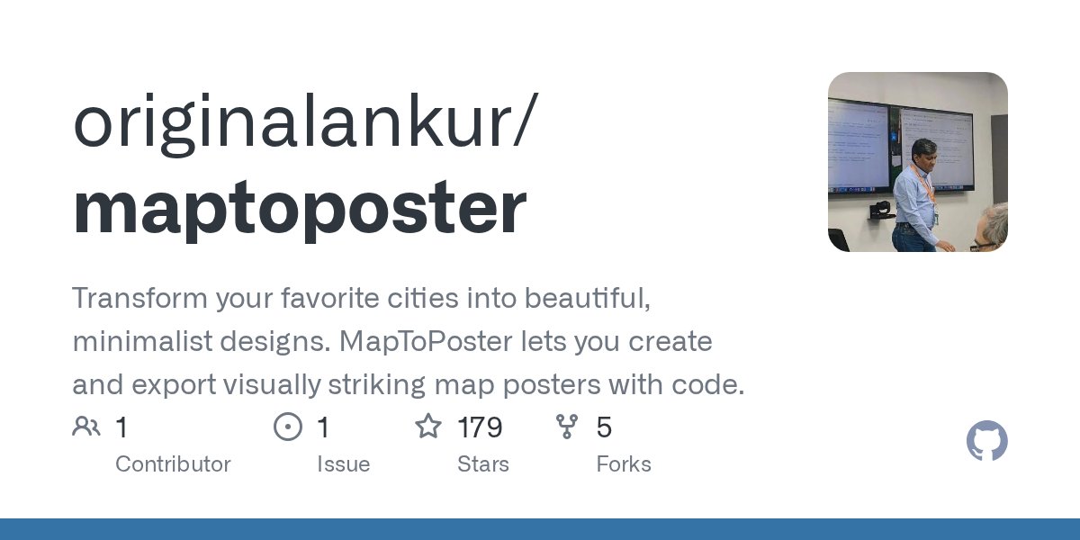
A GitHub project transforms OpenStreetMap data into elegant, themeable posters, revealing how developers are using geographic code to create visual artifacts that celebrate urban patterns.
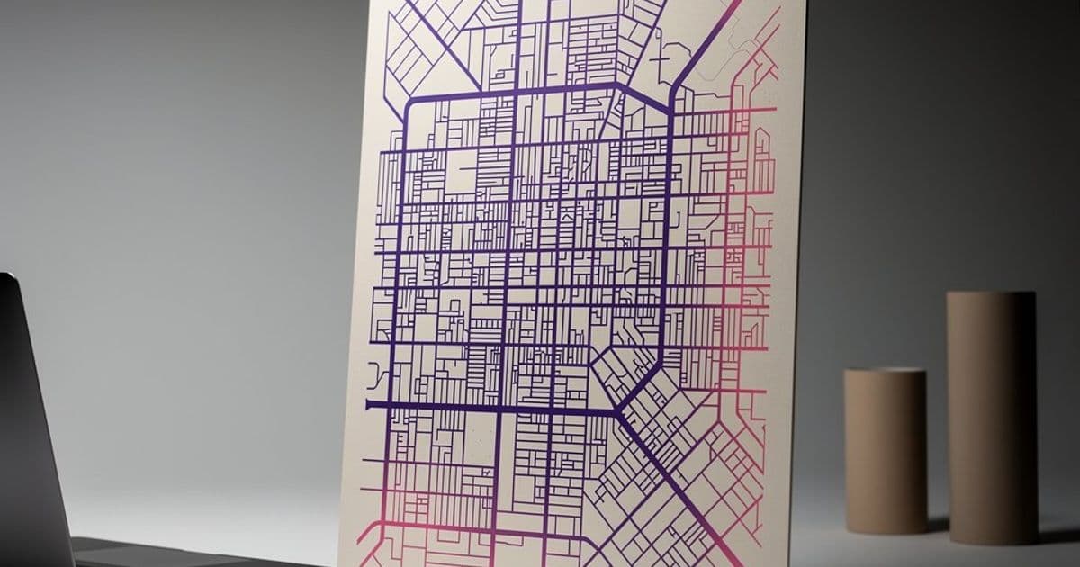
The line between utility and art in software often blurs in unexpected places. A project called MapToPoster sits at this intersection, using Python to transform raw OpenStreetMap data into minimalist poster designs. It's not just a mapping tool—it's a code-driven art generator that turns the grid of Manhattan, the canals of Venice, or the organic streets of Tokyo into printable, stylized graphics.
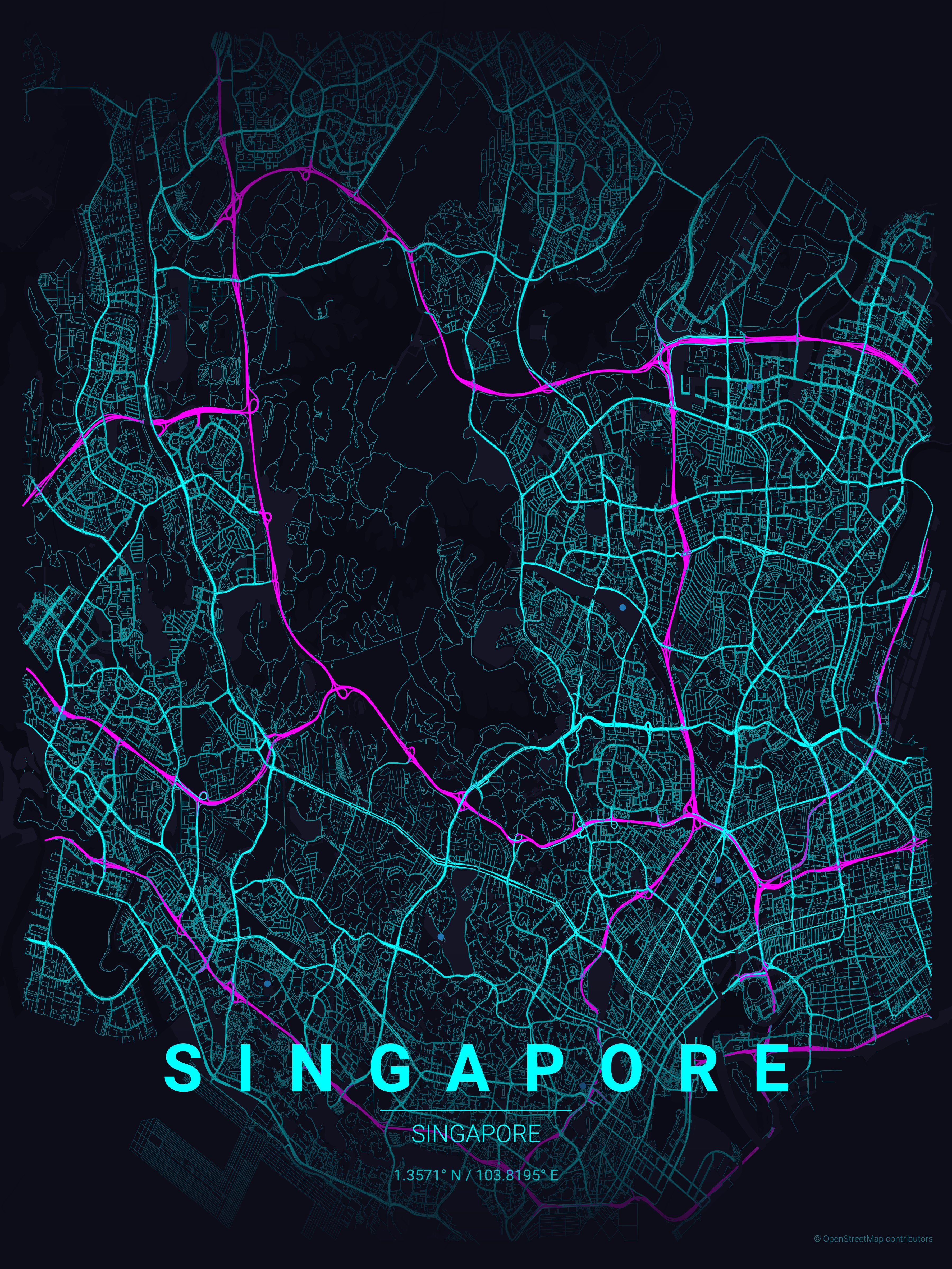
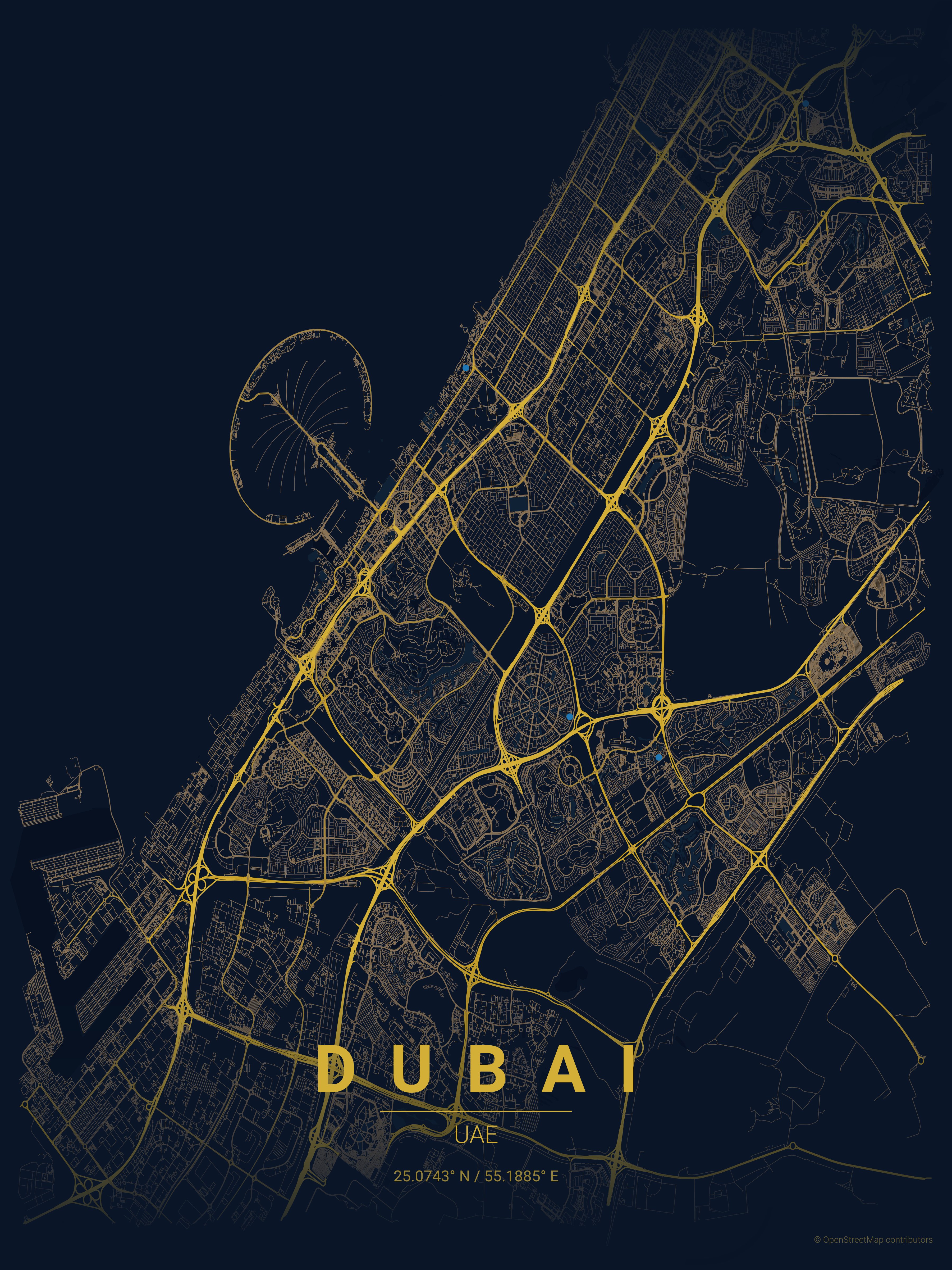
The project's core appeal lies in its simplicity: a command-line interface that takes a city name, a country, and a theme, then outputs a poster. But beneath that simplicity is a thoughtful architecture that leverages the OSMnx library for data fetching and matplotlib for rendering. The result is a system that can render 17 different visual themes, from "noir" (pure black background with white roads) to "neon_cyberpunk" (dark backgrounds with electric pink and cyan accents).
How It Works: From Geocoding to Pixels
The pipeline follows a clear sequence. First, a geocoding service (Nominatim) converts a city name into coordinates. Then, OSMnx fetches the street network data within a specified radius. The rendering engine uses matplotlib to draw the map, with roads colored and sized according to their highway type—motorways are thick and dark, residential streets are thin and light. Parks and water bodies are added as polygons, and text labels are positioned using normalized axes coordinates for consistent layout.
The project's architecture is modular enough for extension. The "Hacker's Guide" section explains how to add new map layers, like railways or buildings, by modifying the create_poster() function. It also details the z-ordering of layers, ensuring that text sits above gradient fades, which sit above roads, which sit above parks and water.
Themes as Design Systems
Themes are defined as JSON files, making them easy to create and share. Each theme specifies colors for background, text, gradient overlays, water, parks, and different road hierarchies. This approach treats design as a configuration problem, separating visual style from geographic data processing.
For example, the "blueprint" theme uses a light background with dark blue lines, mimicking architectural drawings. The "terracotta" theme evokes Mediterranean warmth with earthy tones. The "japanese_ink" theme uses a minimalist ink wash style, with subtle gradients and high contrast.
Practical Use and Community Adoption
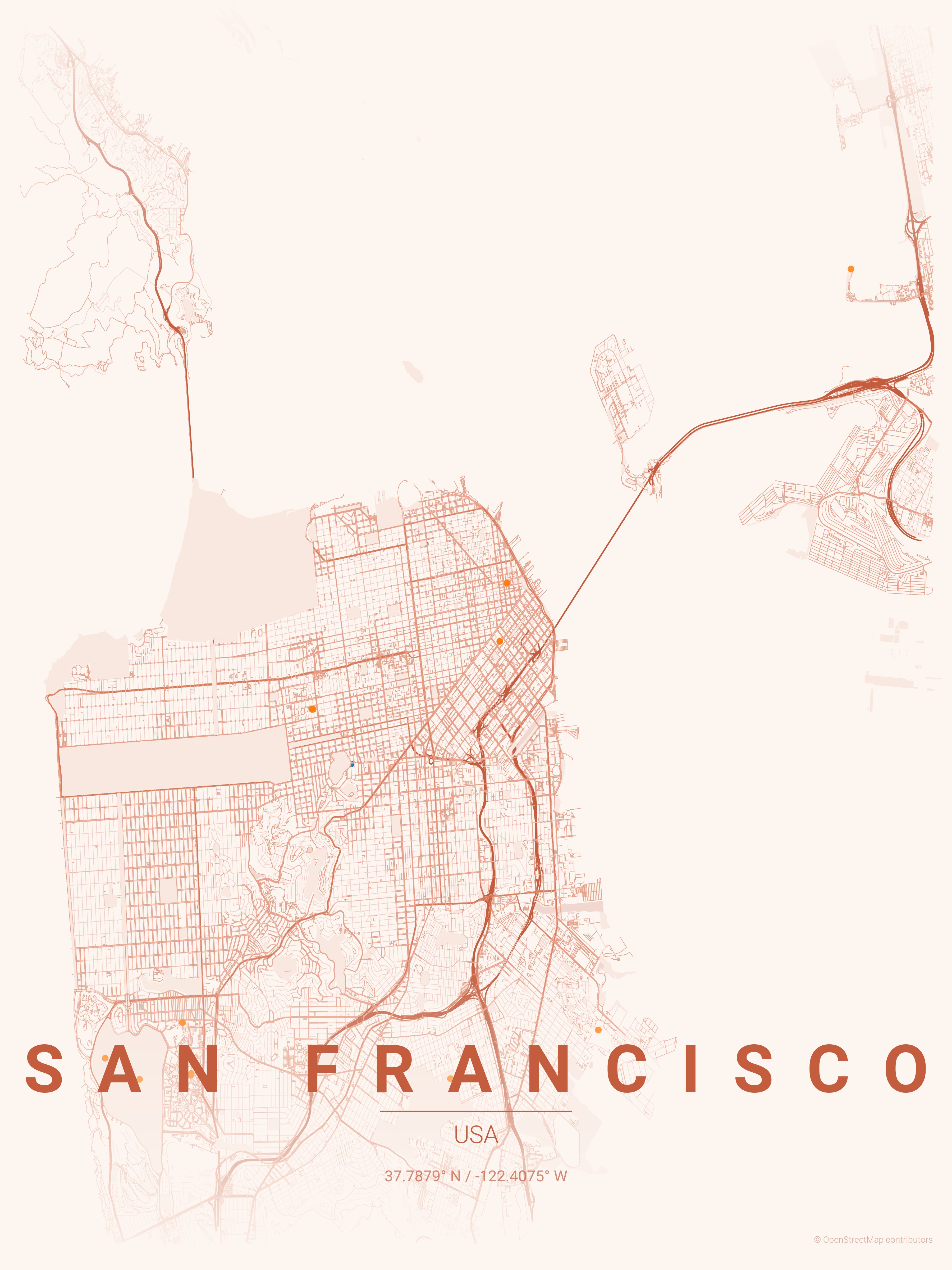
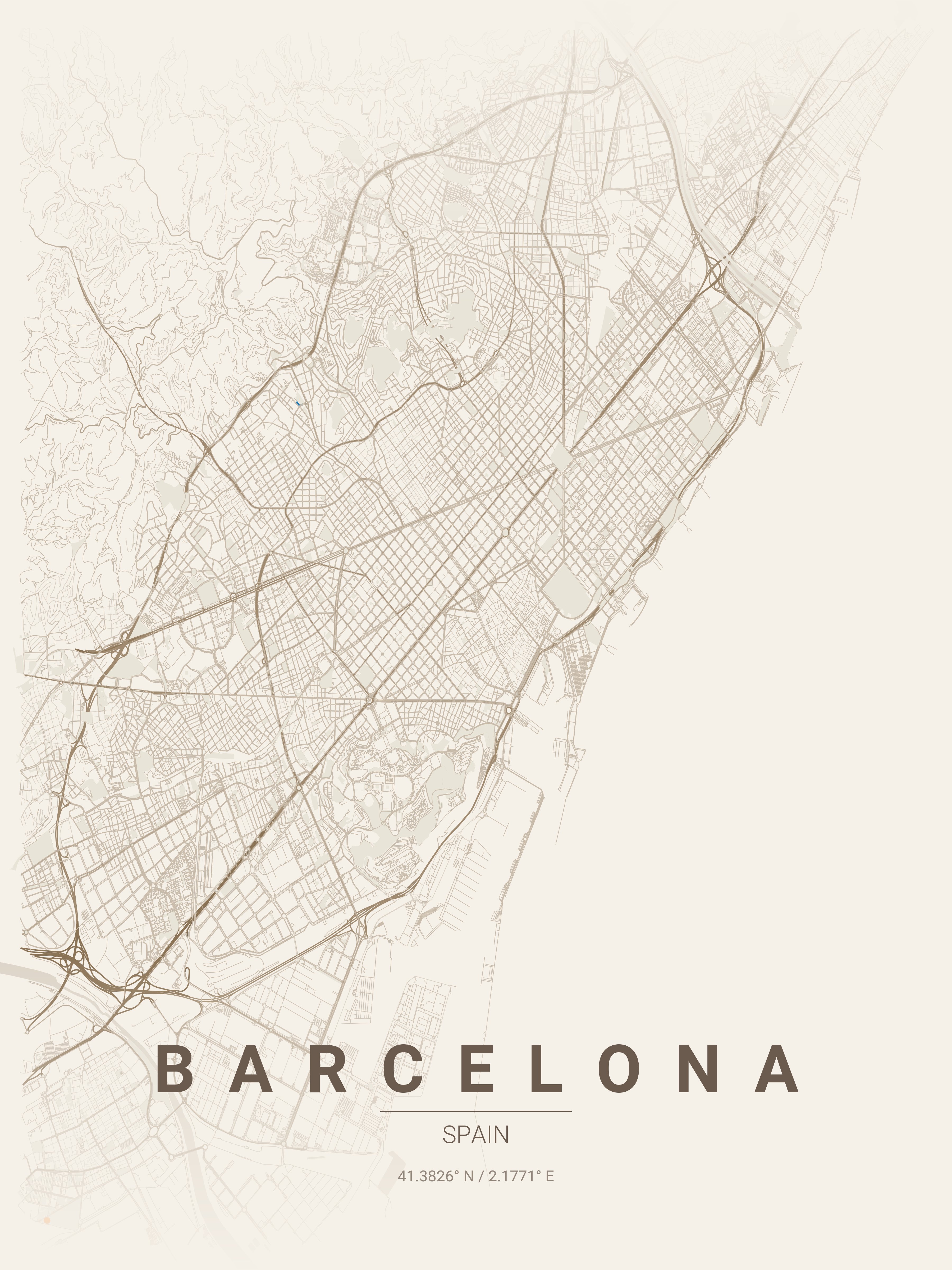
The project has gained traction among developers who appreciate both its technical elegance and its creative potential. It's been used to create posters of cities like San Francisco, Barcelona, Tokyo, and Dubai, each with a theme that complements the city's character. The examples in the README showcase how different themes highlight different urban patterns—Manhattan's grid, Venice's canals, Paris's Haussmann boulevards.
The distance guide is particularly useful for newcomers. It suggests radius ranges based on city size: 4-6 km for dense historic centers, 8-12 km for medium cities, and 15-20 km for large metros. This prevents the common pitfall of fetching too much data, which can slow down rendering and overwhelm the visual output.
Counter-Perspectives: Limitations and Trade-offs
Despite its appeal, the project has limitations. It relies on OpenStreetMap data, which can be incomplete or inconsistent in some regions. The geocoding service (Nominatim) has rate limits, so generating multiple posters quickly might require caching or using a different provider. The rendering is raster-based (PNG output), which limits scalability for large prints. Vector output (SVG) would be more flexible but is more complex to implement.
Performance can be an issue with large cities or high-resolution outputs. The README suggests reducing DPI from 300 to 150 for quick previews, and using network_type='drive' instead of 'all' for faster data fetching. These trade-offs highlight the balance between visual quality and computational efficiency.
Broader Patterns: Code as Creative Medium
MapToPoster fits into a broader trend of using code to create visual art. Projects like Generative Art or Processing sketches demonstrate how algorithms can produce aesthetic outputs. What sets MapToPoster apart is its focus on real-world geographic data, grounding the art in actual urban landscapes.
This approach also reflects a growing interest in "data visualization as art." Rather than just presenting information, these tools create artifacts that celebrate the patterns hidden in data. A MapToPoster output isn't just a map—it's a stylized interpretation of a city's structure, filtered through a designer's lens.
Extending the Project
For those looking to contribute, the project offers clear extension points. Adding a new theme is as simple as creating a JSON file. Adding a new map layer requires modifying the rendering pipeline, but the architecture is documented. The use of OSMnx opens possibilities for adding other geographic features—buildings, amenities, public transport routes.
The project also hints at future directions. Could it support vector output (SVG) for scalable prints? Could it integrate with other data sources, like satellite imagery or demographic data? Could it become a web service, allowing non-technical users to generate posters through a UI?
Conclusion: More Than a Tool
MapToPoster is more than a utility—it's a bridge between geographic data and visual design. It demonstrates how developers can use code to create artifacts that are both functional and beautiful. For the tech community, it's a reminder that software can be expressive, that algorithms can have aesthetic value.
The project's success lies in its focused scope: it does one thing well, and it does it with an eye for design. It doesn't try to be a full GIS system or a generic art generator. Instead, it carves out a niche where code, data, and creativity intersect.
For developers interested in exploring this intersection, MapToPoster offers a low barrier to entry. The code is well-documented, the architecture is clear, and the output is immediately gratifying. It's a project that invites experimentation—tweaking themes, adjusting distances, adding layers—and rewards that experimentation with unique, personalized artifacts.
In a world where software often feels abstract, MapToPoster grounds its output in the tangible reality of cities. It turns lines of code into posters that celebrate the urban landscapes we inhabit, and in doing so, it reminds us that software can be both practical and poetic.
Comments
Please log in or register to join the discussion