
Exploring the evolution of technical illustration workflows for blogs, covering tools like Affinity and Excalidraw, consistency practices, and the hidden effort behind effective visual communication.
Creating compelling technical illustrations represents one of the most underestimated challenges in technical writing. While photography captures physical objects effectively and CAD software renders precise 3D models, the domain of explanatory diagrams – particularly electronic schematics and conceptual visuals – demands entirely different approaches and tools.
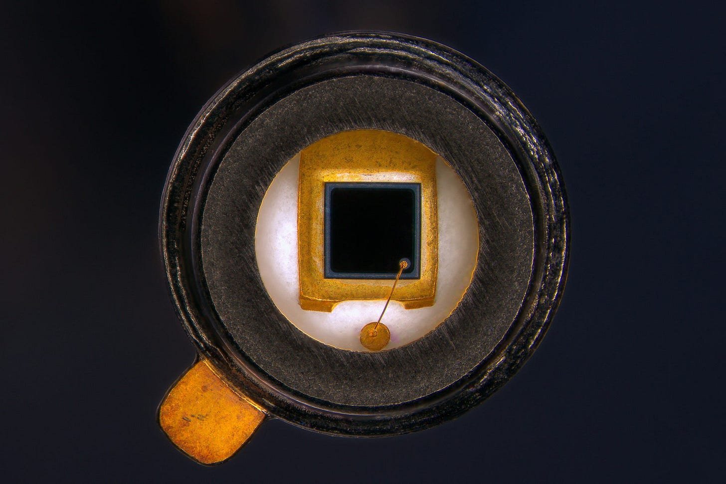
Photography excels at documenting physical components, like this photodiode sensor:
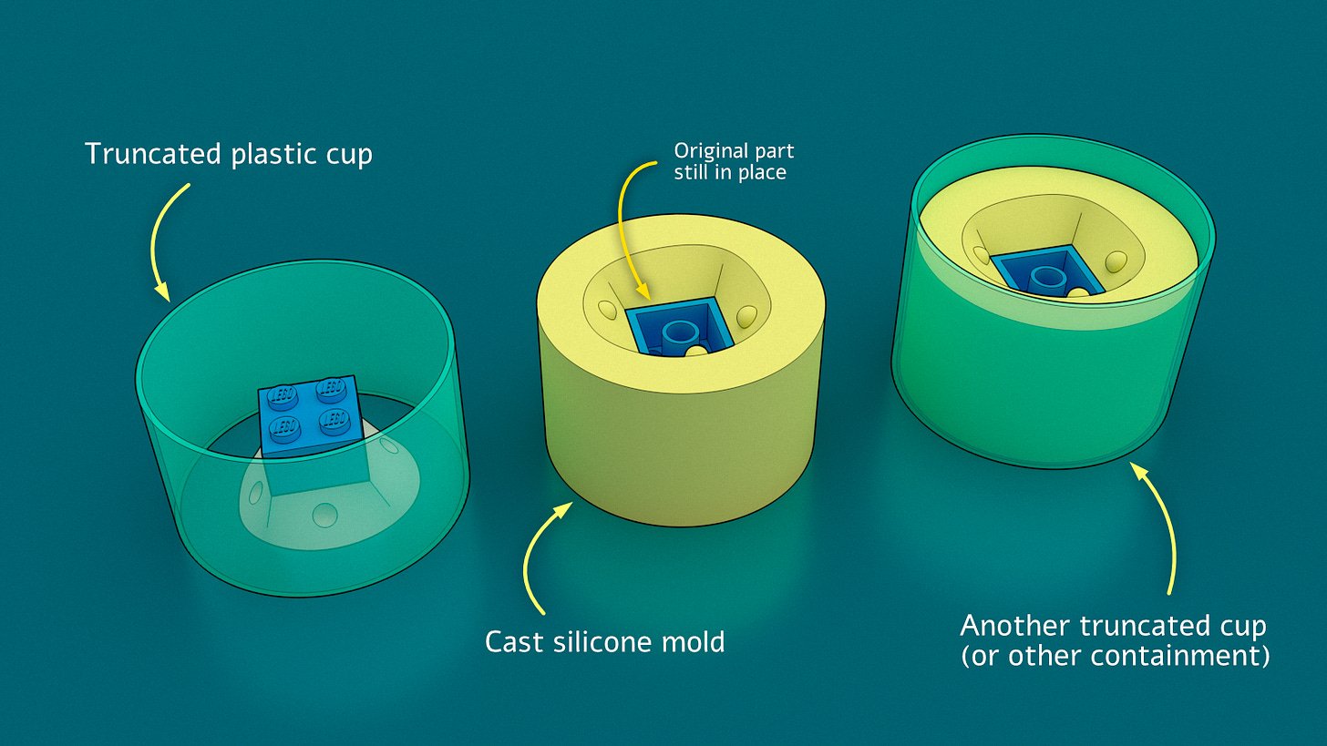
Similarly, CAD systems produce accurate representations of mechanical designs, such as this resin casting explanation:
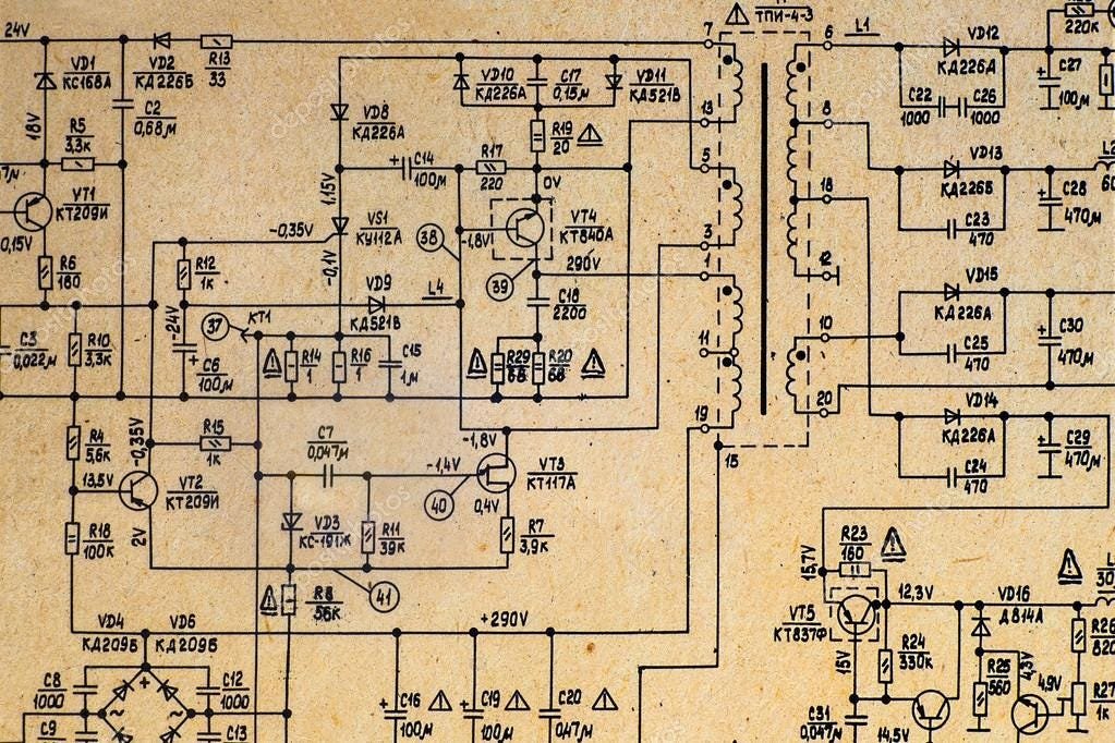
However, these approaches falter when applied to circuit schematics and conceptual diagrams. Early electronic schematics followed hand-drawn traditions that prioritized readability and elegance, unlike modern EDA tools that often produce visually cluttered outputs:
This limitation prompted a toolchain evolution. Initial experiments with CAD software like Rhino3D provided precise control but lacked organic styling. The discovery of Excalidraw offered a web-based vector solution with hand-drawn aesthetics, though with notable interface constraints. Through these tools, three critical principles emerged:
- Component Libraries: Building reusable symbol sets prevents starting from scratch
- Style Consistency: Uniform line weights, fonts, and scaling create visual coherence
- Iterative Refinement: Continuous improvement of workflows beats one-off perfection
These principles culminated in adopting Affinity's vector tools, combining Photoshop-grade capabilities with one-time licensing. By developing standardized workflows and component libraries, schematics gained both efficiency and the desired hand-drawn aesthetic while maintaining precision.
The same methodology transformed conceptual diagrams. Early attempts at illustrating photodiode physics suffered from unclear visual hierarchy. Revised versions implemented systematic differentiation between physical materials (solid colors) and electrical properties (hatched overlays), with consistent arrow styles and annotations.
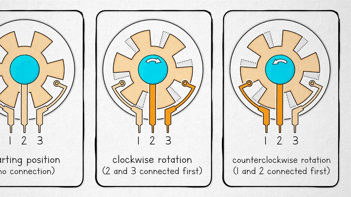
Three-dimensional relationships posed particular challenges. Techniques like subtle drop shadows, motion trails, and strategic layering help convey depth and dynamics in devices like rotary encoders. Each solution required balancing abstraction with technical accuracy – a process often consuming more time than writing the accompanying text.
The unspoken reality? Quality technical illustration demands specialized skills comparable to technical writing itself. Behind every clear schematic or explanatory diagram lies deliberate choices about visual language, painstaking asset management, and hard-won workflow optimizations – proving that in technical communication, a picture isn't just worth a thousand words, but often a thousand decisions.
Comments
Please log in or register to join the discussion