
The new window design in macOS Tahoe has a corner radius so large that it breaks the fundamental interaction of resizing windows, turning a simple action into a frustrating guessing game.
The window corner is one of the most reliable interaction patterns in computing. For decades, users have learned that the edge of a window is where you go to resize it. It's a muscle memory built from thousands of hours of use. So when that interaction starts failing, it's not just annoying—it's a fundamental breakdown of the user interface contract.
macOS Tahoe introduces a window corner radius that measures approximately 20 pixels on each side. This is nearly double what users experienced in previous versions. The aesthetic result is a softer, more rounded appearance that Apple has been moving toward for years. But the functional cost is proving to be significant.
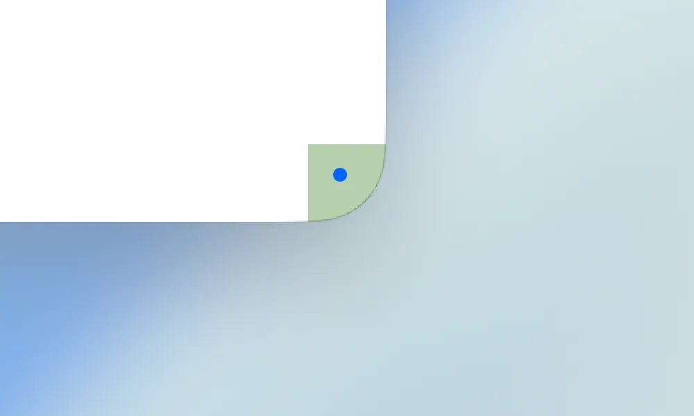
The resize interaction relies on a target area of 19 × 19 pixels positioned near the window corner. This is the "hot zone" where the cursor changes to a resize indicator and the system registers your intent to resize. In a standard rectangular window, this entire area sits within the visible window frame. Users naturally click within the window boundary, and the resize works.

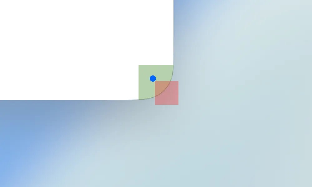
With Tahoe's aggressive corner rounding, approximately 75% of that 19 × 19 pixel target area now falls outside the visible window boundary. The system still expects your click in that same absolute position, but visually, that position is now empty space. You're clicking on what appears to be nothing.

This creates a counterintuitive interaction pattern. Users instinctively move their cursor to the visible corner of the window—the point where the curve meets the edge. That's where decades of experience tells them the resize handle should be. But that's precisely where the system won't respond.
The green area in the diagrams represents where users naturally expect to find the resize handle. It's the logical intersection of the window's visual boundaries. Clicking there feels correct because it matches what you see.
However, the actual target area is shifted outward. The system is looking for clicks in a region that's partially obscured by the corner curve. This means successful resizing requires clicking outside the visible window boundary—a gesture that feels like you're grabbing empty space.
The result is a high failure rate for what should be a trivial operation. Users report needing multiple attempts to resize windows, with the cursor passing over the invisible target area repeatedly before finding the sweet spot. This isn't a matter of learning a new pattern—it's fighting against visual feedback that actively contradicts the required action.
Some users have developed workarounds. The most common is to click slightly outside the corner, where the target area actually resides. Others use keyboard shortcuts or alternative resize methods. But these are compensations for a design that has broken the fundamental spatial relationship between what users see and what the system expects.
The issue highlights a growing tension in interface design. As screens become higher resolution and designers push for softer aesthetics, the gap between visual representation and functional hot zones widens. What looks good in a mockup can fail in practice when the math of pixel-perfect interactions collides with the physics of human motor control.
For a company that has built its reputation on intuitive interfaces, this represents a significant misstep. The window resize interaction is so basic that most users never think about it. When it fails, the frustration is immediate and deep because it breaks an assumption that has held true across operating systems, applications, and decades of computing.
The solution may require Apple to either reduce the corner radius to preserve functional target areas or redesign the resize interaction to account for the new geometry. Until then, Tahoe users are left with a window manager that looks modern but feels broken.
Comments
Please log in or register to join the discussion