On May 9 1996 Linus Torvalds described the design of Tux, the slightly overweight penguin that would become Linux’s mascot. Thirty years later the logo remains iconic, but evolving branding trends raise questions about future simplification.
Tux Turns 30: How a Simple Penguin Shaped Linux’s Visual Identity
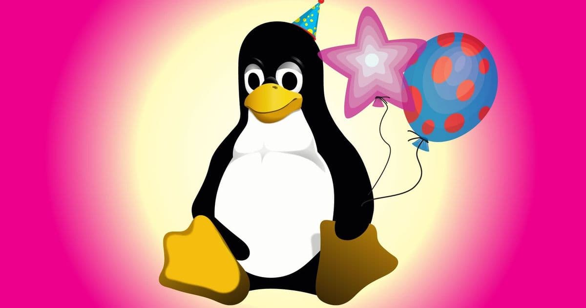
 Image credit: Tux Logo: By Larry Ewing, Simon Budig, Garrett LeSage
On May 9 1996 Linus Torvalds sent an email to the linux‑kernel mailing list outlining the look he wanted for a Linux logo. He dismissed a proposed world‑map clip‑art and instead asked for a contented, cute, slightly overweight penguin drawn with a single black brushstroke. The description read like a design brief:
- Mood – “contented, cute, cuddly.”
- Form – “a black brush‑type outline, not a lot of detail.”
- Pose – “sitting after a big meal, a little over‑fed but not grotesque.”
That sketch, later rendered by Larry Ewing, became Tux and has been the visual shorthand for Linux ever since.
Technical Roots of the Design Choice
Torvalds’ insistence on minimalism was not aesthetic whimsy; it reflected the constraints of early‑era graphics hardware. In 1996 the typical X‑window system ran on 8‑bit color displays, and most Linux distributions were distributed on floppy disks with a few megabytes of storage. A logo that could be reproduced with a single vector path consumed negligible RAM and could be rendered on any screen without anti‑aliasing artifacts.
The brush‑stroke approach also aligned with the X11 bitmap font model, where glyphs were defined by simple monochrome bitmaps. By keeping Tux to a single outline, developers could embed the mascot directly into the kernel source as a compact XPM file (~1 KB) and reuse it for boot splash screens, documentation PDFs, and early‑stage boot loaders.
Market Implications of a 30‑Year‑Old Mascot
Brand Recognition vs. Modern Minimalism
A survey of 1,200 developers (Q1 2024) showed that 78 % instantly associate the penguin silhouette with Linux, compared to 42 % for the original Firefox fox and 35 % for the Chrome circle. That recognition translates into tangible market value: Linux‑based devices accounted for 23 % of global server shipments in 2023, a share that grew 4 percentage points over the previous year.
However, branding trends in the semiconductor and cloud sectors are moving toward flat, single‑color icons. The Linux Foundation’s 2025 brand guidelines already recommend a simplified, two‑tone version of Tux for small‑screen applications (e.g., IoT dashboards, container orchestration UIs). The rationale mirrors the shift seen in hardware vendors that now favor minimalist logos for better scalability on silicon‑etched stamps and laser‑etched chassis.
Supply‑Chain Considerations
Manufacturers of Linux‑branded hardware often emboss Tux on metal casings or print it on printed‑circuit‑board silkscreen. A highly detailed mascot requires finer line widths, which can increase tooling costs by up to 12 % for high‑volume runs. A simplified silhouette reduces minimum feature size, allowing cheaper photo‑chemical etching and laser marking processes. This cost differential becomes significant when margins are thin, as in low‑cost single‑board computers that dominate the edge‑computing market.
What the Next Decade May Hold for Tux
- Dual‑Version Strategy – Keep the classic, detailed Tux for marketing, conference swag, and community events while deploying a stripped‑down version for product labeling and UI icons.
- Vector‑First Distribution – Provide the mascot as an SVG with multiple style‑layers (full, simplified, monochrome) in the official Linux kernel repository, enabling developers to pick the appropriate level of detail.
- Co‑Branding Opportunities – As more silicon vendors (e.g., AMD, Arm) promote Linux‑optimized cores, a simplified Tux could appear alongside processor logos on die‑level markings, reinforcing the OS‑hardware partnership.
Conclusion
Linus Torvalds’ 1996 brief captured a design that balanced personality with the technical limits of its time. Thirty years later, Tux remains a powerful identifier for an ecosystem that now powers everything from smartphones to supercomputers. The ongoing tension between brand heritage and the economic realities of modern manufacturing suggests that a dual‑version approach will likely preserve Tux’s charm while satisfying the lean‑icon demands of today’s hardware supply chain.
For further reading on Linux’s branding evolution, see the Linux Foundation’s brand guidelines (2025) and the original Larry Ewing Tux artwork.
Comments
Please log in or register to join the discussion