This week's roundup covers developer productivity insights, responsive design patterns, clever iframe lazy-loading techniques, SVG background tricks, CSS usage research, and the latest Chrome 145 features including text-justify, customizable selects, and more.
This issue of What's !important is dedicated to our friends in the UK (aka me), who are currently experiencing a very miserable 43-day rain streak. Presenting: the five most interesting things to read about CSS from the last couple of weeks. Plus, the latest features from Chrome 145, and anything else you might've missed. TL;DR: lots of content, but also lots of rain.
Why you can only code for 4 hours/day
Don't worry, you're only coding for 52 minutes/day anyway. Dr. Milan Milanović talks about the devastating impact of meetings, emails, Slack, and interruptions, and what you/your manager can do about it. This article is a real eye-opener with a ton of shocking (but not surprising) statistics about the average developer's flow state.
The research reveals that developers typically get only 52 minutes of actual coding done per day, with the rest consumed by context-switching and administrative overhead. Milanović's analysis shows how modern development workflows have become fragmented, with developers losing up to 23 minutes of focus time every time they're interrupted.
Why you shouldn't switch to smaller breakpoints too early
Ahmad Shadeed explains why you shouldn't switch to smaller responsive breakpoints too early, with examples of websites that've done so and scenarios in which users might hit those breakpoints.
Source: Ahmad Shadeed.
The article demonstrates through real-world examples how premature breakpoint switching can create awkward layouts for users who have their browser windows at non-standard sizes. Shadeed shows cases where websites jump to mobile layouts when users simply have their browser window at 75% width, creating a frustrating experience for desktop users who prefer smaller browser windows.
loading=lazy only works for off-screen elements
So Stefan Bauer demonstrates a neat trick for lazy-loading above-the-fold
Bauer's clever technique leverages the fact that
elements are interactive and can trigger lazy loading for their contents. By wrapping an iframe in a element and using some CSS to style it appropriately, you can achieve lazy loading for iframes that would otherwise be considered "above the fold" by the browser's native lazy loading algorithm.The technique involves using the open attribute to control when the iframe loads, combined with CSS to hide the details disclosure triangle and create a seamless user experience. This approach is particularly useful for embedding third-party content like videos or social media feeds that you don't want to load immediately on page load.
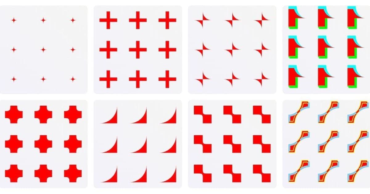
How to create repeating corner-shape backgrounds
Preethi Sam shows us how to use corner-shape in s, which are then used as repeating backgrounds. I've done my own experiments with corner-shape, but this is wonderful and certainly something that I hadn't considered.
Sam's technique involves creating SVG elements with corner-shape properties that can be used as repeating background patterns. This approach allows for creating complex decorative borders and background effects that would be difficult or impossible to achieve with traditional CSS borders alone.
The key insight is that corner-shape can be applied to SVG elements, which can then be used as background images. This opens up possibilities for creating intricate corner decorations that repeat seamlessly across the background of an element.
The CSS Selection (2026 edition)
What do web developers actually do with CSS? While other research studies look at features, The CSS Selection (2026 edition) focuses on CSS patterns and techniques. It's a very interesting read, and you'll definitely laugh once or twice, especially as you discover the different typos for !important.
Here are some of my favorites:
- !IMPORTANT: too shouty
- !impotant: too much information
- !i: that's just lazy
- !imPORTANT: excellent annunciation
- !importantl: ah, so close…
The research provides fascinating insights into how developers actually use CSS in practice, revealing patterns that might surprise even experienced developers. The typo analysis alone is worth the read, showing how developers struggle with the !important syntax in various creative ways.
Chrome features and Quick Hits you might've missed
Chrome 145 shipped a few days ago, and as always, we've been sharing some Quick Hits throughout the week. You can catch these in the sidebar of the homepage, so feel free to drop by if you're ever in the 'hood. Coincidentally, most of the Quick Hits were related to the Chrome update in some way, so I'll recap everything together:
text-justify
text-justify, which you can combine with text-align: justify to specify whether you want the word spacing (text-justify: inter-word) or letter spacing (text-justify: inter-character) to be adjusted to make the text justified. Geoff wrote about this way back in 2017 when only Firefox supported it (sort of…), so by my calculation, Safari should support it by 2035. So not this decade, but before GTA 6. Just kidding… (I think).
word-spacing and letter-spacing
Similarly, word-spacing and letter-spacing now accept % units, as they do in Safari and Firefox. This brings Chrome in line with other browsers and provides more flexibility for responsive typography.
overscroll-behavior
overscroll-behavior now works for non-root scroll containers, like in Safari and Firefox. WebDev RedFox's warning about overscroll-behavior couldn't have come at a better time.
column-wrap and column-height
column-wrap and column-height for better multicolumn layouts are also here now, but only in Chrome, unfortunately. These new properties provide more control over multi-column layouts, allowing developers to create more sophisticated magazine-style layouts.
customizable
That also applies to customizable , arguably the most exciting feature on this list. As I shared earlier in the week, Adam Argyle wonderfully boiled down this surprisingly complex feature to a simple outline that's extremely easy to understand.
Argyle's breakdown shows how the new customizable select feature works, providing developers with unprecedented control over the styling and behavior of select elements. This has been a long-requested feature in web development, and its arrival marks a significant improvement in form styling capabilities.
Looking ahead
Looking a little more to the future now, it seems that we'll eventually be able to have multiple borders and outlines on a single element as well as border-shape, as demonstrated by Dr. Lea Verou and Una Kravets respectively.
Dr. Verou's work on multiple borders shows how we might soon be able to apply multiple border and outline styles to a single element, opening up new possibilities for complex decorative effects. Meanwhile, Una Kravets' exploration of border-shape demonstrates how we might be able to create non-rectangular borders in the future.
Until next time!
Comments
Please log in or register to join the discussion