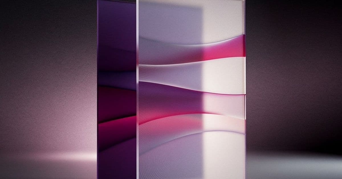
A deep dive into how CSS gradients, pseudo-elements, and blending modes can recreate classic optical illusions, revealing the surprising gap between what browsers render and what our brains perceive.
Optical illusions aren't just a curiosity for psychology textbooks—they're a fascinating playground for CSS developers. By leveraging the browser's rendering engine, we can recreate these perceptual tricks with pure code, revealing how our visual system fills in gaps and interprets patterns. A comprehensive collection of these experiments is available on CodePen, where each demo can be interacted with to reveal or stop the effect.
The Mechanics of Visual Deception
The illusions fall into several categories based on how they manipulate perception. Some rely on color and contrast, others on geometry and perspective, and many on motion. What's remarkable is how little CSS is often needed to create these effects—sometimes just a few gradients and pseudo-elements.
Color and Contrast Manipulations
Many illusions work by exploiting how our brain processes brightness and color context. The Cornsweet Illusion demonstrates this perfectly: two identical gray bars appear different because one is adjacent to white and the other to black. The CSS implementation is straightforward—two divs with the same background color, placed against different contrasting backgrounds. The browser renders them identically, but our visual system interprets them differently.
Similarly, White's Illusion shows how identical gray columns appear darker when surrounded by white versus black. The demo uses mix-blend-mode to achieve this effect, though the creator notes this approach made hover interactions more complex—a practical lesson in balancing visual impact with user experience.
The Adelson's Checkerboard Illusion is perhaps the most famous example. Two tiles labeled A and B appear to be different shades of gray, but are actually identical. The shadow cast by the cylinder creates a context that tricks our perception. Recreating this in CSS requires careful gradient work to simulate the lighting and shadow effects that create the illusion.
Geometric and Spatial Illusions
The Poggendorff Illusion shows a diagonal line interrupted by a vertical bar appearing misaligned, even though the segments are continuous. This can be created using ::before and ::after pseudo-elements to generate the diagonal line and vertical bar. A more elaborate version uses two CSS gradients—one tilted at 70 degrees and another consisting of vertical columns.
The Müller-Lyer Illusion demonstrates how arrowheads dramatically change length perception. The top line with outward-pointing edges appears longer than the bottom line with inward-pointing edges, though both are identical. From a coding perspective, each shape is a pseudo-element, with the horizontal lines using identical gradients and only repositioning the edges.
Perspective-based illusions like the Hering and Wundt illusions exploit our brain's depth interpretation. In the Hering illusion, straight red lines appear to curve outward against a radial background. The Wundt illusion shows the opposite effect. These can be recreated using gradients that create the illusion of depth, though the creator notes the Wundt effect is more subtle in CSS.
Motion and Static Illusions
Perhaps the most fascinating category involves illusions that appear to move despite being completely static. The Expanding Hole illusion creates a sensation of falling into a pit using just a background pattern with two radial gradients and a blurred pseudo-element. It's particularly effective when not looking directly at it, exploiting peripheral vision.
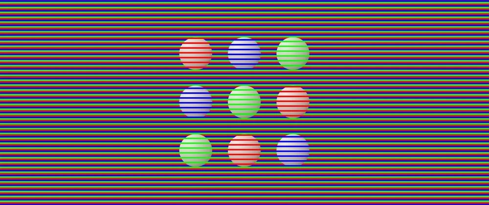
The Rotating Snakes illusion is one of the few in the collection that uses HTML elements instead of relying exclusively on CSS. The peripheral discs appear to rotate even though nothing moves—a classic effect that demonstrates how our visual system interprets contrast and pattern.
The Ouchi Illusion gives the impression of sideways motion inside a circle, which happens because our eyes constantly make small movements. The creator notes that if you can't see the effect, try slightly moving the screen while looking just outside the circle—a practical tip for experiencing these illusions.
Animated Illusions
When motion is actually present, it creates its own perceptual tricks. The Motion Binding illusion shows two sets of lines moving independently—one horizontally, one vertically. In reality, it's a single shape moving uniformly. The demo reveals the true motion on hover.
The Reverse Spoke Illusion is particularly disorienting: the background colors spin while the spokes remain fixed, yet the spokes appear to rotate in the opposite direction. This demonstrates how our brain interprets relative motion between elements.
The Mainz-Linez Illusion shows how focus location changes perception. Focus on a red dot and it moves straight up and down. Shift focus to a black cross in the center and the same dot appears to zigzag. The CSS code for the wavy lines is adapted from a Temani Afif snippet on CSS-Tricks and his wavy shape generator.
Technical Implementation Patterns
Several technical patterns emerge across these illusions:
Gradient Mastery: Many illusions rely on creative gradient use. The Cafe Wall illusion, where horizontal lines appear slanted despite being parallel, requires just three gradients. The Waves illusion, which creates wave-like motion in a static image, uses a large number of conic gradients—though the creator notes browsers struggle to render this efficiently.
Pseudo-element Strategies: ::before and ::after are workhorses for creating shapes without additional HTML. The Penrose Triangle (an impossible shape) and Kanizsa Square (where a square appears from Pac-Man shapes) both use pseudo-elements to create the illusion of depth and missing shapes.
Blending Modes: mix-blend-mode appears in several demos, particularly for color-based illusions. However, as noted with White's Illusion, this can complicate interactive elements.
CSS Trigonometry: The Troxler Fading effect, where missing dots appear as different colors when focusing on a center cross, could have used CSS trigonometric functions for dot positioning. The creator chose to hardcode values instead, a practical decision for static content.
The Cognitive Science Connection
These illusions reveal fundamental aspects of visual processing:
- Context is Everything: Identical colors appear different based on surroundings (Cornsweet, White's, Adelson).
- Pattern Completion: Our brain fills in missing information (Kanizsa Square, Ehrenstein's Illusion).
- Motion Detection: We perceive movement from static patterns (Expanding Hole, Rotating Snakes).
- Depth Interpretation: Flat images are interpreted as three-dimensional (Hering, Wundt, Ponzo).
Practical Applications and Considerations
While these illusions are primarily educational, they demonstrate techniques that have practical applications:
- UI Design: Understanding how contrast and color context affect perception can improve interface design.
- Accessibility: Some illusions might be problematic for users with visual processing differences.
- Performance: The Waves illusion demonstrates how complex gradients can impact rendering performance.
- Progressive Enhancement: Many illusions work with pure CSS but benefit from JavaScript for interaction.
Further Resources
The creator cites two key resources for inspiration:
- "35 optical illusions and why they trick your brain" by Patrick Pester
- "154 Visual Phenomena & Optical Illusions" with explanations by Michael Bach
Conclusion
CSS optical illusions represent a unique intersection of code, perception, and psychology. They demonstrate that what browsers render and what users perceive are often different things—a crucial insight for developers creating visual experiences. By understanding these perceptual tricks, we can better predict how users will interpret our designs and create more effective interfaces.
The collection shows that even simple CSS—gradients, pseudo-elements, and basic positioning—can create complex perceptual effects. This suggests that the limits of CSS for visual design are often defined by our imagination rather than the technology itself.
For developers interested in exploring further, the CodePen collection provides interactive examples, and the referenced resources offer deeper dives into the science behind these phenomena. The creator's note about platform availability (Medium, DEV) also highlights how technical content like this benefits from community discussion and iteration.
Comments
Please log in or register to join the discussion