
The 2026 Kokuyo Design Awards showcase how everyday writing tools are evolving from functional objects into personalized experiences that reflect our changing relationship with creativity and self-expression.
The 2026 Kokuyo Design Awards have once again demonstrated how the humble world of stationery continues to evolve, transforming everyday objects into thoughtful design experiences. Now in its 25th year, the competition hosted by the 120-year-old Japanese stationery giant KOKUYO received nearly 1,500 entries from designers worldwide, all responding to this year's theme of "hamon: design that resonates"—a call for concepts rooted in personal experience that could connect with broader society.
At the heart of this year's winning designs is a fascinating shift: stationery is no longer just about function, but about creating moments of awareness, personalization, and emotional connection.
The Grand Prix: Before Note by Hiroki Kannari
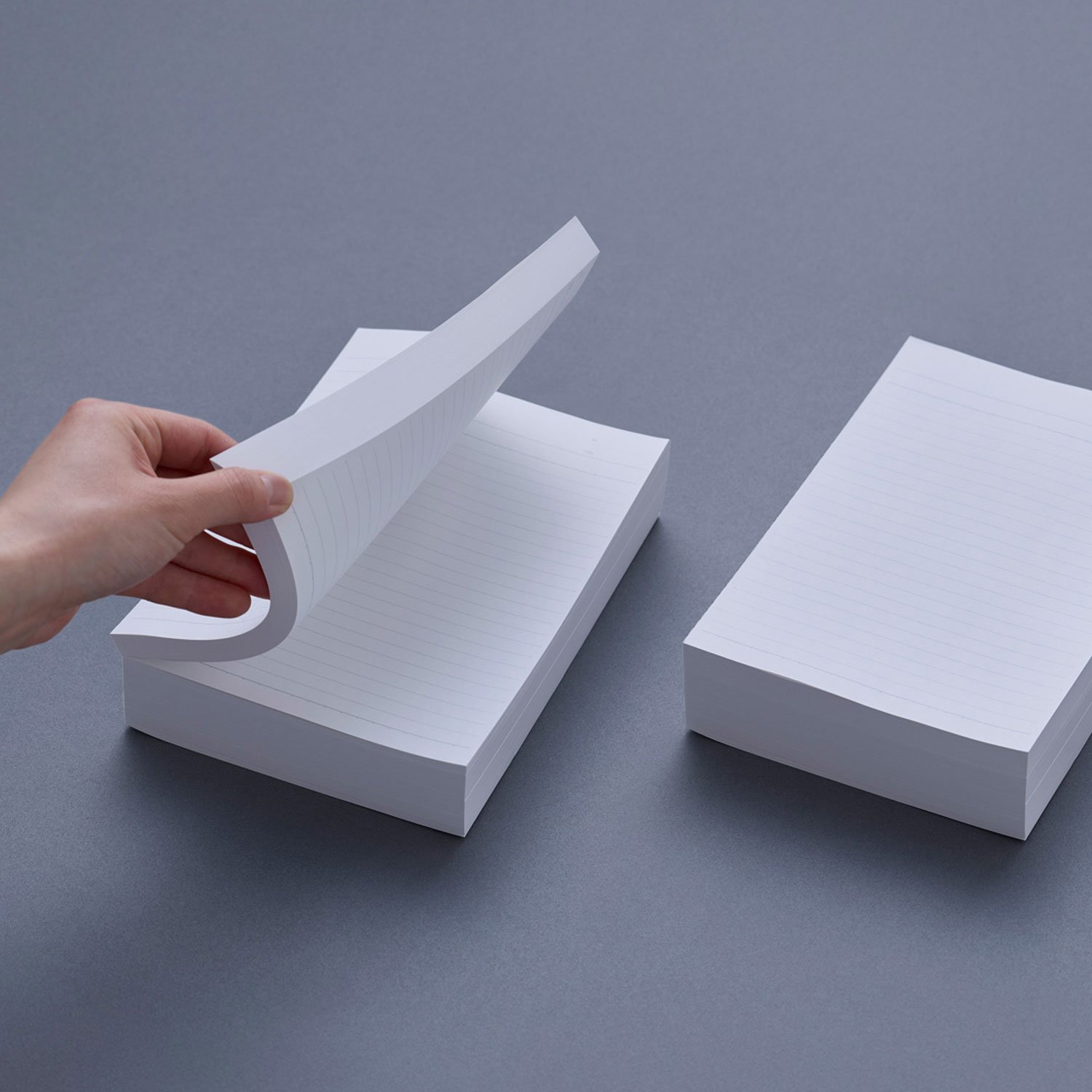
The top prize went to "Before Note," a concept that challenges our fundamental understanding of what a notebook is. Rather than presenting a finished product, Kannari offers what he calls a "pre-notebook"—essentially a bundle of blank pages that users complete themselves by selecting the number of sheets and customizing the cover design.
This approach sits at an intriguing intersection between mass production and individual expression. In an era where personalization has become increasingly valued, Before Note transforms the passive act of buying a notebook into an active creative process. The design speaks to a broader cultural moment where consumers want to be co-creators rather than just purchasers.
What makes this particularly clever is how it addresses both practical and emotional needs. Practically, it allows users to create notebooks of exactly the size they need. Emotionally, it gives them ownership over the creative process from the very beginning. The notebook becomes not just a tool for recording thoughts, but a reflection of the user's own choices and preferences.
Merit Awards: The Poetry of Small Details
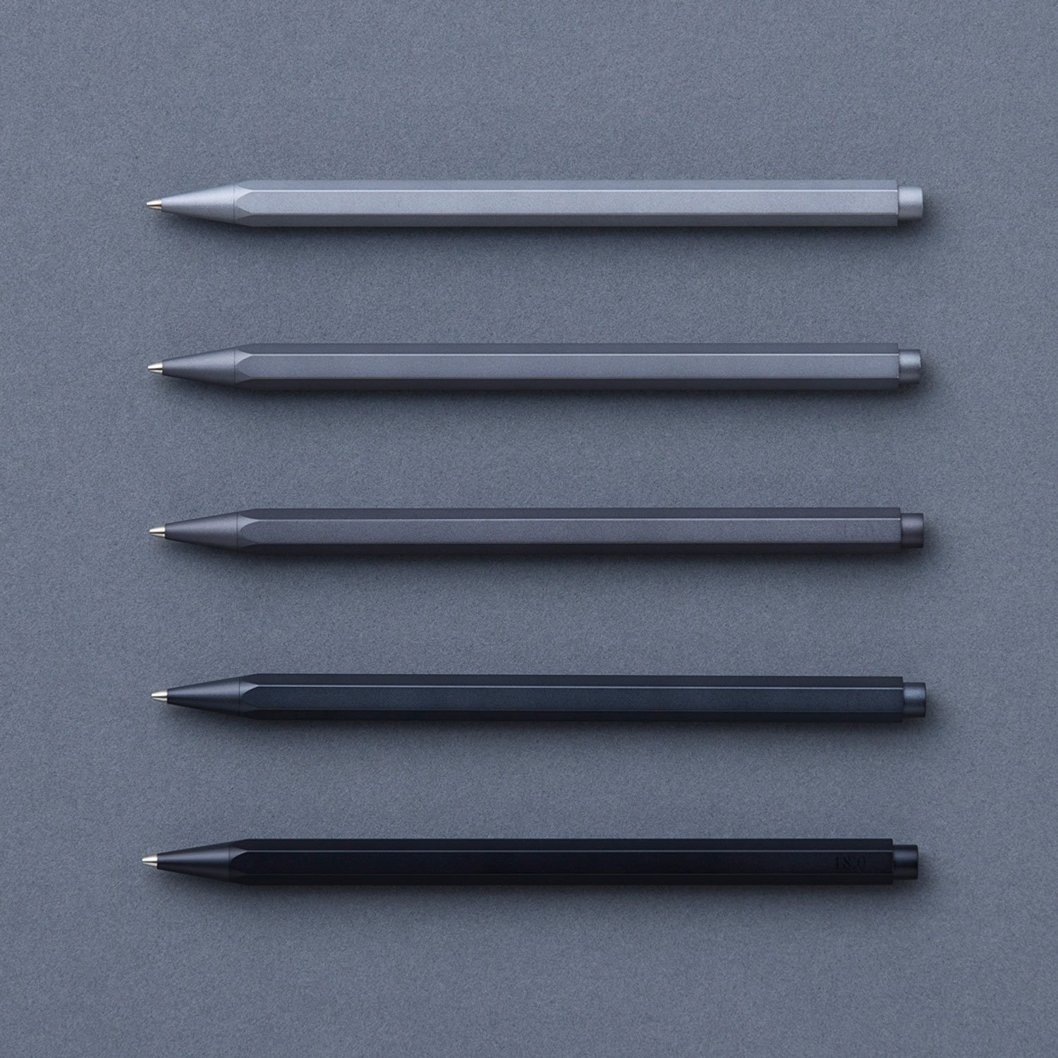
Gram by Takashi Higashide
Sometimes the most profound design innovations come from paying attention to what we usually overlook. "Gram" is a pen series that explores the barely perceptible differences in weight—adjusting by just a few grams without changing the pen's shape or material.
The brilliance here lies in its sensitivity. Most of us have never consciously considered how the weight of our writing instrument affects our experience, yet Higashide's design makes us aware of these subtle sensations. By transforming writing into a more conscious, tactile act, Gram invites users to rediscover the physical pleasure of putting pen to paper in an increasingly digital world.
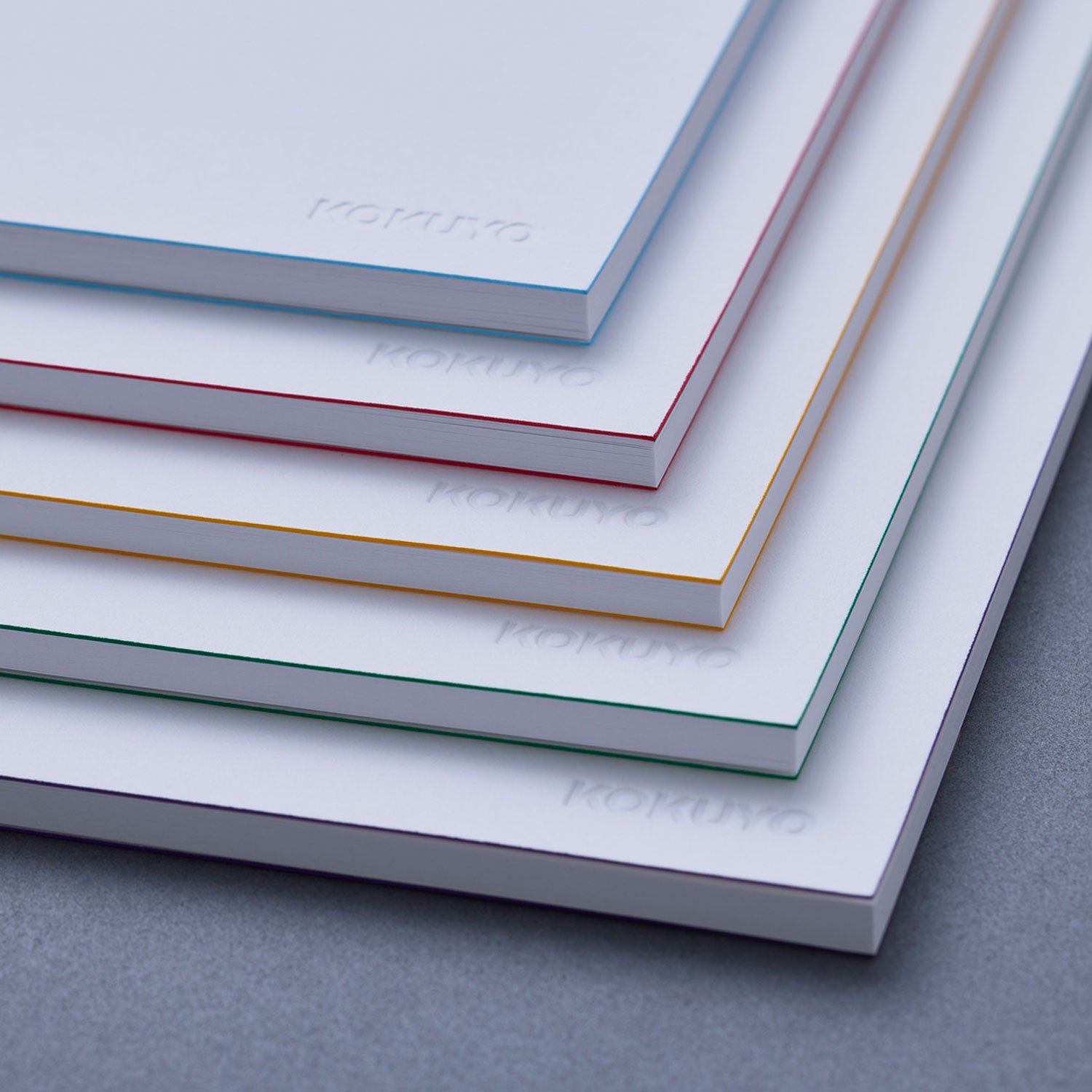
Notebooks Identified by Edges by Yuji Tsukamoto
Minimalism often walks a fine line between elegant simplicity and frustrating blandness. Tsukamoto's notebooks achieve the former by using colored edges as the primary distinguishing feature. At first glance, they appear as plain white covers with quiet elegance, but the colored edges allow users to quickly identify different notebooks while maintaining visual harmony.
This design demonstrates how constraints can spark creativity. By limiting color to the edges rather than the covers, Tsukamoto not only creates an aesthetically pleasing solution but also reduces ink usage—an understated nod to sustainability that doesn't compromise the product's beauty or functionality.
Gradience Diary by Mizuki Igarashi & Rara Takizawa
Traditional planners with their rigid boxes and neatly separated days impose an artificial structure on our experience of time. The Gradience Diary rejects this entirely, using a soft gradient instead of lines to allow users to expand or shrink their writing space as needed.
This design acknowledges something fundamental about human experience: time doesn't feel neatly divided into equal boxes. Some days are packed with activity, others more contemplative. By allowing tasks to flow across days naturally, the Gradience Diary mirrors how time actually feels—fluid, uneven, and continuous. It's a beautiful example of how good design can align with our psychological reality rather than imposing arbitrary structures.
Finalists: Expanding the Boundaries of Stationery
Red and White Packing Paper by Tasuku Denno
This honeycomb-structured wrapping material transforms into decoration, extending the life of gift packaging. It's a clever response to our growing awareness of waste and the desire for products that serve multiple purposes.
AWAI by Ryoichi Nakamura
A pen that produces faint, smudged lines, encouraging ambiguity and reflection rather than bold certainty. In a world that often demands clear, definitive statements, AWAI creates space for uncertainty and contemplation.
OVERLAP by Yohei Oki
Using intersecting lines and blank space, this notebook design provokes new ways of thinking and writing. It challenges the assumption that blank pages are the most open-ended starting point for creativity.
KASUMIORI by Yoshihiro Matsumura
Inspired by kasumi (mist), this reading guide and bookmark creates a sense of depth and ambiguity like looking through fog. It transforms reading into a more atmospheric, reflective experience.
A Glimmer of Inspiration by Nao Momoishi
Created by a copywriter, this pen is designed to help users quickly record sudden bursts of inspiration by casting subtle spotlights. It acknowledges the fleeting nature of creative moments and the need for tools that can capture them instantly.
What These Designs Tell Us About Our Relationship with Tools
Looking across all the winners and finalists, several patterns emerge that speak to broader cultural shifts:
From passive consumption to active creation: Designs like Before Note invite users to participate in the creation process, reflecting a desire for more meaningful engagement with the objects in our lives.
Heightened sensory awareness: From the subtle weight differences in Gram to the atmospheric quality of KASUMIORI, these designs encourage us to pay attention to sensations we typically overlook.
Rejection of rigid structures: The Gradience Diary's fluid approach to time planning reflects a broader questioning of imposed systems and a desire for tools that adapt to human rhythms rather than forcing humans to adapt to them.
Sustainability through thoughtful design: Several entries, like Notebooks Identified by Edges, achieve environmental benefits not through sacrifice but through elegant solutions that enhance rather than diminish the user experience.
Tools as companions in creativity: Rather than seeing stationery as mere instruments, these designs position them as partners in the creative process—sensitive to our needs, responsive to our rhythms, and capable of inspiring new ways of thinking.
The Enduring Power of Physical Tools
The Kokuyo Design Awards continue to be relevant precisely because they celebrate the enduring appeal of physical tools in an increasingly digital world. While we may write more emails than letters and take more digital notes than handwritten ones, these designs remind us that the physical act of writing, drawing, and creating with our hands offers something irreplaceable.
Perhaps what resonates most about this year's winners is how they transform ordinary moments—writing a note, planning a day, wrapping a gift—into opportunities for awareness, creativity, and connection. In doing so, they suggest that the most powerful designs aren't necessarily the most revolutionary, but those that help us see the poetry in everyday actions.
The 2026 Kokuyo Design Awards remind us that even in our digital age, there remains something profoundly human about the simple act of putting pen to paper—and that thoughtful design can make that act even more meaningful.
Comments
Please log in or register to join the discussion