
Riccardo Mori's critique of Apple's Liquid Glass design language reveals a troubling contradiction: a system that promises to elevate content while systematically obscuring it, and a set of guidelines that demand simplicity while enforcing bland uniformity. Through careful analysis of Apple's own documentation, Mori exposes how the new aesthetic prioritizes surface effects over functional clarity, forcing developers to surrender their brand identity to a single, imposed visual regime.
Apple's upcoming Liquid Glass interface redesign has generated considerable discussion among developers and designers, but few analyses cut as deeply into the fundamental contradictions as Riccardo Mori's recent critique. What emerges from his examination is not merely a disagreement with aesthetic choices, but a fundamental questioning of whether Apple's design team actually understands the purpose of user interface elements—or if they've become so captivated by their own visual effects that function has become secondary to form.
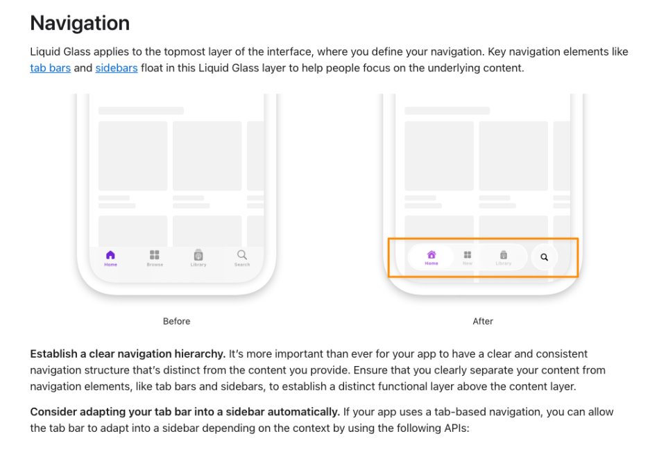
Mori's analysis begins with a simple observation that becomes increasingly damning the more you consider it. In Apple's own guidance for "Adopting Liquid Glass," the company presents navigation elements that "float in this Liquid Glass layer to help people focus on the underlying content." Yet the accompanying image shows tab bars and toolbars that, despite their translucency, still obscure the very content they claim to elevate. "This is like proposing an interface that helps you focus your sight on your peripheral vision," Mori writes, and the analogy is precise. When something fades into the background, it ceases to be foreground; you cannot simultaneously blur an element into obscurity and claim it helps users focus on what lies beneath.
The contradiction becomes explicit when Apple advises developers to "Ensure that you clearly separate your content from navigation elements, like tab bars and sidebars, to establish a distinct functional layer above the content layer." This guidance directly contradicts the visual example provided, where the navigation layer and content layer are anything but clearly separated. Mori notes the irony that this description actually matches the "Before" image—the interface that Apple is replacing. The company has managed to describe what works while showing what doesn't.
{{IMAGE:2}}
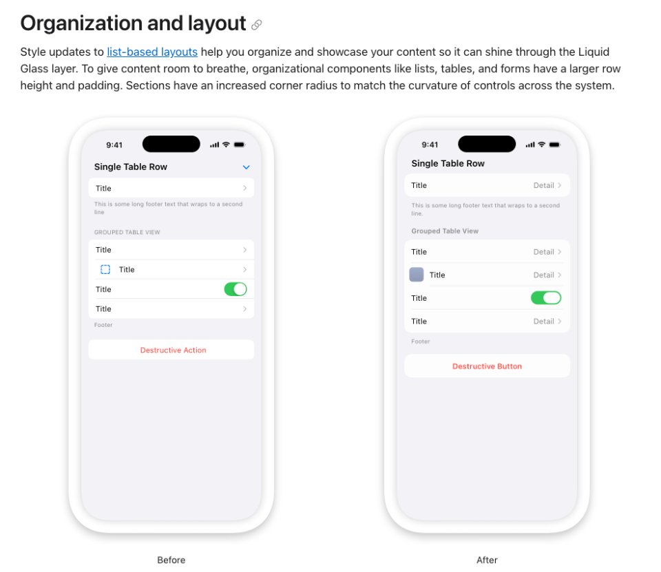
The problems extend beyond navigation into layout and organization. Apple's new guidelines recommend larger row heights and padding for lists, tables, and forms, claiming this gives content "room to breathe." Mori counters that this simply reduces information density, forcing more scrolling without improving clarity. Comparing before-and-after layouts, he observes that the "After" version injects white space everywhere it's not needed, while paradoxically pushing headers closer to the status bar where additional space might actually be beneficial. The redesigned switches, stretched and elongated, represent "change for change's sake"—a phrase that echoes throughout his critique.
When examining Apple's broader design philosophy, the language becomes increasingly abstract and, in Mori's view, meaningless. The guidelines speak of "Elevate and distinguish the content beneath them" as the role of controls, prompting fundamental questions: Should controls and content even occupy the same space? Should the lines between them be blurred? Mori argues that the best interface design gives each element its own space—controls out of content's way, clear and organized, ready to manipulate the content without competing with it.
The guideline's discussion of "Harmony" through "concentric design"—aligning with the concentric shape of hardware and software—receives particular scorn. "How does one align in a concentric context?" Mori asks. "Is that a matter of picking a circle, an arc, a shape?" He interprets this as Apple's attempt to wrap obvious design advice in "pretentious designer vocabulary."
Perhaps most troubling is the guideline's definition of "Consistency" as something that "continuously adapts." Mori points out the logical impossibility here: consistency, by definition, means remaining unchanged. A design that continuously adapts is, in fact, inconsistent. The proper guidance, he suggests, should be about maintaining visual and functional consistency across different displays and window sizes.
The icon design guidelines reveal what Mori sees as Apple's most egregious assault on developer creativity and brand identity. The company advises developers to "Find a concept or element that captures the essence of your app or game, make it the core idea of your icon, and express it in a simple, unique way with a minimal number of shapes." Mori calls this "the recipe for blandness," noting the inherent contradiction: "Make a unique dish using a minimal number of simple ingredients." While technically possible, uniqueness becomes ceiling-limited very quickly.
The progressive abstraction of Apple's own icons demonstrates this degradation. The Dictionary icon has evolved from a recognizable book to something that could be a font management app. The Stickies icon went from actual yellow notes to vague rounded rectangles in a clear box. Notes transformed from a notepad to a flat square with two lines. Calculator became a security keypad. Game Centre devolved into "a group of colourful bubbles." Most egregious is Migration Assistant's icon in macOS 26 Tahoe, which Mori describes as "utterly meaningless"—it could mark an emergency exit in an airport, while the old icon clearly communicated its purpose.
This icon simplification trend represents, in Mori's view, the opposite of what should happen with high-resolution displays. The 2009 Mac OS X Human Interface Guidelines explicitly stated that Retina displays allowed for "richer in texture, more detailed, more realistic" icons. Today's guidelines recommend the opposite: minimal shapes, simple backgrounds, and abstraction that loses meaning. As C.M. Harrington notes in a quote Mori includes, "Apple is forcing third party devs to be in service of Apple. The guidelines and rules are meant to sublimate the brands of the third party, and replace it with Apple."
Louie Mantia's analysis, which Mori strongly recommends reading in full, captures the broader impact: "Springing big changes like this all at once forces so many independent developers, entire companies, and the industry as a whole to freeze their own development schedules to accommodate Apple's design system. It's asking a lot. For almost nothing in return."
Mantia asks the fundamental question that haunts Liquid Glass: "I keep looking at all the changes Liquid Glass brings, and I cannot find one instance where it has markedly improved the experience in any way." Everything got rounder—except the things that didn't. Everything got inset that wasn't before. Everything is now blurry—why? "In some ways, there's almost more UI variance than there was before, which doesn't make any sense. But in other ways, everything feels far more restrictive than it once was."
The prescriptive nature of Apple's current guidelines contrasts sharply with earlier, more supportive documentation. The 2010 iOS HIG, while having requirements, encouraged developers to "balance eye appeal and clarity of meaning" and investigate cultural interpretations. It allowed developers to opt out of Apple's shine effect using a simple Info.plist key. The language was encouraging: "Create a 512×512 pixel version of your application icon for display in the App Store. Although it's important that this version be instantly recognizable as your application icon, it can be subtly richer and more detailed."
Today's guidelines, by contrast, read as warnings: "Any custom backgrounds and appearances you use in these elements might overlay or interfere with Liquid Glass or other effects that the system provides." "Prefer to remove custom effects and let the system determine the background appearance." "Let the system handle applying masking, blurring, and other visual effects, rather than factoring them into your design."
The message is clear: your app's appearance is no longer entirely yours. The system will impose its glass effects, its blurs, its highlights—whether your icon represents paper, wood, metal, or leather, it will have a 45° glass specular highlight that "you did not agree to."
Mori's critique ultimately reveals a design philosophy that has lost its way. The 2009 Mac OS X HIG celebrated "lush, vibrant icons that capture the user's attention" and acknowledged that "icon genres help communicate what users can do with an application before they open it." It provided guidance while allowing creativity. It understood that different applications had different needs—user applications should be colorful and inviting, utilities more serious.
The current Liquid Glass guidelines, by contrast, seem driven by a desire for visual uniformity that serves Apple's brand more than developer or user needs. They demand simplicity while enforcing blandness, claim to elevate content while obscuring it, and preach consistency while demanding continuous adaptation.
Mori's analysis suggests that Apple's design team may be making things up as they go, but more troublingly, they appear to be making decisions that prioritize surface aesthetics over functional clarity, system control over developer autonomy, and visual trends over timeless design principles. In doing so, they risk transforming the Mac's interface from something that "was sober, utilitarian, intuitive, peppered with descriptive icons that made the user experience fun" into something that is merely fashionable—and potentially, functionally worse.
The question that remains is whether Apple will recognize these contradictions before Liquid Glass becomes immutable, or whether the Mac community will once again have to wait for the pendulum to swing back toward design that serves users rather than system aesthetics.
Comments
Please log in or register to join the discussion