
Understanding how colorblindness affects color perception and practical strategies for creating accessible color palettes
Color is one of the most fundamental tools in visual communication, yet for approximately 1 in 20 people worldwide, the colors we choose can create significant barriers to understanding. This isn't a random phenomenon but a predictable mathematical reality that designers can work with to create more inclusive experiences.
How Colorblindness Works
The human eye contains three types of cone cells, each responsible for detecting different wavelengths of light: red, green, and blue. When one or more of these cone types functions abnormally, a person experiences colorblindness. This isn't simply "seeing in black and white"—most colorblind individuals still perceive color, just with a reduced color space.
The mathematical nature of colorblindness is particularly fascinating. Colors exist along "confusion lines" in color space, where every color on a given line appears identical to someone with specific colorblindness. This means we can mathematically simulate colorblindness by mapping colors along these confusion lines to their equivalent perceived colors.
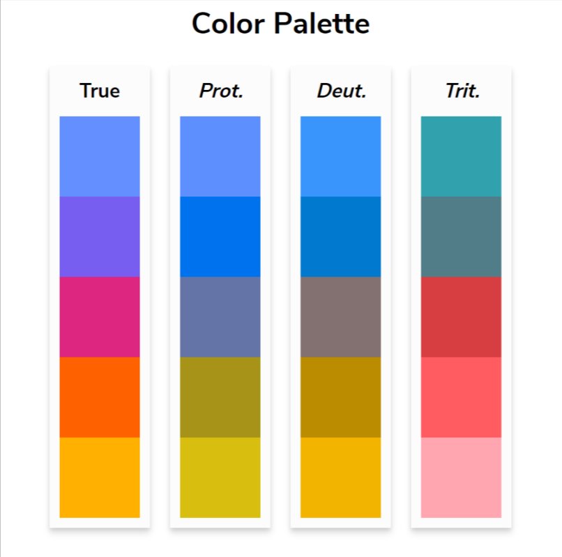
The Three Main Types
Three primary forms of colorblindness affect how people perceive colors:
Protanopia affects red cone cells, making it difficult to distinguish between red and green hues. Deuteranopia impacts green cone cells with similar effects. Tritanopia, the rarest form, affects blue cone cells and makes it challenging to differentiate between blue and yellow.
Each type creates its own unique challenges for designers. For instance, someone with protanopia might see a vibrant red stop sign as a dark gray or brown, while deuteranopia could make a green traffic light appear more yellow or white.
The Red-Green Problem
Red-green colorblindness represents the most common form, affecting approximately 1 in 16-17 men and 1 in 250 women through conditions like deuteranomaly. This prevalence makes the traditional design practice of using red and green as contrasting colors particularly problematic.
Consider a simple chart using red and green bars. To someone with red-green colorblindness, these bars might appear as similar shades of brown or yellow, making it impossible to distinguish the data categories. The same issue applies to red text highlights on neutral backgrounds—the contrast that seems obvious to those with normal color vision disappears for many readers.
Creating Accessible Color Palettes
Rather than abandoning color entirely, designers can create palettes that maintain contrast across all types of color vision. The key is understanding which color combinations remain distinguishable regardless of how someone perceives color.
Some effective contrasting pairs include:
- Orange and blue combinations maintain strong contrast across all colorblindness types
- Purple and yellow provide clear differentiation
- Certain shades of magenta and green can work when carefully selected
Professional organizations have developed tested color palettes specifically for accessibility. The IBM Design Library offers "color blind safe" palettes, while researchers like Bang Wong and Paul Tol have published extensively on accessible color schemes for scientific visualization.
Beyond Color: Multiple Channels of Information
The most robust approach to accessible design goes beyond just choosing the right colors. When color conveys critical information, it should be reinforced through other visual channels:
Patterns and textures can distinguish chart elements just as effectively as color. A blue striped bar and a solid red bar remain distinguishable even if the colors appear similar.
Symbols and icons provide another layer of differentiation. Using different shapes or adding text labels ensures information isn't lost if color perception varies.
Text formatting like bold, italic, or underline can emphasize content without relying solely on color changes.
Practical Tools and Testing
Modern design tools increasingly include colorblindness simulation features. These allow designers to preview their work as it would appear to someone with different types of color vision. The mathematical simulations, while not perfect, provide valuable insights into potential accessibility issues.
When testing color palettes, consider loading them into simulation tools that show how colors appear across protanopia, deuteranopia, and tritanopia. This immediate feedback helps identify problematic combinations before they reach your audience.
The Business Case for Accessibility
Creating accessible designs isn't just about inclusivity—it's also about reaching your full audience. With 5% of the population experiencing some form of colorblindness, ignoring this consideration means potentially losing or confusing a significant portion of your users.
Moreover, accessible design often benefits everyone. The high-contrast color combinations that work for colorblind users also tend to be more readable in various lighting conditions and on different devices. The additional visual cues like patterns and symbols that aid colorblind users also help users with other visual impairments or those viewing content in suboptimal conditions.
Moving Forward
The field of color vision research continues to evolve, with ongoing studies refining our understanding of how different types of colorblindness affect perception. While current simulation tools provide valuable guidance, they remain imperfect representations of individual experiences.
As designers, our goal isn't to perfectly replicate every possible visual experience but to create robust designs that communicate effectively across the widest possible range of human perception. By understanding the mathematical nature of colorblindness and applying proven accessibility principles, we can create visual experiences that work for everyone—regardless of how they see color.
Comments
Please log in or register to join the discussion