
Excessive bold text is undermining effective communication in technical writing, reducing emphasis to noise and making documents harder to read rather than easier.
The digital age has brought many changes to how we communicate, but one trend is becoming increasingly problematic: the excessive use of bold text in technical and business writing. What was once a powerful tool for emphasis has become so overused that it's losing all effectiveness, creating documents that are harder to read rather than easier to navigate.
The Problem with Over-Emphasis
I'm seeing more and more technical writing where bold font weights appear on nearly every other sentence. This practice seems to have spread widely, possibly accelerated by LLMs that have learned this pattern from existing content. The fundamental issue is simple: the more a writer uses typographical emphasis, the less power it has.
When everything is emphasized, nothing is emphasized. This creates a paradox where writers intend to make their content more scannable and important points more visible, but instead create visual noise that readers must filter through. The skimming reader, who was supposed to benefit from these highlights, now has to work harder to distinguish what's truly important.
The Typography Toolbox
Writers have several tools for emphasis at their disposal:
- Bold: The most commonly overused
- Italic: Subtle and effective when used sparingly
- CAPITALS: Often perceived as shouting
- Underline: Now primarily used for hyperlinks
Among these, bold has become the default choice for many writers, but it's also the most problematic when overused. Capitals, while attention-grabbing, are rightly seen as aggressive and can undermine the writer's credibility. Underlines have largely been repurposed for hyperlinks, making them less suitable for emphasis in modern writing.
Why Italics Often Work Better
Italic text provides a more nuanced approach to emphasis. Unlike bold, which leaps out even when skimming, italics only make their presence felt when you're actively reading the text. This subtlety allows writers to use italics in longer passages without creating visual clutter.
When I use italics to emphasize a word or phrase, it's like adding stress when speaking aloud. The emphasis only registers when the reader is engaged with the content, which is precisely when you want them to notice it. This makes italics particularly effective for highlighting key concepts or adding nuance to meaning.
The Proper Role of Bold
Bold text does have important uses, but they should be limited and intentional. The most valuable property of bold is its ability to draw the eye even when the reader is just glancing at a page. This makes it excellent for:
- Headings and section titles: Helping readers navigate longer documents
- Defining unfamiliar terms: Placing emphasis at the point of explanation
- Critical warnings or important notes: When something truly needs to stand out
I particularly like using bold for unfamiliar technical terms when they're first explained. This technique, inspired by Giarratano and Riley, allows readers to quickly find definitions when they encounter terms later in the text. The key is placing the bold at the point of explanation, which may not always be the first use of the term.
Better Alternatives to Bold Sentences
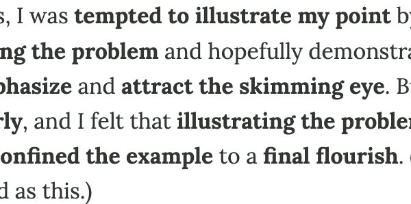
A common but misguided practice is to bold entire sentences within paragraphs, hoping they'll stand out during skimming. While this can work occasionally, its effectiveness diminishes rapidly with repeated use. More importantly, it's often not the best tool for the job.
Callouts typically work better for highlighting important information. They draw the eye more effectively than bold text and don't require using the same words as in the main text. This flexibility allows writers to craft more effective summaries or warnings that complement rather than duplicate the prose.
The Bullet List Problem
Another area where bold is often misused is in bullet lists, where the first clause of each item might be bolded as if it were a heading. While this can provide some structure, it's usually unnecessary. The bullets themselves already draw attention to each item, and prose paragraphs typically flow better than bullet lists anyway.
I always try to convert bullet lists to prose when possible, as prose is more pleasant to read and allows for better transitions and context. Bullet lists should be reserved for situations where the items truly need to stand alone or when the list format adds clarity.
Writing for the Reader's Experience
The fundamental principle that's often forgotten is that writing should be an enjoyable experience for the reader. This is especially true when explaining complex technical concepts. When writers overuse bold text, they're not making the reading experience better—they're making it worse.
Consider what happens when a reader encounters a page filled with bold text. Instead of quickly finding the important points, they must work to filter out the noise. Instead of a smooth reading experience, they get a choppy, visually overwhelming document that feels more like a PowerPoint presentation than thoughtful prose.
Finding the Right Balance
The solution isn't to abandon bold text entirely, but to use it more thoughtfully. Ask yourself: Does this really need to be bold? Would italics work better? Could a callout serve the purpose more effectively? Is this emphasis actually helping the reader, or just adding visual clutter?
Remember that emphasis works by contrast. If everything is emphasized, there is no contrast, and therefore no emphasis. The power of bold comes from its rarity and its ability to signal truly important information. When used sparingly and intentionally, bold text remains a valuable tool in the writer's arsenal.
But when everything is bold, nothing is bold. And that's a problem we need to address if we want our technical writing to be clear, effective, and enjoyable to read.
Comments
Please log in or register to join the discussion