
Isometric infrastructure diagrams are emerging as a powerful tool for DevOps teams to map complex systems with unprecedented clarity. By transforming flat schematics into engaging 3D-like visuals, they enhance cross-team communication and reduce architectural blind spots. This approach turns abstract configurations into intuitive blueprints for better decision-making.
In the chaos of modern DevOps—where microservices, cloud clusters, and CI/CD pipelines intertwine—visualizing infrastructure isn't just helpful; it's essential. Traditional 2D diagrams often fall short, flattening depth and relationships into confusing spaghetti maps. Enter isometric diagrams: a technique borrowed from engineering and game design that renders systems in pseudo-3D perspective, making hierarchies and connections instantly graspable.
Unlike top-down layouts, isometric views reveal hidden dependencies—like how a database cluster scales behind an API gateway or how Kubernetes pods interact across nodes. This clarity isn't aesthetic fluff; it directly impacts operational efficiency. Teams spot bottlenecks faster, onboard new members intuitively, and document systems in a way that survives tribal knowledge loss. As one engineer noted, 'A well-crafted diagram is worth a thousand Slack threads during incident response.'
Tools like FossFLOW are democratizing this approach. By automating isometric rendering from infrastructure-as-code (IaC) definitions, they allow developers to generate dynamic visuals directly from Terraform or CloudFormation scripts. No more manual drag-and-drop in legacy tools; the diagram evolves with the codebase. 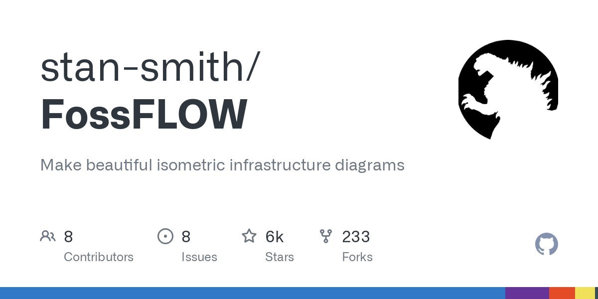 showcases how FossFLOW turns YAML into vivid, navigable architectures, complete with color-coded services and real-time status overlays.
The implications ripple beyond documentation. Isometric diagrams foster alignment between dev, ops, and security teams by providing a common visual language. They also aid in compliance audits and disaster recovery planning, where understanding data flow paths is critical. As distributed systems grow more intricate, this fusion of art and engineering might just prevent the next deployment disaster—one angled box at a time. After all, seeing isn't just believing; it's understanding.
Comments
Please log in or register to join the discussion