Apple is testing a redesigned App Store search ad interface that removes the distinctive blue background, making paid placements look nearly identical to organic search results. The change, spotted in iOS 26.3, appears to be an A/B test and could signal a broader shift in how Apple presents sponsored content.
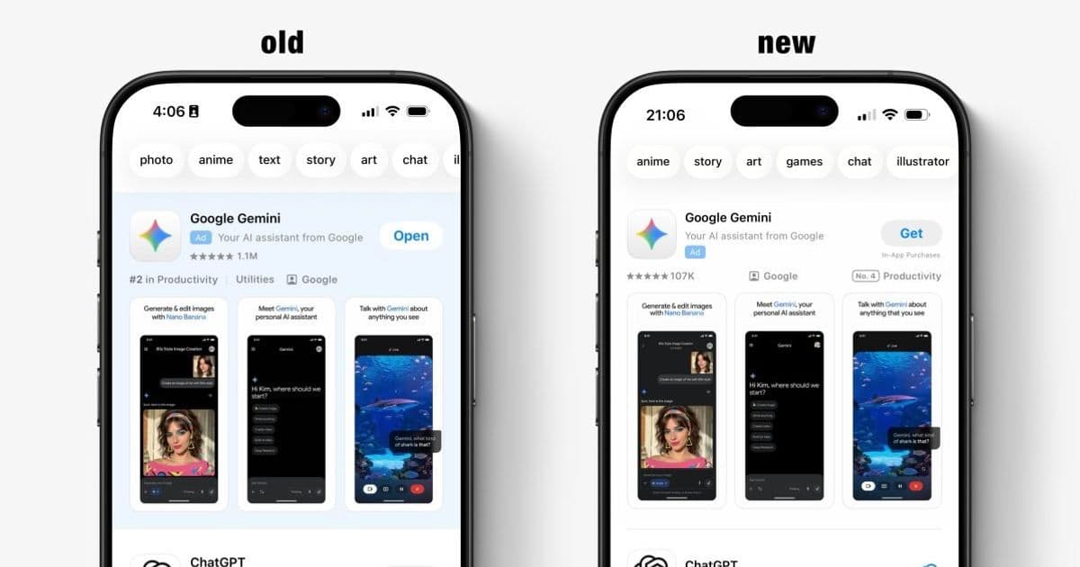
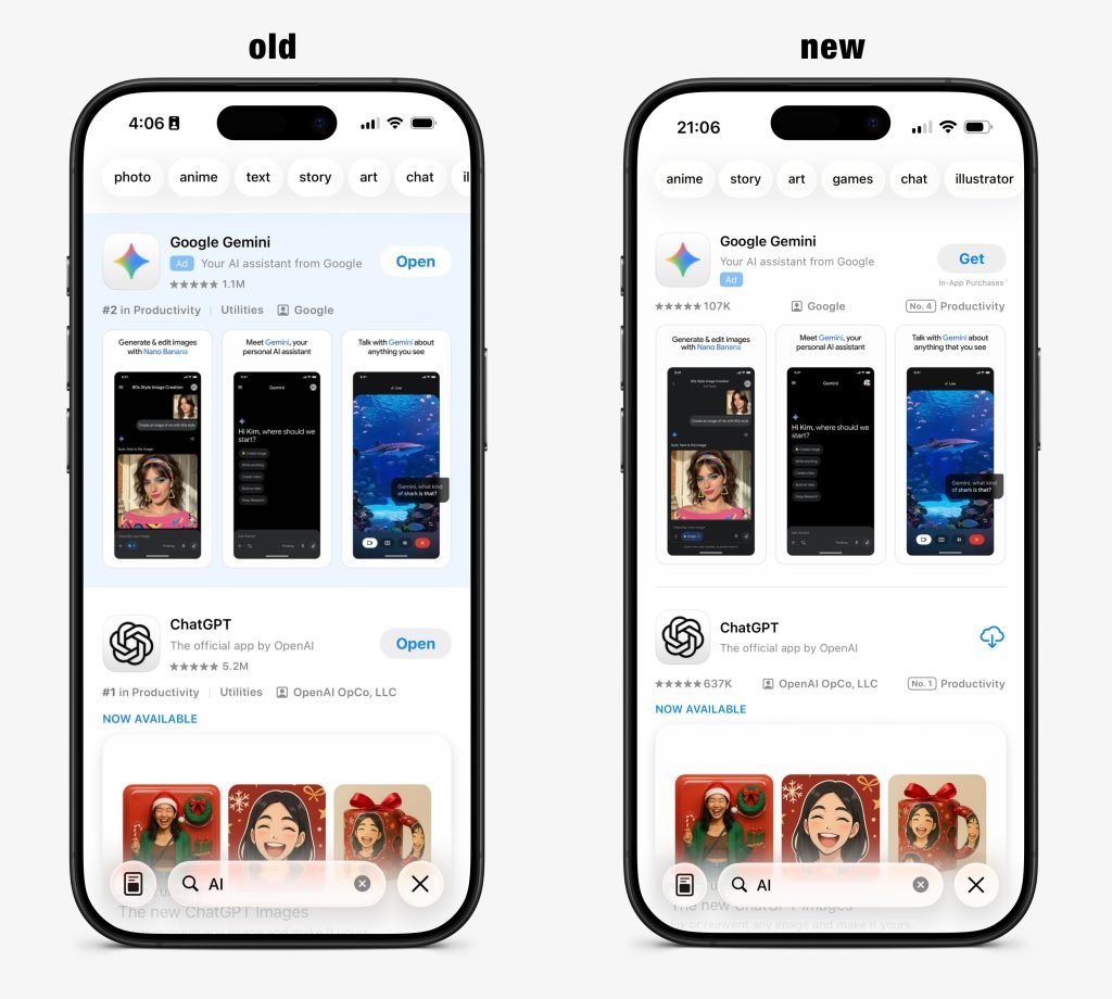
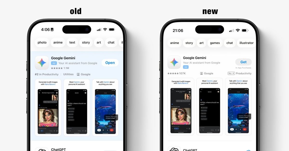
Apple appears to be conducting a quiet but significant experiment with its App Store search advertising platform. Some users running the latest iOS 26.3 beta are noticing that the familiar blue background surrounding sponsored search results has vanished. This visual redesign fundamentally changes how users perceive the boundary between paid advertisements and organic search results.
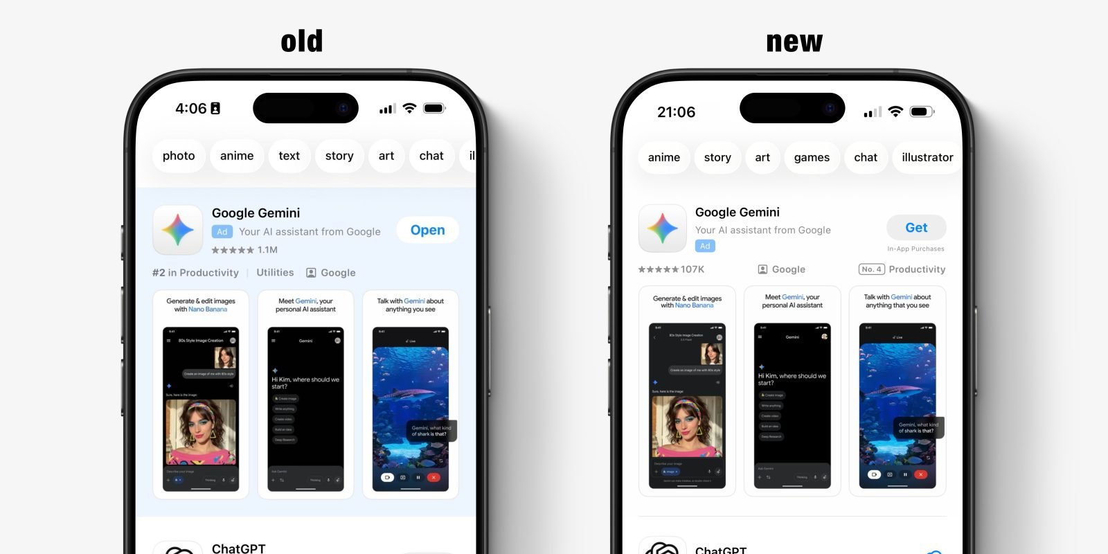
The change is subtle but consequential. Previously, Apple's search ads featured a clear blue background that immediately distinguished them from the standard white search result cards. Now, the only visual differentiator is a small "Ad" banner positioned next to the app icon. This means a sponsored app now appears almost identical to an organic result, with the same card design, same color scheme, and same layout. The distinction has been reduced to a single text label that users must actively look for.
This redesign appears to be part of a broader strategy shift. In December 2025, Apple announced that App Store search results would soon begin showing more than one sponsored result per query. The removal of the blue background supports this expansion by making multiple ads appear more integrated into the overall search list. Rather than standing out as distinct "ad blocks," the sponsored placements now blend into the organic results, creating a more continuous visual experience.
From a user experience perspective, this change presents a clear trade-off. On one hand, the integrated design feels less intrusive and more native to the search experience. The visual clutter of blue boxes is eliminated, creating a cleaner interface. On the other hand, the reduced visual distinction makes it harder for users to quickly identify which results are paid placements. This could lead to situations where users click on what they believe is the top organic result, only to discover it's a sponsored app. While Apple does include the "Ad" label, it's significantly less prominent than the previous blue background.
For developers and marketers, this change has immediate implications. Search ads become more valuable when they blend seamlessly with organic results, as click-through rates typically increase when users perceive a result as more "natural" rather than obviously sponsored. However, this also means the competition for top search positions intensifies, as the visual advantage of being the first result—whether paid or organic—becomes more pronounced.
The timing of this test is noteworthy. Apple's search advertising business has been growing steadily, but it faces increasing scrutiny from regulators and developers who question the balance between monetization and user experience. In the European Union, the Digital Markets Act has already forced Apple to make significant changes to its App Store policies. A visual redesign that potentially increases ad engagement while reducing transparency could attract additional regulatory attention.
It's important to note that this appears to be a limited A/B test rather than a finalized design change. Apple frequently experiments with different ad presentations in specific markets or user segments before making broader decisions. The company has not officially commented on whether this redesign will roll out to all users or if it will be modified based on test results.
For users who want to maintain clear differentiation between ads and organic results, the change requires more careful scrutiny of search results. The "Ad" label, while present, is small and positioned in a location that doesn't immediately catch the eye. This represents a shift from Apple's previous approach, where the blue background provided an at-a-glance visual cue.
The broader context here is Apple's increasing focus on services revenue. With hardware sales facing market saturation, services like the App Store search ads business have become critical growth drivers. This redesign, if implemented widely, would likely increase ad engagement and revenue, but at the potential cost of user trust and transparency. It's a calculated risk that reflects the ongoing tension between platform monetization and user experience in the mobile ecosystem.
As this test continues, users, developers, and regulators will be watching closely to see how Apple balances these competing priorities. The final decision on this visual redesign could set an important precedent for how other platforms handle the presentation of sponsored content in search experiences.
Comments
Please log in or register to join the discussion