A deep look at how the visual hierarchy of call-to-action buttons in modern interfaces, exemplified by YouTube's link hijacking, reveals a shift from user-centric to platform-centric design priorities.
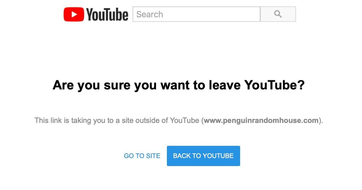
The other day I was browsing YouTube — as one does — and I clicked a link in the video description to a book. I was then subjected to a man-in-the-middle attack, where YouTube put themselves in the middle of me and the link I had clicked: Hyperlinks are subversive. Big Tech must protect themselves and their interests. But link hijacking isn’t why I’m writing this post. What struck me was the ordering and visual emphasis of the “call to action” (CTA) buttons. I almost clicked “Back to YouTube”, which was precisely the action I didn’t want. I paused and laughed to myself.
Look how the design pattern for primary/secondary user interface controls has inverted over time:
- Classic software: Primary CTA: what’s best for you. Secondary CTA: an alternative for you.
- Modern software: Primary CTA: what’s best for us. Secondary CTA: what’s acceptable to us.
It seems like everywhere I go, software is increasingly designed against me.
The Anatomy of a Hijacked Click
Let's dissect the specific interface I encountered. When you click an external link on YouTube, you're presented with an interstitial screen. This screen contains two buttons, and their visual treatment is a masterclass in dark pattern design.
On the left, the secondary button says "GO TO SITE." It's visually de-emphasized—likely a ghost button or a simple text link with low contrast. On the right, the primary button says "BACK TO YOUTUBE." This button is visually emphasized, often with a solid fill, higher contrast, and a more prominent position. The user's intent is clear: they clicked a link to leave YouTube. Yet, the interface is engineered to make the path back to YouTube the path of least resistance.
This isn't a bug; it's a feature. The design is intentionally inverted. In classic software design principles, the primary action is the one that advances the user's goal. If you're in a checkout flow, "Place Order" is primary. If you're editing a document, "Save" is primary. The secondary action is a retreat—"Cancel," "Go Back," "Discard Changes."
YouTube has flipped this. Their primary action is what serves YouTube's interest: keeping you on the platform. The secondary action is what serves your interest: leaving the platform to follow the link you explicitly requested.
The Evolution of CTA Hierarchy
This inversion didn't happen overnight. It's the result of a gradual shift in how digital products measure success. In the early days of software, success was measured by task completion. Did the user accomplish what they set out to do? The interface was a tool to facilitate that goal.
As platforms became the dominant business model, success metrics changed. Success is now measured by engagement, retention, and time-on-site. Every click that leads a user away is a failure in the platform's metrics. This creates a fundamental conflict of interest between the user's goal and the platform's goal.
The CTA hierarchy becomes a battleground. Designers, under pressure to optimize for platform metrics, are incentivized to design interfaces that subtly (or not so subtly) guide users toward platform-favorable outcomes. The primary/secondary button distinction is a powerful tool in this arsenal. It's a visual cue that tells users, "This is the recommended action," and in the context of a hijacked link, the recommendation is to stay.
The Broader Pattern: Software Designed Against the User
YouTube's link hijacking is a prominent example, but this pattern is pervasive. Consider other common interfaces:
- Subscription Walls: When you try to read an article, the primary button is often "Subscribe Now" or "Start Free Trial," while the secondary link, "Continue Reading," is buried or requires hunting for a "close" or "no thanks" option.
- Cookie Banners: The "Accept All" button is typically large, colorful, and primary. The "Manage Preferences" or "Reject All" options are smaller, less prominent, or hidden behind multiple clicks.
- Social Media Sharing: When you share a post, the primary button might be "Share to [Platform]" while the option to copy a link is secondary or hidden in a menu.
- App Store Permissions: When an app requests access to your contacts, the primary button is "Allow," while "Don't Allow" is secondary.
In each case, the platform's interest (data collection, engagement, growth) is given visual primacy over the user's interest (privacy, control, autonomy).
The Technical and UX Trade-offs
From a technical implementation perspective, this is straightforward. Buttons are styled using CSS. The primary button gets a more prominent background color (often a brand color), a stronger border, or a larger size. The secondary button might be a ghost button (transparent background with a border) or a simple text link. The order is determined by the layout—Flexbox or Grid can easily place one button before the other.
The UX trade-off is more complex. Platforms argue that these patterns protect users from malicious links and provide a safe experience. There's a kernel of truth here; phishing is a real threat. However, the implementation often prioritizes platform retention over genuine user safety. A truly user-centric approach might involve:
- Clearer Warnings: Instead of a generic "Are you sure?" message, provide specific context about the destination.
- Consistent Hierarchy: If the user's intent is to leave, the "Leave" action should be primary. The "Stay" action should be secondary.
- User Control: Allow users to disable these interstitials for trusted sites or adjust the default behavior.
The current design pattern does the opposite. It creates friction for the user's desired action while making the platform's desired action frictionless.
The Impact on User Trust and Behavior
Over time, these patterns erode user trust. When users repeatedly encounter interfaces that feel manipulative, they develop a conditioned skepticism. They learn to look for the "close" button, to hunt for the "no thanks" option, to read the fine print. This cognitive load is a tax on the user experience.
More insidiously, it can lead to "banner blindness" and "click fatigue." Users become so accustomed to fighting against the interface that they may start ignoring important warnings or making rushed decisions just to get through the friction. The very patterns designed to protect users can, in the long run, make them more vulnerable.
A Call for Conscious Design
As frontend architects and designers, we have a responsibility to consider the ethics of our work. The tools we use—CSS, JavaScript, UI frameworks—are neutral. The patterns we implement are not.
When designing a flow, ask:
- Whose interest does this primary action serve?
- Am I creating unnecessary friction for the user's goal?
- Could I achieve my business objective without subverting user intent?
The YouTube example is a stark reminder. The interface was so effective at its goal that I almost fell for it. My pause and laugh were a moment of awareness, but for millions of users, it's a daily, subconscious interaction that shapes their digital behavior.
The inversion of the CTA hierarchy is more than a design detail; it's a symptom of a larger shift in how we build software. We've moved from building tools for users to building arenas for engagement. The buttons are just the most visible part of that shift.
Conclusion
The next time you see a primary button and a secondary button, take a moment to consider who they're for. In classic software, the primary button is a helping hand. In modern platform design, it's often a leash. The difference is subtle in code but profound in its impact on user agency.
As we continue to build the web, we must decide what kind of architects we want to be. Will we design for the user's goal, or will we design for the platform's metric? The choice is written in every line of CSS we write for a button.
Comments
Please log in or register to join the discussion