
Michael Abernethy, Principal Frontend Engineer at Rubrik, shares 25+ years of experience building design systems at companies like Skype, Skyscanner, and Rubrik. This comprehensive guide covers the engineering discipline of Design System Engineering (DSE), from the wake-up call that sparked Rubrik's Aura Design System to practical implementation details, testing strategies, and how AI is changing the workflow.
The Wake-Up Call That Started It All
At Rubrik, the design system journey began with a moment that still gets discussed in team meetings. Six years ago, CTO Arvind Nithrakashyap casually remarked during a meeting that the product looked "like a college project." The observation hit home because it was accurate—the UI had been thrown together by engineers shipping features as fast as possible to meet impossible deadlines.
This feedback prompted a complete UI/UX overhaul that would eventually become the Aura Design System Library: 90+ React-based components ranging from simple buttons to complex tables connected to GraphQL endpoints. The transformation visibly improved the product, which went on to win industry awards.
Most engineers understand the urge to prioritize shipping features over design polish. But when you're pitching to enterprise customers paying millions per year, "good enough" UI won't cut it. The question isn't whether you need a design system—it's how to build one that scales.
What Actually Is a Design System?
Think of a design system as your software's brand identity, but built for engineering teams. It's the unified source of truth for a product's entire digital identity, encompassing:
- Rules and guidelines: How components should be used and combined
- Visual language: Colors, fonts, spacing, image styles
- Reusable code components: The actual React/Angular/iOS/Android libraries
- Documentation: Style guides that define the system's rules
The goal is instant recognition—like Nike's swoosh or Apple's bitten apple. When users see a button in one part of your app, they should recognize it everywhere. This reduces cognitive load and creates a premium feel that justifies enterprise pricing.
Design System Engineering (DSE)
The DSE team bridges design and engineering:
- Design team creates the look and feel in Figma
- DSE team converts it into working code (React, Angular, iOS, etc.)
- Result: A standalone library used across the entire product line
This ensures visual cohesion while empowering other engineers to build features without deep CSS/React expertise.
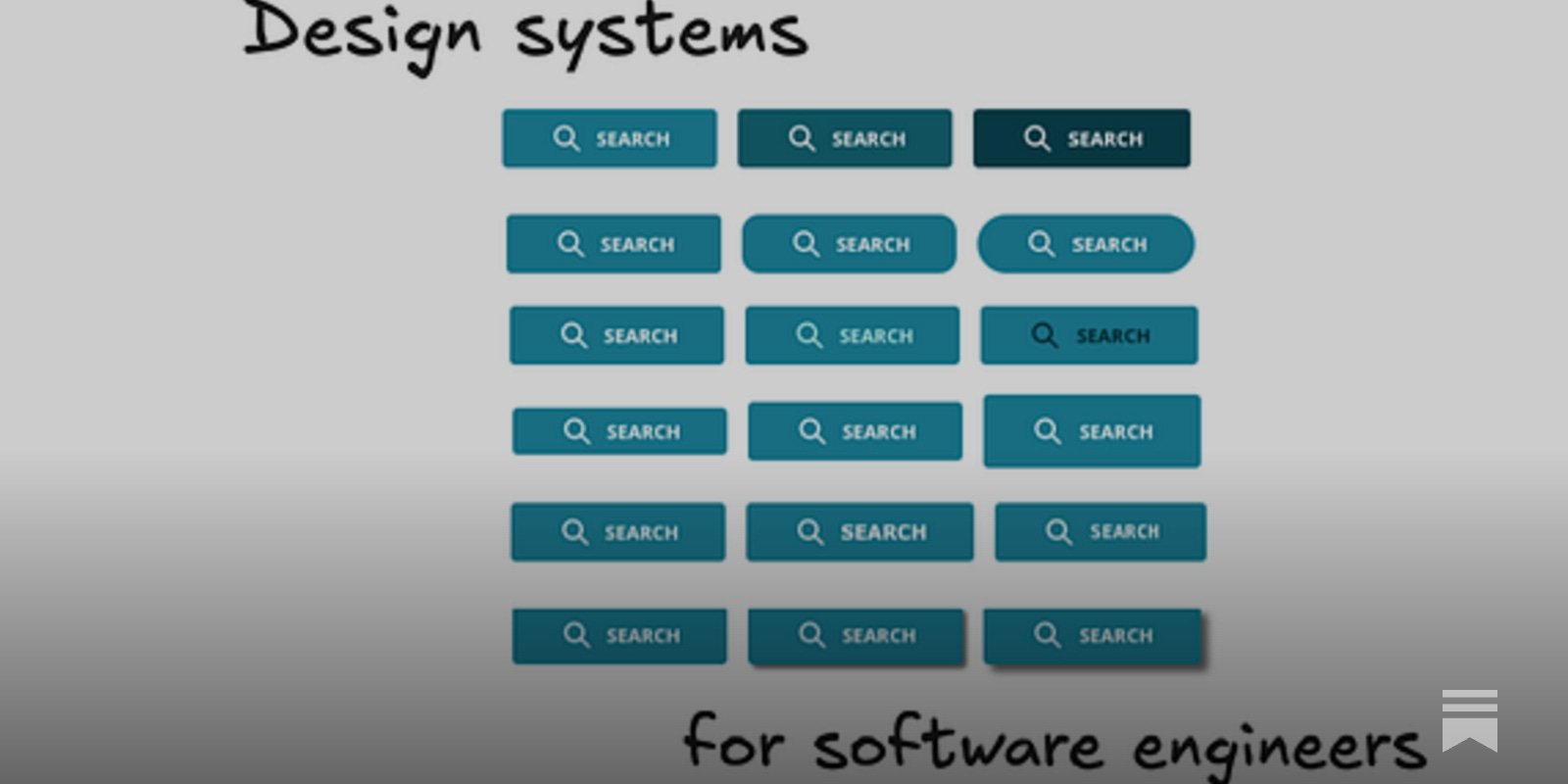
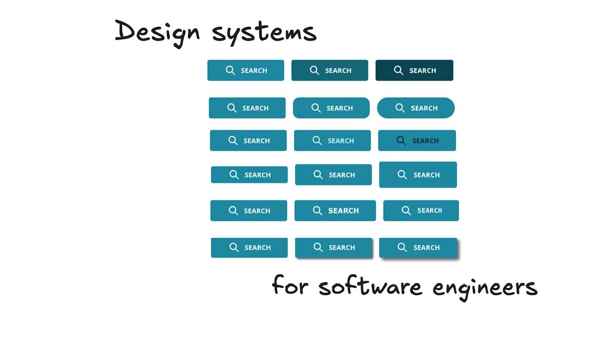
The Button: A Microcosm of Complexity
To understand the effort involved, consider the humble button—just one component. Here are the decisions required:
Visual decisions:
- Which shade of teal balances readability with other page colors?
- What text color works on all devices and backgrounds?
- How many pixels tall to draw attention without wasting space?
- What border radius fits the aesthetic?
- Should it have shadows (flat vs. raised)?
- Which font looks modern and readable?
Functional decisions:
- Extra background colors for less important actions?
- Color borders and thickness?
- Icon support and spacing?
- Keyboard navigation appearance?
- Hover and click states?
- Loading animations?
- Disabled state styling?
- Mobile adjustments for iOS/Android?
- Accessibility for color-blind users?
- Localization for right-to-left languages?
That's just for a button. A simple design system has 15-20 components; complex ones have 50-100. Each requires this level of detail.
Building a Design System: The Range Bar Example
Let's walk through how Rubrik built a specific component: the Range Bar for storage capacity selection.
Step 1: UX Research
Users hated typing numbers for min/max storage capacity. They wanted:
- Visual representation without typing
- Automatic calculation of standard storage sizes (powers of 2)
- Simple click-based navigation
UX researchers gathered this feedback and created rough sketches.
Step 2: Design in Figma
The designer received the rough sketch and expanded the existing Slider component:
- Added "start" and "stop" thumbs
- Implemented automatic snapping to powers of 2
- Added optional typing with rounding on blur
Step 3: Design System Engineer Review
Before coding, the DSE engineer reviews for:
Implementation constraints: Are CSS shapes impossible? Are gradients supported? Scalability: Do interactions trigger too many re-renders? Performance: Could shadows or animations degrade performance? Edge cases: What if min equals max? How are errors displayed? Does it work on ultra-wide and mobile screens? Accessibility: Keyboard focus handling? Mouseless usage? Localization: Long words? Right-to-left languages?
Step 4: Coding in Figma Dev Mode
Figma's Dev Mode provides:
- Component sizing and spacing details
- CSS copy/paste functionality
- Key engineering information in one place
Naming: "RangeSlider" (expressive, no implementation details) vs. "MinMaxStorageSlider" (too specific)
API design: Descriptive prop names consistent with the library
Future-proofing: Should it support locked min/max ranges? This affects React implementation.
Step 5: Advanced Considerations
Performance: Debounce events for rapid sliding? Theming: Works across Rubrik's three themes Accessibility: Arrow key support (left/right for min, up/down for max)
Analytics: Instead of adding tracking to 1,200 pages, embed it in components. When a button is pressed, it automatically sends tracking events. This increased relevant events 4x without requiring dev code changes.
Async React (v18/19): Prioritize typing display over error states. Makes apps feel snappier.
Loading states: For React Server Components, handle data loading gracefully. Pass a "loading" prop for consistent appearance.
Testing at Scale
Rubrik uses multiple testing layers:
Unit Tests with AI
Over the past year, Rubrik has come to rely heavily on AI to write unit tests. Benefits:
- Significant time savings
- Catches more edge cases
- Generates high code coverage from short prompts
Storybook
An open-source tool for documenting UI components outside the main app:
- Creates "stories" showing components in different states
- Allows engineers to toggle props and copy/paste resulting code
- Provides visual customization without app complexity
At Rubrik, nearly every frontend engineer visits the internal Storybook weekly.
Chromatic for Visual Regression
Chromatic takes visual snapshots of every component and compares them to previous versions:
- Runs on every PR touching design system files
- Acts as a blocking GitHub reviewer
- Takes ~15 minutes to run the full suite
- Has prevented 100+ bugs from reaching production
When Chromatic finds regressions, it flags changed pixels. Engineers examine the impact before merging.
AI in Design System Work: Current Reality
Can AI create a complete design system from a single prompt? Not yet. But it's extremely helpful in specific areas:
Where AI Excels
Unit test generation: As mentioned, AI writes comprehensive tests quickly.
Code generation for simple components: Basic buttons, inputs, cards can be scaffolded.
Documentation: AI can generate usage examples and prop documentation.
Accessibility checks: AI can identify missing ARIA labels or keyboard navigation issues.
Where AI Struggles
Consistency across a system: AI doesn't maintain visual coherence or design language.
Complex interactions: Multi-step flows, state management, and async behavior need human design.
Performance optimization: Understanding re-render patterns and async React requires deep expertise.
Brand identity: Creating a distinctive look that feels premium requires human creativity.
Emerging Use Cases
Figma MCP (Model Context Protocol): Connects AI directly to Figma designs for better code generation.
Design system subagents: Specialized AI agents for specific tasks like accessibility auditing or performance analysis.
When NOT to Build a Design System
For startups and smaller teams, pre-built libraries are often better:
- Material UI: Google's Material Design implementation
- Chakra UI: Accessible, modular component library
- Base UI: MUI's headless component library
These provide professional design out of the box. Building custom makes sense when:
- You have 10+ designers and frontend engineers
- Product-market fit is established
- UI inconsistency is slowing development
- Enterprise customers expect premium polish
Investing in Custom: Engineering Requirements
Skills Needed
Design system engineers need:
- Deep React/CSS knowledge: Understanding performance implications
- API design skills: Creating intuitive, consistent component APIs
- Testing expertise: Building comprehensive test suites
- Cross-team communication: Bridging design and engineering
- Forward-looking vision: Anticipating future needs
Timeline Expectations
A basic system: 3-6 months for 15-20 components A comprehensive system: 12+ months for 50-100 components
This assumes dedicated DSE team. It's a significant investment.
Big Tech Approach
Companies like Uber and Rubrik treat design systems as products:
- Dedicated teams (not side projects)
- Versioned releases
- External documentation
- Community contributions
Uber's Base Design System is shared externally. This requires additional engineering for:
- Public APIs
- Comprehensive documentation
- Backward compatibility
- Community support
Getting Started: A Five-Step Approach
1. Audit Your Current State
Document existing inconsistencies:
- How many button variants exist?
- How many color palettes?
- How many spacing scales?
This creates the business case.
2. Start with One Component
Pick your most-used component (usually Button or Input):
- Define all states and variants
- Write comprehensive tests
- Document thoroughly
- Get design and engineering sign-off
3. Build the Infrastructure
Set up:
- Component library repository
- Storybook for documentation
- Chromatic or similar for visual regression
- CI/CD pipeline
- NPM package publishing
4. Expand Gradually
Add components in order of impact:
- Layout components (Grid, Stack)
- Input components (Button, Input, Select)
- Navigation components (Tabs, Menu)
- Complex components (Tables, Charts)
5. Measure and Iterate
Track metrics:
- Time to build features before/after
- Number of UI bugs
- Developer satisfaction
- Design-to-engineering handoff time
Inspiration from the Community
Look at how other companies approach design systems:
- Uber's Base: Publicly shared, comprehensive
- Shopify Polaris: Tailored for e-commerce
- GitHub Primer: Open source, community-driven
- Atlassian Design System: Enterprise-focused
Each reflects the company's specific needs and constraints.
The Bottom Line
Design systems are engineering products, not design afterthoughts. They require:
- Dedicated resources (not a side project)
- Cross-functional collaboration
- Rigorous testing
- Long-term maintenance commitment
The payoff is substantial: faster development, higher quality, and software that looks worthy of enterprise pricing. But the journey is measured in months, not weeks.
For growing tech companies, the question isn't whether to build a design system—it's when, and how to do it right.
Michael Abernethy is Principal Frontend Engineer at Rubrik, where he leads the Design System Engineering team. He has 25+ years of experience building UIs and design systems at companies including Skype, Skyscanner, and Rubrik.
Comments
Please log in or register to join the discussion