An exploration of whether the Meta logo can be mathematically represented as a Besace curve through parameter fitting and the insights this reveals about the relationship between mathematical perfection and artistic design.
The recent observation that the Meta logo resembles a Besace curve presents an intriguing intersection of mathematics and design. A Besace curve, defined by parametric equations where t ranges over [0, 2π], offers a fascinating framework for analyzing whether this recognizable corporate emblem has precise mathematical foundations or represents artistic interpretation.
The parametric form of a Besace curve can be expressed as:
x(t) = a cos(t) + b sin(t) y(t) = -sin(t)(a cos(t) + b sin(t))
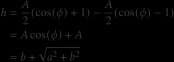
Through mathematical transformation, we can rewrite the x-coordinate as a sine function with a phase shift, revealing that the maximum value of x is A and the minimum is -A. Similarly, the y-coordinate reaches its maximum at A(cos(φ) + 1)/2 and minimum at A(cos(φ) - 1)/2.
The relationship between the curve's dimensions and its parameters becomes particularly interesting when we consider the height and width. The height, defined as the difference between maximum and minimum y values, simplifies to h = 2√(a² + b²). The width, conversely, is given by w = 2a. These relationships allow us to solve for the parameters a and b given specific dimensions:
a = w/2 b = √((h/2)² - a²)
When applied to the Meta logo, with estimated dimensions of h = 120 and w = 200, these formulas yield b = 20 and a = 97.98. Implementing these parameters in Mathematica code produces a curve that resembles the Meta logo but doesn't perfectly match it.
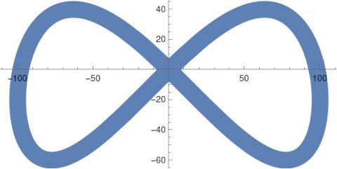
This discrepancy raises several important questions about the relationship between mathematical models and real-world design. The Meta logo features a thick line with non-uniform width, making precise mathematical fitting challenging. The fuzzy boundaries of the logo's middle section further complicate exact parameter determination.
Several possibilities emerge from this analysis:
- The Meta logo might not be precisely a Besace curve, despite the visual similarity.
- The logo could represent a modified version of a Besace curve, with parameters that haven't been identified in this analysis.
- The logo might have been inspired by a Besace curve but then refined through artistic interpretation rather than strict mathematical adherence.
- The logo could employ an entirely different mathematical approach that produces a similar visual result.
The Mathematica visualization demonstrates that while mathematical curves can approximate recognizable shapes, they often miss the subtle nuances that make designs distinctive. The thick, variable-width line of the Meta logo suggests that human designers may have taken a mathematically-inspired starting point and then modified it through artistic judgment.
This analysis reveals a fundamental truth about design: mathematical precision and artistic expression often follow different paths. While equations can generate aesthetically pleasing curves, the final polish that makes a logo truly distinctive frequently comes from human intuition rather than mathematical perfection.
The Besace curve provides an interesting lens through which to examine the Meta logo, but the imperfect fit reminds us that great design often lives in the space between mathematical purity and artistic interpretation. As we continue to analyze corporate logos through mathematical frameworks, we should appreciate both the patterns that emerge and the ways design transcends pure formula.
Comments
Please log in or register to join the discussion