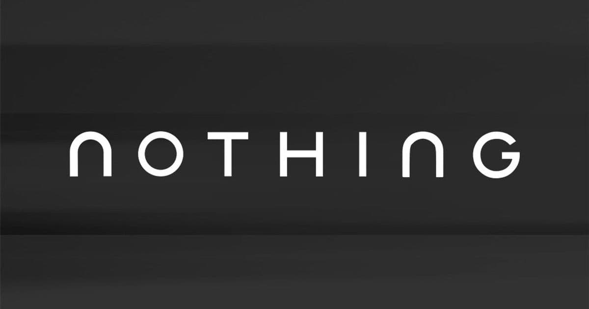
Nothing hints at significant visual identity overhaul with new typography, signaling potential shifts in product design philosophy.

London-based tech brand Nothing has signaled a major rebranding effort just five years after its founding, unveiling a new logo design across its social media channels. The teaser features two distinct typographic treatments of the Nothing brand name: the familiar NDot font that's become synonymous with their products, alongside a completely new font treatment suggesting a fundamental shift in visual identity.
The company's enigmatic social media post simply states "Getting ready to make history" without additional context. This timing is notably early in Nothing's lifecycle compared to typical tech rebrands, such as Redmi's logo update after 11 years. The unexpected move fuels speculation about strategic shifts beyond aesthetics, potentially including changes to Nothing's hardware design language.
Nothing's hardware evolution already shows signs of transformation. Last year's Phone (3) notably replaced the signature Glyph Interface LED lighting system with a monochrome secondary display called Glyph Matrix. This rebranding could signal further departures from established design elements as Nothing refines its product philosophy.
For consumers, this rebrand suggests several practical considerations:
- Product Continuity: Existing Nothing devices will maintain functionality, but future products may feature radically different design languages
- Brand Recognition: The distinctive NDot font has been a key identifier; a new visual system could impact brand recognition
- Design Philosophy: The change potentially indicates Nothing moving toward more minimalist or experimental aesthetics
- Software Experience: Core Nothing OS features will likely remain consistent despite visual changes
Industry analysts note that successful rebrands often accompany hardware innovations. When Redmi shifted to uppercase lettering, it coincided with product segmentation expansion. Nothing's timing suggests potential announcements of new product categories or significant Phone (3) successors that align with this refreshed identity.
The rebrand's impact on Nothing's market positioning remains uncertain. As a challenger brand built on distinctive design, dramatic visual changes risk alienating existing fans while potentially attracting new audiences. What remains clear is that Nothing continues prioritizing bold moves in a competitive market, though whether this gamble pays off depends on the substance behind the new branding.
Official sources remain tight-lipped about rollout timelines. Consumers should watch for announcements regarding Phone (3) software updates and potential design reveals of upcoming products that may showcase this new visual direction.

Comments
Please log in or register to join the discussion