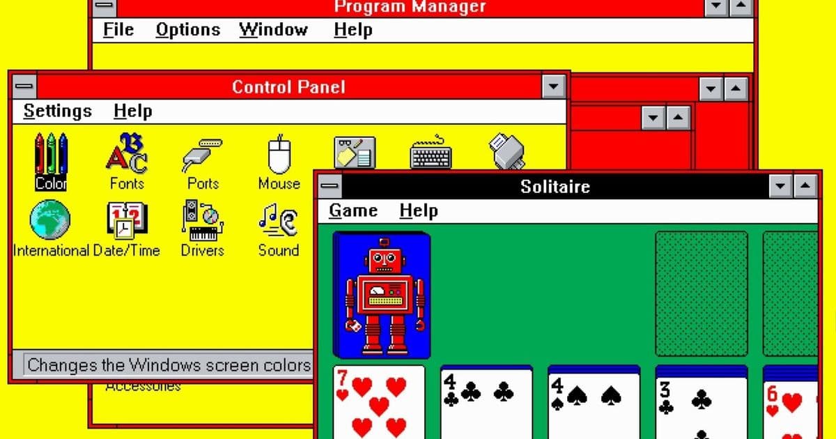
For decades, the garish red-and-yellow default color scheme in Windows 3.1 was dismissed as a placeholder joke. PC Gamer's Wes Fenlon tracked down the original designer to uncover the surprising truth behind this iconic UI choice.
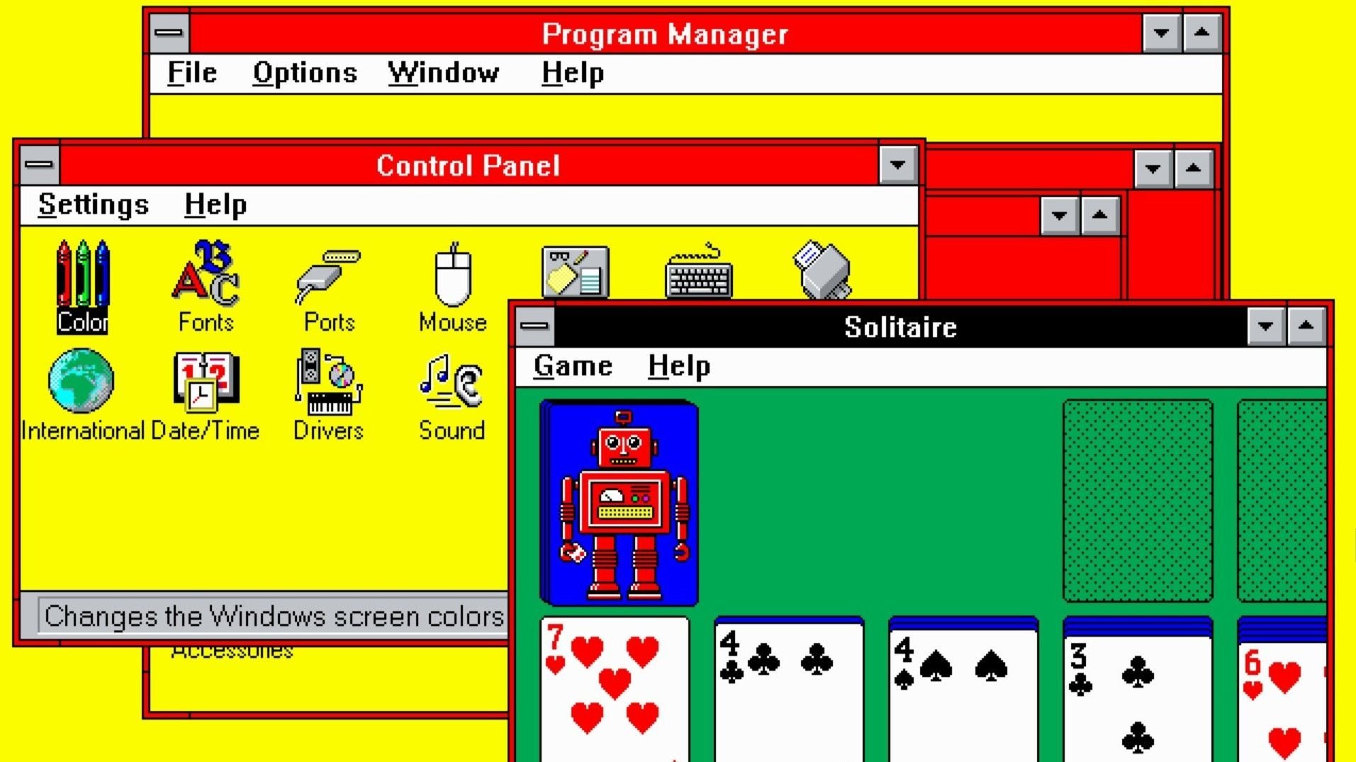
In the pantheon of tech design missteps, few icons have endured like Windows 3.1's default color scheme. The jarring combination of electric red and mustard yellow against gray was so visually aggressive that for decades, it was widely assumed to be an inside joke—a placeholder that Microsoft forgot to replace before shipping. Senior Editor Wes Fenlon, however, suspected there was more to the story. "It was long-assumed to be a joke," he writes, "so I tracked down the original designer to get the true story."

Fenlon's investigation led him to Brian Reid, the Microsoft designer who created the color palette in 1992. Contrary to popular belief, Reid explained the choice was deliberate and rooted in early 90s design philosophy. "We needed high contrast," Reid told Fenlon. "On the low-resolution monitors of the time, you needed colors that would pop." The red was specifically chosen for its "strong, attention-grabbing" qualities, while yellow provided optimal legibility against the darker gray backgrounds. This wasn't clown vomit—it was a calculated accessibility solution.
The misconception, Fenlon discovered, stemmed from the fact that Windows 3.1 also included a more subdued "Windows Standard" scheme (blues and grays). But the red-and-yellow combination was the default, and its in-your-face vibrancy became synonymous with early Windows. "People saw it and thought, 'This can't be real,'" Fenlon notes. "But Reid's explanation makes perfect sense when you consider the technical limitations of the era."
What makes this story particularly resonant for today's developers is how it reflects the tension between design principles and technological constraints. The "hot dog stand" palette was born not from aesthetic preference, but from the harsh realities of CRT displays and limited color depth. It serves as a reminder that design decisions are often artifacts of their time—a lesson in how we judge historical interfaces through modern lenses.
Fenlon's deep dive into this 30-year-old UI mystery reveals more than just a color story. It's a case study in how tech folklore can obscure the practical realities of software development. The next time you mock an old interface's "dated" aesthetics, consider: what compromises were made to make it functional on the hardware of its day?
This article was originally published on PC Gamer and is based on reporting by Wes Fenlon.
Comments
Please log in or register to join the discussion