
The evolution from fixed-width, pixel-perfect designs to fluid, content-first approaches using modern CSS features like Grid, Subgrid, and intrinsic layouts represents a fundamental shift in how we create resilient web experiences.
The quote from Jeffrey Zeldman that opens the article—"Your company’s survival is tied to the ability of the products it makes to work in situations you haven’t imagined, and on devices that don’t yet exist"—has become a guiding principle for modern web design. This isn't merely about responsive layouts that adapt to screen sizes; it's about creating systems that remain functional and beautiful when content changes unexpectedly, when users access them from contexts we never planned for, and when new technologies emerge that we can't yet predict.
The journey from the early days of web design to today's sophisticated CSS capabilities reveals a profound transformation in our approach. When the author first started designing websites, the workflow was rigid: create a 960px canvas in Photoshop, craft pixel-perfect layouts, then translate those exact measurements into fixed-width HTML and CSS. This approach worked when the web was primarily viewed on desktop monitors with consistent dimensions. Ethan Marcotte's 2010 article "Responsive Web Design" in A List Apart shattered this paradigm, introducing the concept of fluid layouts that could adapt to any screen size.

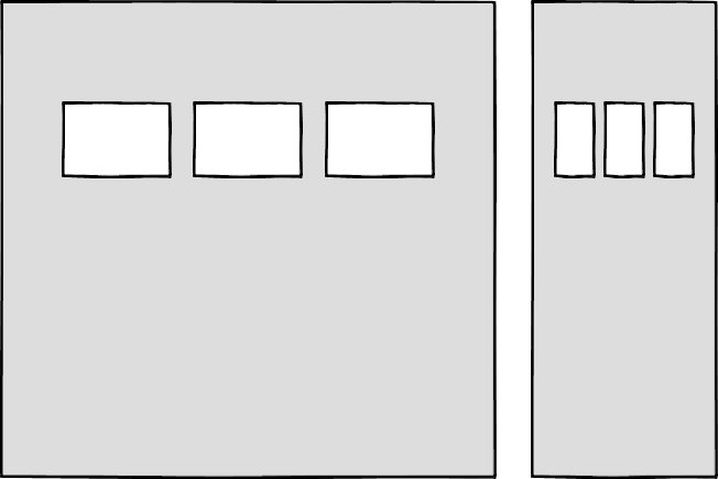
The initial implementation of responsive design relied on percentage-based layouts and media queries. Early techniques involved creating grid systems with utility classes like .column-span-6 that floated elements and used percentage widths. While functional, this approach tied layout structure directly to the markup, requiring developers to manually add row containers whenever content needed to be reorganized. Frameworks like Bootstrap popularized this pattern, but it created a fundamental constraint: content editors needed HTML knowledge to modify page structure, and components became tightly coupled to specific viewport sizes.
The real limitation emerged when designing for reuse across different contexts. A component designed to span six columns on a desktop might need to stack vertically in a sidebar or adapt to different content densities. Media queries, while essential for device adaptation, couldn't solve this problem because they only responded to the viewport width, not the component's actual container. This created a disconnect between the component's design intent and its real-world usage.
Container queries emerged as the theoretical solution to this problem. Instead of components responding to the browser window size, they would adapt based on their parent container's dimensions. This would enable truly reusable components that could be placed anywhere in a layout—sidebar, main content, or footer—and respond appropriately. However, container queries faced significant challenges: limited browser support, the need for JavaScript workarounds, and the fundamental question of how to determine when a component should change its appearance. Even with container queries, we'd still need predefined breakpoints, and the decision about when to adapt would often depend on content rather than container size.
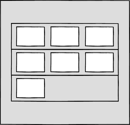
The evolution of CSS itself has provided more elegant solutions. Flexbox and CSS Grid revolutionized layout creation by moving away from rigid, float-based systems. With Grid's repeat(auto-fit, 450px) pattern, we can create columns that automatically wrap to new rows when space runs out, without requiring explicit row containers. This decouples layout from markup structure, allowing content to be added or removed without breaking the design. Flexbox provides similar flexibility with its wrapping and space distribution capabilities.
The most significant breakthrough in this evolution is CSS Subgrid. Subgrid allows nested grid items to inherit the track definitions of their parent grid, enabling components to align perfectly with sibling elements even when content varies dramatically in size. This solves one of the most persistent problems in web design: maintaining visual harmony when content changes unpredictably. A card component can now adjust its height based on the tallest card in its row, ensuring consistent alignment without manual height calculations or JavaScript.

Jen Simmons introduced the concept of "intrinsic layouts" to describe this new approach. Unlike traditional responsive layouts that use percentages to create fluid columns, intrinsic layouts combine fixed and flexible units to create designs that respond to available space while respecting content constraints. The fr unit, for instance, distributes extra space but never makes a column smaller than its content requires. This represents a fundamental shift from designing for specific breakpoints to designing for space itself.
Intrinsic layouts use functions like min(), max(), and clamp() to create flexible yet bounded designs. For example, width: clamp(300px, 50%, 600px) creates an element that prefers to be 50% of its container but never shrinks below 300px or grows beyond 600px. This approach allows designs to adapt fluidly while maintaining readability and usability across all scenarios.
The move toward content-first design extends beyond layout. Logical properties like margin-block-end and padding-block-start replace physical directions (left, right) with logical ones (start, end), making designs inherently adaptable to different writing modes and languages. Pseudo-elements like ::first-line and ::first-letter allow styling based on content position without additional markup. These features collectively enable designs that separate presentation from structure, allowing content to change without breaking the visual design.

Beyond technical implementation, designing for the unexpected requires considering user situations beyond device dimensions. The Media Queries Level 5 specification introduces features that respond to environmental conditions like light levels (light-level: dim for dark environments) and user preferences like prefers-reduced-data for bandwidth-constrained situations. These queries allow us to create adaptive experiences that respect both technical constraints and human needs.
The srcset attribute enables responsive images that serve different file sizes based on viewport width, while loading="lazy" and preload attributes give us control over when resources are downloaded. These features, combined with user preference media queries, allow us to create experiences that adapt not just to screen size, but to connectivity, data plans, and environmental conditions.
The philosophical shift here is profound: we're moving from designing for specific devices to designing for contexts, from rigid layouts to flexible systems, and from one-size-fits-all solutions to personalized experiences. This requires a different mindset during the design process. Instead of creating mockups for three breakpoints, we design in the browser, testing how components behave with varying content and in different containers. We establish design systems based on principles rather than fixed measurements.
This approach also challenges traditional workflows. Design tools like Photoshop, which excel at creating static compositions, struggle to represent fluid, content-dependent layouts. The solution is to design in code, using real content and testing edge cases during the design phase. This requires designers to understand CSS capabilities and developers to appreciate design principles—a collaboration that ultimately produces more resilient products.
The adoption of these techniques has been slower than the initial responsive design revolution for several reasons. Large organizations often have existing codebases and frameworks that resist change. There's no single framework that provides an "intrinsic design" template in the way Bootstrap provided responsive grids. The approach requires more experimentation and customization, which can be daunting for teams accustomed to standardized solutions.
However, the benefits are compelling. Designs built with intrinsic principles are more maintainable, more accessible, and more future-proof. They accommodate content changes without requiring redesigns, work across a wider range of devices and contexts, and provide better user experiences by respecting both content needs and user preferences.
The ultimate goal is to create designs that are resilient to the unexpected—not just new devices, but new content, new languages, new user needs, and new contexts of use. This requires embracing flexibility at every level: in our layout systems, our component architectures, our design processes, and our thinking. By putting content first, designing for space rather than devices, and building in adaptability from the start, we can create web experiences that remain functional and beautiful regardless of what the future brings.
The journey from fixed-width Photoshop compositions to intrinsic, content-first CSS represents more than a technical evolution—it's a fundamental rethinking of how we approach digital design. We're moving from controlling every pixel to creating systems that gracefully handle the unknown, from designing for specific scenarios to building for possibility. In doing so, we're not just preparing for unexpected devices or situations; we're creating a more flexible, inclusive, and resilient web for everyone.
Comments
Please log in or register to join the discussion