
An exploration of the limitations in current CSS theming systems and a proposal for a more flexible, semantic approach to color naming and application.
In the evolving landscape of web design, theming systems have become fundamental to creating distinctive, accessible digital experiences. Yet as front-end developers increasingly seek to break free from the constraints of standardized frameworks, a fundamental question emerges: why do systems designed to provide flexibility often impose such rigid limitations on color usage?
The author's journey into this territory began with simple curiosity about how fellow developers approach website theming, evolving into a deeper investigation after conversations with CSS-Tricks editor Geoff Graham. This exploration reveals a paradox: while modern frameworks offer extensive color palettes, they simultaneously restrict how these colors can be applied in practice.
The Current State of Color Palettes
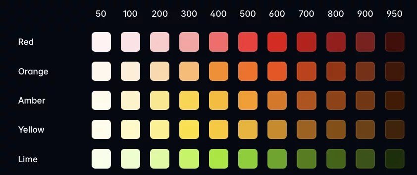
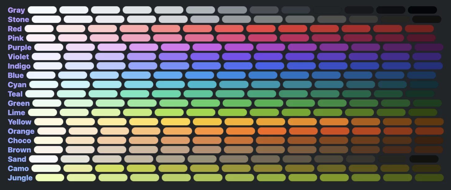
The contemporary web design ecosystem has made significant progress in providing comprehensive color systems. Frameworks like Tailwind CSS now include extensive color libraries with multiple tones, while specialized tools like Adam Argyle's Open Props push boundaries further with up to 13 tones per color. Pico CSS takes this even further with 19 different tones per color, demonstrating a clear trend toward more nuanced color systems.
However, the author makes a compelling case that these pre-built palettes, while convenient, often lead to a "sea of sameness" in web design. Sites using Bootstrap inevitably look like Bootstrap; sites built with Tailwind carry its distinctive visual fingerprint. This homogeneity occurs because color is merely one element of design identity, though arguably the most immediately apparent. The complete design system encompasses typography, spacing, corner radius, and countless other subtle decisions that collectively create a unique aesthetic.
The solution, according to the author, lies in creating custom color palettes tailored to specific projects. This approach aligns with the principle that differentiation creates distinction, which in turn creates identity. The accessibility concerns that often deter developers from custom palettes are dismissed with a simple yet profound insight: "Sufficient contrast" is the only principle one truly needs to remember for accessible color design.
The Palette Creation Dilemma
When creating custom palettes, developers face a choice between manual design and programmatic generation. The author advocates for a manual approach using tools like Figma, arguing that stressing over predefined tone values (50-950) puts the cart before the horse. Colors should be selected based on their actual application in the design, not theoretical completeness.
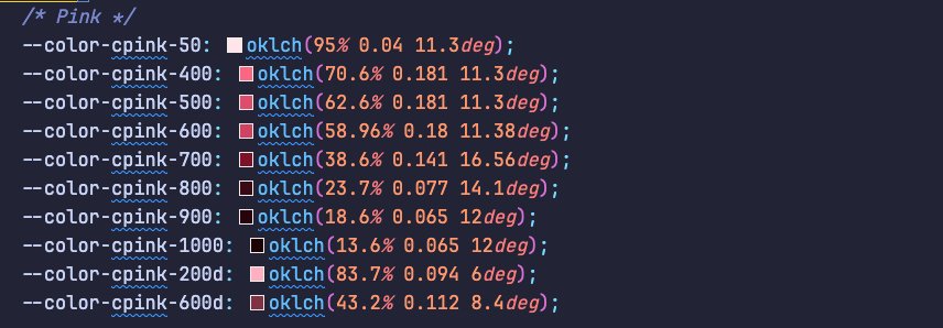
In their work on Splendid Labz, the author demonstrates this pragmatic approach by omitting numerous tone values that weren't needed for the design. They even added custom variants like "200d" and "600d" to represent desaturated (muted) colors that existing systems couldn't capture. This example illustrates how a thoughtful, design-driven approach to color palettes can yield more effective results than rigid adherence to predefined systems.
For those preferring programmatic solutions, several tools are mentioned, including RampenSau, Perceptual Palettes, and the Accessible Palette Generator. Among these, RampenSau receives particular praise for its creator's deep knowledge of color space.
The Semantic Naming Conundrum
Despite the abundance of colors available in modern frameworks, their practical application reveals significant limitations. Systems like DaisyUI support only two tones per color, while even more comprehensive frameworks like Pico CSS restrict usage through "semantic class names" that ultimately limit developers to approximately two tones per design element.
This raises a puzzling question: if colors are so important to design, why do these frameworks restrict their utilization so severely? The author suggests several possible reasons:
- System designers may not possess the same visual sensitivity as dedicated designers
- Semantic class name confusion creates inherent limitations
- Values were intended merely as guidelines rather than comprehensive systems
The most significant issue appears to be the semantic confusion that permeates these systems. The author observes that "semantic" in this context actually conflates two distinct concepts:
- Order of hierarchy (primary, secondary, tertiary, etc.)
- The "thing" being styled (background, border, text, etc.)
This confusion is further complicated by the fact that hierarchy itself splits into two dimensions:
- Color-specific order (primary = red, secondary = blue)
- Use-case specific order (heavy button = primary, light button = secondary)
A Proposed Solution: Separating Concerns
The author's proposed solution involves a clear separation between these conflated concepts:
- Reserve hierarchy terms (primary, secondary, tertiary) specifically for color hues
- Use descriptive verbs for appearance variations (outline, light, heavy, ghost)
- Leverage the existing numeric system (100-900) to represent actual color tones
This approach allows for a wealth of color combinations without being restricted by a single hierarchical dimension. The implementation can be achieved through CSS custom properties, with examples provided for vanilla CSS, Sass, and Tailwind CSS.
The author acknowledges that this approach generates numerous CSS variables but argues that the performance impact would be minimal compared to other elements like images. The trade-off between flexibility and file size appears justified given the expressive power gained.
Global Variables and Component Design
Beyond color systems, the author discusses the importance of global variables for properties that propagate throughout a design system. Examples include border properties, outline styles, and transition parameters. These global variables enable consistent styling across components while allowing for easy theme changes.
The author also addresses the component-level semantics that most frameworks handle well, suggesting that namespace reduction can be beneficial in projects that don't require extensive namespacing. This aligns with the principle of keeping systems simple when complexity isn't necessary.
Framework-Specific Considerations
Different frameworks present different challenges and opportunities for implementing this theming approach. For Tailwind CSS users, the author provides a plugin example that could work in version 3, though notes uncertainty about version 4. The example demonstrates how to generate theme classes that map color roles to specific hues.
The author also critiques certain design choices in existing frameworks, such as DaisyUI's creation of abstract variables like --color-success and --color-danger instead of directly using --color-red for errors. This abstraction, they argue, creates unnecessary limitations without providing clear benefits.
Practical Applications and Scalability
The article concludes by emphasizing that the complexity of theming systems should match project requirements. Simple projects may work perfectly with basic color palettes and minimal theming. More complex applications, however, benefit from the robust system the author proposes.
This philosophy aligns with Jason Cohen's observation that "what is okay at a lower level becomes not okay at a larger scale." The author's system provides the flexibility needed for complex design systems while remaining simple enough for smaller projects.
For those interested in exploring this approach further, the author references their own work at Splendid Labz, specifically mentioning Splendid Styles and Splendid Layouts as implementations of these principles.
Conclusion
The author's exploration of theming and color naming represents a thoughtful challenge to conventional approaches in CSS frameworks. By separating the concerns of color hierarchy, use-case semantics, and tone representation, they propose a system that offers greater flexibility without sacrificing clarity or performance.
As web design continues to evolve, the tension between standardized frameworks and custom design solutions will likely persist. The author's contribution lies in providing a practical framework for thinking about color and theming that bridges this divide—offering the structure needed for maintainable code while providing the flexibility required for distinctive, expressive design.
In the end, the article serves as both a critique of current limitations and a constructive roadmap for developers seeking to create more vibrant, dimensional web experiences that break free from the constraints of visual homogeneity.
Comments
Please log in or register to join the discussion