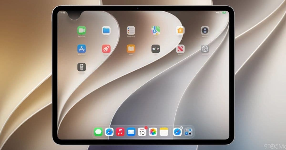
Apple is reassigning the swipe-down-from-center gesture on iPhone and iPad to invoke its new Siri AI. Notification Center, which has owned that gesture since iOS 5 in 2011, gets pushed to the top-left corner once the feature is turned on.
Apple is rewriting a gesture that has been stable since 2011. Starting with iOS 27 and iPadOS 27, enabling the new Siri AI experience reassigns the swipe-down-from-the-center-top gesture away from Notification Center and over to Siri. For anyone who builds, tests, or supports apps across both platforms, this is the kind of system-level change that quietly reshapes how users reach your notifications.
What actually changed
Notification Center has lived behind a downward swipe from the top of the screen since iOS 5 shipped in 2011. On modern devices with a notch or Dynamic Island, that swipe split into two zones: pull down from the left side for Notification Center, pull down from the right for Control Center. That split arrived with iPhone X and Apple later unified it across the iPad lineup.
With iOS 27 and iPadOS 27, the defaults do not move on their own. If a user never enables Siri AI, the gesture map stays exactly as it has been. The change is opt-in, tied to turning on the new Siri.
Once Siri AI is enabled, swiping down from the center of the top edge invokes Siri instead of opening Notification Center. The majority of the top edge becomes Siri territory. Notification Center retreats to the top-left corner, the same general pattern Apple used when it relocated Control Center to the top-right corner on iPhone X.

Why this matters for developers
Notifications are a core surface for most apps, and the path users take to reach them is now narrower on devices where Siri AI is active. The hit target for opening Notification Center shrinks to a corner. On iPad it shrinks further: the zone above the Home screen icons is almost entirely handed to Siri, and 9to5Mac notes that the Notification Center area gets even smaller if a user disables the AM/PM indicator or the date in the status area.
A smaller, repositioned entry point means users may see your delivered notifications less often through manual browsing. That puts more weight on getting the notification right at delivery time: clear titles, useful subtitles, well-structured grouping with UNNotificationContent and thread identifiers, and time-sensitive interruption levels for the alerts that genuinely need to break through. If users are no longer casually swiping into a full chronological list, the live banner and the lock screen become the primary moments where your message lands.
The corner relocation also affects anyone shipping onboarding flows or in-app tips that reference system gestures. If your app tells users to "swipe down from the top to see your alerts," that instruction is now wrong for a subset of devices, specifically those with Siri AI enabled. Hardcoded gesture instructions in tutorials, support docs, and tooltips are worth auditing before iOS 27 reaches general release.
Cross-platform context
For teams maintaining the same app on iOS and Android, this is a reminder that the two platforms are diverging again on a basic interaction. Android keeps its notification shade behind a top swipe with no AI gesture competing for the same motion. iOS is now layering an assistant invocation on top of the same physical gesture and resolving the conflict by region of the screen. Documentation and QA scripts that assume "swipe down for notifications" works identically across both operating systems will need platform-specific branches.
There is no public API that lets an app detect whether a user has enabled Siri AI or where Notification Center currently lives, so you cannot adapt your UI conditionally based on that state. The practical response is to stop depending on system-gesture instructions entirely and route users to your own in-app notification history or settings when you need them to find something.
What to watch as the betas progress
Apple has reorganized Notification Center access exactly once before in the modern era, when Control Center jumped to the top-right corner on iPhone X. That change felt disruptive at first and then settled into muscle memory. This one could follow the same arc, or Apple could adjust the zones in later betas based on feedback. Early reaction to the Siri AI system itself has been strongly positive, which makes the gesture trade-off easier for users to accept.
For now, the action items are concrete. Test your notification flows on iOS 27 with Siri AI both on and off. Review any copy or tutorial content that references the top swipe. And treat the corner as the new home for Notification Center on devices where the assistant is active, designing your notification content so it does its job at the moment of delivery rather than relying on users to go digging for it.
Comments
Please log in or register to join the discussion