Apple's iOS 27 developer beta does more than add a transparency slider to Liquid Glass. The underlying content-blurring changes fix the legibility problems from the first release, which has real implications for how you build and test UI on top of the system material.
When Apple shipped Liquid Glass as the headline UI direction for iOS 26, it created the most divisive interface change the platform had seen in years. The visual idea was appealing, but the first implementation had a concrete, measurable problem: text rendered on a translucent layer sitting over text in the content beneath it became hard to read. For developers, that wasn't just an aesthetic complaint from users. It was a real accessibility and QA headache that affected tab bars, toolbars, navigation overlays, and any custom view layered on top of scrolling content.
iOS 27, now in developer beta, changes the calculus. Ben Lovejoy at 9to5Mac reports that after running the beta with the Liquid Glass effect maxed out, the legibility issues he expected to find simply weren't there. That matters more than the user-facing slider that has gotten most of the attention.
What actually changed
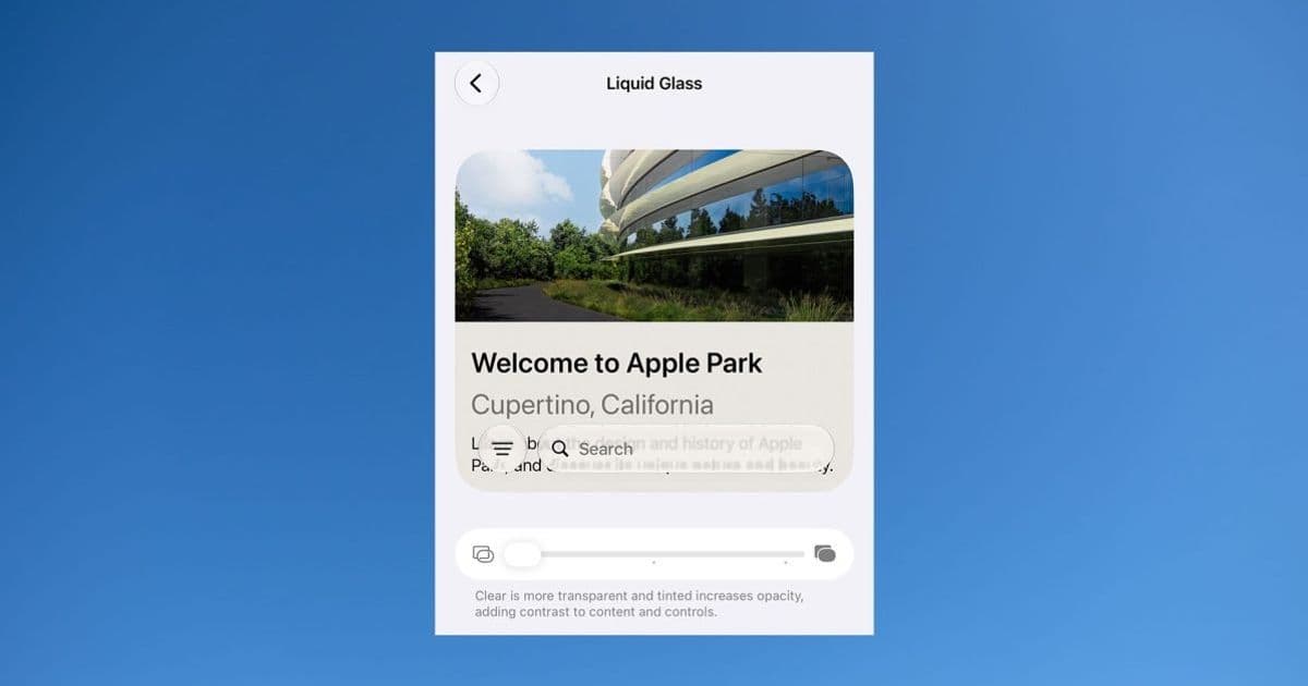
The story most people heard is that Apple added a slider. At one end you get a strong glass effect with high transparency. At the other end the material frosts over until it's effectively opaque, which is functionally the same as turning the effect off. That gives end users control, and on its own it would have ended the debate by letting people who hated the look opt out.
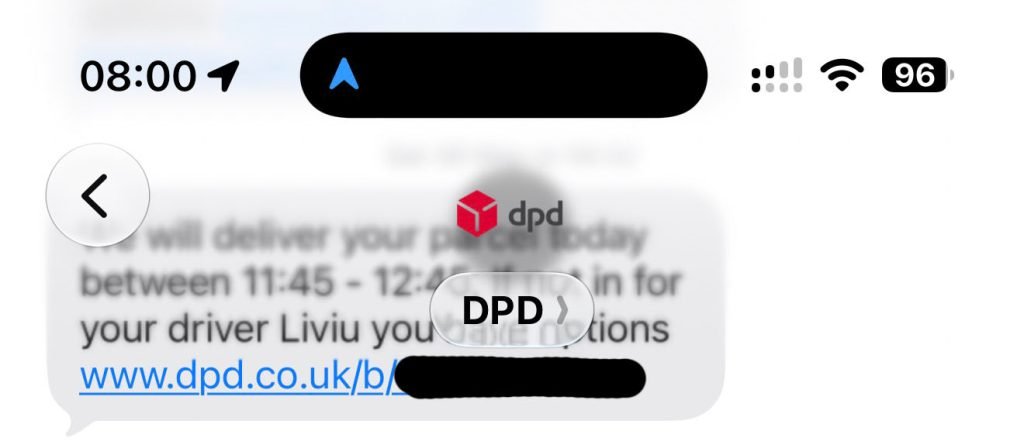
But the slider isn't the interesting part for anyone building apps. The interesting part is that Apple appears to have reworked how the system blurs underlying content. Even with transparency pushed to maximum, the top layer stays readable. The example Lovejoy highlights is black text from a Messages tab overlaying black text from an older message scrolled up behind it. That is the worst-case scenario for any translucent material: same color, high contrast collision, no luminance separation to fall back on. In the first implementation it produced mud. In iOS 27 the underlying content is blurred enough that the foreground text reads cleanly.
Why this matters if you ship on iOS
If you build iOS apps, the Liquid Glass material is not something you opt into so much as something the system applies to standard chrome. Navigation bars, tab bars, toolbars, and sheets adopt the material automatically when you use the standard UIKit and SwiftUI components. That means the first release's legibility problems hit apps that did nothing wrong. Teams that filed feedback or scrambled to add custom backgrounds were compensating for a system-level rendering choice.
The iOS 27 change shifts the default behavior in your favor. If the system now guarantees readable foreground content across the full transparency range, the defensive workarounds many teams added in the iOS 26 cycle become unnecessary, and in some cases counterproductive. A custom opaque background you added to dodge the old blur problem will now look out of place next to the system's improved material. This is a good moment to audit any view where you overrode the standard background specifically to fight Liquid Glass legibility, and to test whether removing that override gives you the cleaner native look back.
There is also a testing implication. Because users can now set transparency anywhere along the slider, your UI needs to hold up across the whole range, not just at the default. The good news is that Apple is doing the heavy lifting with the content blur. The practical advice is to test your custom overlays at both extremes: full transparency and full frost. If you draw your own translucent surfaces rather than relying on system materials, you don't automatically inherit the improved blur, so verify your hand-rolled materials still read well when a user cranks transparency up.
The cross-platform angle
For teams maintaining both iOS and Android apps, this is a reminder that the two platforms are pulling in different directions on system materials. Android's Material 3 expressive design leans on dynamic color and tonal surfaces rather than the heavy translucency Apple is pursuing. If you share a design system across both platforms, Liquid Glass is one of those places where you should let each platform be itself rather than forcing a single visual language. Trying to replicate Liquid Glass on Android with manual blur layers tends to cost battery and frame budget without matching the system integration Apple gets for free. Conversely, trying to flatten iOS chrome to match a Material look fights the platform and now means giving up the readable translucency Apple just improved.
If you build with a cross-platform framework like Flutter or React Native, the relevant question is how quickly your toolkit surfaces the iOS 27 material behavior through native components. Frameworks that wrap native UIKit chrome will inherit the improved blur automatically. Frameworks that draw their own approximations of iOS chrome will lag behind until they update, so check your framework's iOS 27 support notes before assuming the fix reaches your users.
What to watch next
Lovejoy floats a plausible theory: Apple may be collecting anonymized data on where people set the transparency slider. If a meaningful share of users push it toward maximum transparency, Apple could extend the slider even further in that direction in a later beta. For developers that would mean an even wider range of material states to design against, which reinforces the case for testing your custom surfaces across the full spectrum now rather than after the public release.
The broader pattern here is Apple responding to a contentious design decision with engineering rather than a binary on/off switch. The toggle in iOS 26 was a retreat. The reworked blur plus a continuous slider in iOS 27 is a more durable answer, because it keeps the design direction Apple clearly wants while removing the concrete reason people rejected it. For anyone shipping apps on the platform, the takeaway is straightforward: re-test your layered UI against the iOS 27 beta, pull back the workarounds you added last cycle, and let the system material do the work it now does well.
The iOS 27 developer beta is available through the Apple Developer Program, and the relevant interface guidance lives in Apple's Human Interface Guidelines.
Comments
Please log in or register to join the discussion