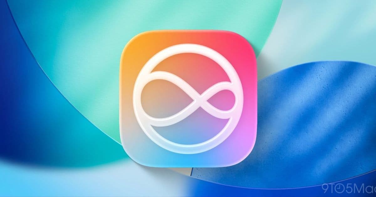
Apple's upcoming Siri redesign in iOS 27 will feature a bold dark interface with vibrant colors matching the WWDC 2026 logo, marking a significant departure from the current assistant design.
Apple is preparing to unveil a major redesign of Siri with iOS 27, and according to Bloomberg's Mark Gurman, we now have detailed insights into how the personal assistant's interface will look. This significant visual overhaul represents Apple's most ambitious update to Siri's appearance since its introduction, with a dark-themed interface featuring colors that directly mirror the company's WWDC 2026 branding.
A Bold New Direction for Siri
The upcoming Siri interface represents a substantial departure from the current design that has remained relatively unchanged for years. Based on Gurman's reporting, the new design will feature a dark background with vibrant, glowing elements that create a striking visual contrast. This aesthetic choice aligns with Apple's broader design language seen in recent years, which has increasingly embraced darker interfaces with accent colors.
The most notable aspect of this redesign is Apple's decision to implement a dark theme only. Unlike most system elements that adapt to both light and dark modes, the new Siri interface will exclusively use dark colors, with no light-mode option available. This decision suggests Apple is making a deliberate statement about the direction of its digital assistant, positioning it as a more immersive, focused experience.
Color Scheme: Mirroring WWDC 2026
The color palette for the new Siri interface directly borrows from Apple's WWDC 2026 logo featuring the Swift bird. According to Gurman, the interface will incorporate the same "shades of gold and blue, alongside the bright white light and dark undertones" present in the promotional materials.
This color strategy extends to the Search or Ask bar at the top of iOS 27, which will feature a dark background with a blinking cursor that glows in the same vibrant colors as the WWDC animations. This creates a cohesive visual experience across Apple's developer conference branding and the Siri interface.
What makes this particularly interesting is that this UI will be present regardless of whether the iPhone is in light or dark mode. This suggests that Apple is prioritizing the new Siri's visual identity over system-wide consistency, a notable decision for a company typically known for its meticulous design consistency.
Developer Implications
For developers, this redesign presents both opportunities and considerations. The new Siri interface will likely be accompanied by updated SiriKit frameworks and design guidelines. Developers creating Siri integrations will need to ensure their custom interfaces and responses work harmoniously with the new aesthetic.
The dark theme only approach simplifies some development considerations, as designers won't need to create light mode variants. However, the vibrant color elements require careful attention to contrast and accessibility to ensure all users can effectively interact with the assistant.
Apple has typically provided comprehensive design resources for Siri integrations, and we can expect updated documentation following the WWDC 2026 announcement. Developers should prepare to review these resources and potentially update their Siri extensions to match the new visual language.
Migration Considerations
For users and developers alike, this Siri redesign represents a significant visual shift. While the underlying functionality may remain familiar, the completely different aesthetic will require an adjustment period. Apple has typically maintained visual consistency across its products, so such a dramatic change to a core system element is noteworthy.
The timing of this redesign—just ahead of WWDC 2026—suggests Apple may be positioning Siri as a centerpiece of its annual developer conference. This could indicate expanded capabilities beyond just the visual refresh, with Apple potentially announcing deeper integrations, new AI features, or enhanced developer tools alongside the new interface.
Historical Context
This would be one of the rare occasions when Apple's event teasers have offered such a direct preview of upcoming features. Typically, Apple maintains a degree of mystery around major announcements, but the explicit connection between the WWDC 2026 logo and the Siri interface suggests Apple wants developers to be prepared for this significant change.
Siri has undergone numerous functional improvements since its debut, but this represents its most substantial visual redesign. The dark theme approach aligns with Apple's broader design trends, as seen in the evolution of Apple Music, TV, and News apps, which have increasingly embraced darker interfaces with accent colors.
As we approach WWDC 2026, developers and users alike should prepare for a Siri that looks as different as it potentially functions. The combination of a dark-only interface with vibrant accent colors marks a bold new direction for Apple's personal assistant, one that could signal deeper changes to come in how we interact with digital assistants on Apple platforms.
For the most current information about Siri's redesign and iOS 27, developers should monitor Apple's developer portal and attend the WWDC 2026 keynote, where Apple is expected to provide comprehensive details about these changes.
Comments
Please log in or register to join the discussion