A frontend ticket about a ragged margin turns out to sit on top of five centuries of accumulated technical debt. The story of why the web in 2026 still cannot justify a line of Arabic text the way a tenth-century calligrapher could is less about a missing feature than about who pays for infrastructure that serves readers without advertisers.
Most engineering stories about a single CSS property are short, because most CSS properties do roughly what they say. The essay that prompted this one begins with text-align: justify and ends, several thousand words later, with a twice-mutilated Abbasid vizier, a Qur'an that hid in a Venetian friary for four hundred years, and an Egyptian physician who taught himself font engineering on his evenings. The distance between those two points is the actual subject. A ragged left margin on a customer dashboard looks like a bug in a stylesheet. It is closer to a fossil record, and reading it correctly tells you something uncomfortable about how the infrastructure under writing systems actually gets built.
The core argument running through the piece is deceptively simple: Arabic typography is not an unsolved problem. It was solved, comprehensively and in writing, more than a thousand years ago, and it has been re-solved for the digital era by a handful of people working mostly for free. What remains broken is not the hard part. It is one well-understood algorithm in a few layout engines, left undone because the population it would serve contains, as the author puts it with some precision, no advertisers. The bug is not technical. The bug is economic, and the technology is merely where the economics become visible.
What the scribes had already finished
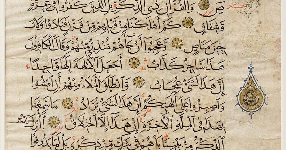
To see why this matters, you have to understand what classical Arabic justification actually does, because it is genuinely different from the Latin convention every Western reader absorbs without noticing. When a Latin paragraph is justified, the typesetter measures the words, then pours the leftover slack into the spaces between them. The words stay fixed; the air between them stretches. Arabic scribes considered this ugly and did the opposite. They left the spaces alone and extended the letters themselves, lengthening the connecting strokes between certain letter pairs to carry a line out to the margin. The technique is called tatwil, or in the modern technical vocabulary kashida, and a well-set page of Naskh has every line flush at both edges without a single stretched word-space. The justification lives inside the words.
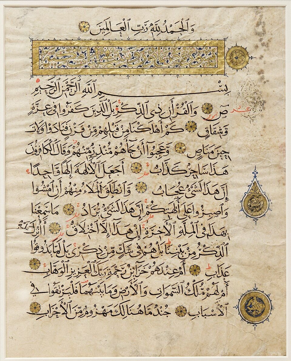
This was not folk practice. It was a codified system with an author and a paper trail. Ibn Muqla, an Abbasid vizier and chief calligrapher who served and was imprisoned by successive caliphs, wrote down al-khatt al-mansub, the proportional script, in which every letterform is measured in rhombic dots of the reed nib and every curve is a defined arc of a defined circle. His biography is the kind of thing you assume has been embellished until you check: a severed right hand, a pen lashed to the stump, a cut-out tongue, a body reburied three times by a daughter keeping the grave from the police. The system he recorded outlived everyone who hurt him by a millennium, refined along the way by named individuals, Ibn al-Bawwab in Baghdad, Yaqut al-Musta'simi codifying the canonical Six Pens after surviving the Mongol sack of 1258 by hiding in a minaret, the Persian scribes inventing the hanging Nasta'liq that justifies by sloping the baseline downward.
The load-bearing point for everything that follows is this: in the Arabic tradition, justification is a shaping problem, not a spacing problem. The line is brought to the margin by changing the shapes of the letters, sometimes by elongating strokes, sometimes by selecting among the alternate forms most letters carry. Latin typesetting never needed any of this machinery because Latin letters do not connect. Arabic letters do, and that single structural fact, that the script is cursive always, with no print-versus-handwriting distinction, is the root of every difficulty that follows.
The architecture that finally got it right
The modern resolution to this, arrived at after decades of wrong turns, is elegant: the encoding stores the abstract letter, and the font supplies the shapes. Unicode gives you one codepoint for the letter 'ayn. The font carries its four positional glyphs, isolated, initial, medial, and final. A shaping engine applies the relevant OpenType features at render time, selecting which glyph each letter wears based on its neighbours, fusing required ligatures, stacking vowel marks. An Arabic font, in this model, is a small program; the stored text is its input, not its output. The word is performed fresh every time you look at it, the way music is performed from a score rather than retrieved from a recording.
This is a clean separation of concerns, and when it works the reader never notices it working. Type the four codepoints for Muhammad and watch each prior letter renegotiate its shape as the next arrives, the initial form collapsing into a medial when a successor appears, the non-joining dal interrupting the flow and forcing a final form. Four codepoints in storage become one continuous stroke on screen, mediated by seven OpenType lookups nobody sees. None of it happens without a shaping engine, and that conditional is where most of the world's software still fails.
The fossils still embedded in the standard
The wrong answers did not disappear. They were standardised. Before shaping engines existed, the 8-bit code pages of the DOS and early Windows era encoded the shapes directly, a separate character for initial 'ayn, another for medial, and so on. When Unicode promised round-trip compatibility with every prior encoding, it had to swallow those sets whole, and they survive today as the Arabic Presentation Forms, several hundred codepoints that no new document should contain and that PDF text extractors emit by default. This is why searching an Arabic PDF so often fails silently: the haystack is encoded as shapes and the needle as letters, and the two render identically while comparing as different strings. One of the bugs the essay opens with, twelve thousand customer names invisible to search because a 2017 migration stored them as presentation forms, is exactly this collision, and its cure is a single normalisation call, NFKC, that collapses the fossils back to abstract letters. The reason it took a quarter of a year to find is that the symptom, customer not in system, carries no codepoint dump with it.
The deepest part of the piece is its long timeline, which reads, deliberately, like a badly maintained changelog. Print and Arabic met badly in 1514, when the first book in movable Arabic type was set in Fano by craftsmen who could not read what they were composing, and the joints show it.
The Ottoman calligraphers who looked at output of that quality and declined the whole technology are usually cast as reactionaries who made the Islamic world miss printing. The historian Kathryn Schwartz showed in 2017 that the famous edicts supposedly banning the press rest entirely on European travellers' hearsay, with no surviving text. The more documented truth is that an empire employing tens of thousands of calligraphers in a refined thousand-year craft looked at Fano-grade work and saw a downgrade. They were, the author notes drily, the only people in the story with functioning quality assurance.
Metal type did eventually catch up, but only with a government behind it. The Bulaq Press in Cairo, state-funded and lavish with hundreds of separately cut sorts per fount, produced the 1924 Cairo Qur'an that standardised the text and proved metal could walk right up to the manuscript page.
Then newspaper economics ran the logic in reverse. A Linotype magazine held ninety channels and the script needed several times that, so in the late 1950s the Beirut publisher Kamel Mrowa worked with Linotype to cut Arabic in half, merging initial into medial and final into isolated, dropping the ligatures. Simplified Arabic conquered the Arab newsroom in a generation because it was cheap and the alternative was not being a daily paper. Most operating-system Arabic fonts still descend from that compromise. The pattern recurs at every technological boundary: when the machine cannot do the script, simplify the script, ship it, and call it progress.
Where the web actually stops
The specifics of the browser failure are where the essay's argument lands hardest, because they are so close to success. Early drafts of the CSS Text Module did list kashida as a justification value, and Internet Explorer 5.5 implemented it in the year 2000, complete with a tuning property, with decent results for the era. The value was then dropped from the spec on the perfectly circular grounds that only one browser had implemented it. No modern engine ships it. Chrome, Firefox, and Safari all fall back to stretching word-spaces, producing exactly the rivers of white the original ticket complained about.
The reason is structural and, as obstacles go, almost beautiful. Latin justification treats shaped text as frozen, which lets shaping and layout live in separate boxes; every production text stack is architected around that separation. Kashida justification breaks the boxes open, because elongating a stroke changes a glyph's width, which changes where the line breaks, which changes how much elongation is needed, so shaping and layout have to negotiate in a per-line loop. OpenType has carried a mechanism for the font's side of that negotiation, the jstf table, since the nineties, and after thirty years it sits in a perfect standoff: almost no shaping engine reads it, so almost no foundry ships it, so no engine acquires a reason to start. The problem is not that nobody knows how. Microsoft Word has done crude kashida justification since the late nineties. Thomas Milo's DecoType built a proper engine around the script's own grammar decades ago and shipped it inside InDesign's Middle East edition as Tasmeem, output that calligraphers will sign off on. The capability exists, retail, on a laptop. It simply has not been ported into the renderers everyone now reads everything in.
So people hack it, and the standard hack, inserting literal U+0640 TATWEEL characters into the text, is the one the original essay's faked mockup runs on. As a technique it sits between a kludge and a small act of vandalism, because the tatweel becomes content: it breaks search, rides along on copy-paste, confuses screen readers, and lands in the wrong place the moment the column reflows. The web's only tool for the scribes' shaping-based justification is to corrupt the string.
The bidirectional tax
Layered on top of shaping is the bidirectional algorithm, defined in UAX #9, in the standard since 1991, and one of the most intricate specifications Unicode publishes. Characters carry directional personalities: Arabic letters strongly right-to-left, Latin strongly left-to-right, digits weak and traveling with their context, punctuation neutral and taking direction from whoever stands beside it. The algorithm resolves these into runs, reorders them for display, and produces text on screen in a different order than the text in memory.
This is where the daily friction lives, and the essay is candid that it is not an edge case but the default experience. A phone number stored as 010-1234-5678 arrives as 5678-1234-010, per spec, identically in every browser, because once an Arabic letter appears earlier in the paragraph the digits get reclassified as Arabic numbers, the hyphen goes neutral, and the runs swap. A range like 10 to 20 silently inverts. The cursor, at any run boundary, has two legitimate positions and every editor picks differently, which is why fluent bilingual engineers abandon mixed Arabic-English emails midway and retreat to one language to stop fighting the caret. The author's memory of being unable to register for Facebook because the cursor's behaviour at the first language switch simply stopped them cold is the kind of detail that reframes the whole thing. These are not exotic bugs filed by specialists. They are the texture of writing in this script in 2026, and the cures, an invisible U+200E mark slipped before a digit, a <bdi> wrapper, are carried around by multilingual typesetters like a pocketful of exorcist's tools.
Who actually paid for the letters
The implication the essay builds toward, and the reason it lingers after the technical details fade, is a claim about funding and care. Nearly everything in the stack that works was built by almost nobody, against every incentive their professional environment offered.

HarfBuzz, the shaping engine applying init and medi and rlig in your browser at this moment, was carried for years substantially by Behdad Esfahbod, an Iranian-Canadian engineer detained for ten hours at the US border on suspicion of being Iranian, which he was. The engine rendering every Arabic letter you read correctly was, for years, maintained by someone the government on whose soil much of the work happened classed as a security risk.

Its co-maintainer today is Khaled Hosny, an Egyptian physician by training who taught himself OpenType tooling over a decade and built Amiri, released under the SIL Open Font License in 2011 and, the author argues, still the best free Arabic font of the digital era. Amiri revives the typeface of the Bulaq Press that set the 1924 Cairo Qur'an, which makes the best free Arabic font of the digital era a one-man reconstruction of the best government-funded font of the metal era. Since its 2022 rewrite it carries a curvilinear kashida that substitutes graded swelling strokes when fed elongations, the pen's own behaviour, performed live in a browser. The rest of the ecosystem fills in around it: Scheherazade from the missionary linguists of SIL International, the Noto Arabic faces from a Google internationalisation budget that is, by that company's standards, a rounding error, the W3C's excellent and almost entirely unimplemented Arabic Layout Requirements from volunteers.
The pattern is consistent and damning. The browser vendors took HarfBuzz when it was free and finished and have contributed approximately nothing toward the justification loop that would let the scribes' system finally run on a screen. No quarterly report has a line item reading Arabic users can now justify a paragraph. The ragged margin on the dashboard, closed as Won't Fix, is what the absence of that line item looks like when multiplied across every renderer on earth.
There is a counter-perspective worth holding against this, in fairness to the engineering. The separation of shaping from layout that blocks kashida justification is not laziness; it is a genuinely sound architecture that makes the rest of the text stack tractable, and reuniting them in a per-line negotiation has real performance and complexity costs that someone would have to own. Volunteer maintainership is also not obviously a failure state. Some of the most durable infrastructure humanity has built, from the early internet protocols to much of cryptography, came from people working outside any commercial reward, and the work is not worse for it. One could argue the system is functioning as designed: the people who care most build the hard parts, and the commons benefits.
But that defense only stretches so far, and the essay's framing exposes where it snaps. The remaining gap is not research. The scribes specified the system in the tenth century. The volunteers have already rebuilt the letters, the typefaces, the shaping, and the standards documents. What is missing is one understood algorithm in a handful of layout engines maintained by some of the best-capitalised companies in history, blocked not by difficulty but by the absence of anyone whose bonus depends on it. When the only thing standing between a few hundred million readers and correctly justified text is whether a billion-dollar firm decides the unglamorous port is worth a sprint, functioning as designed stops being a defense and becomes the indictment.
The through-line connecting Ibn Muqla's severed hand to a text-justify value dropped from a spec is that writing systems are infrastructure, and infrastructure reveals whose convenience a civilisation is actually optimised for. The Latin paragraph never needed a forty-page bidirectional algorithm, never needed a shaping engine, never had its justification quietly deleted from a standard because only one vendor bothered. Every one of those costs falls on the other script, and every one has been absorbed, repeatedly, by individuals working for love while the institutions that could close the last gap look the other way. The scribes solved this. The volunteers re-solved it. What is left is a decision nobody with the resources to make it has chosen to make, and that, more than any encoding fossil or cursor glitch, is the technical debt the title is pointing at.
Comments
Please log in or register to join the discussion