A meditation on Apple's Sleep Indicator Light—from its debut in the iBook G3 to its disappearance—exploring how this small detail embodied the company's humanistic approach to technology and why its absence still resonates with users today.
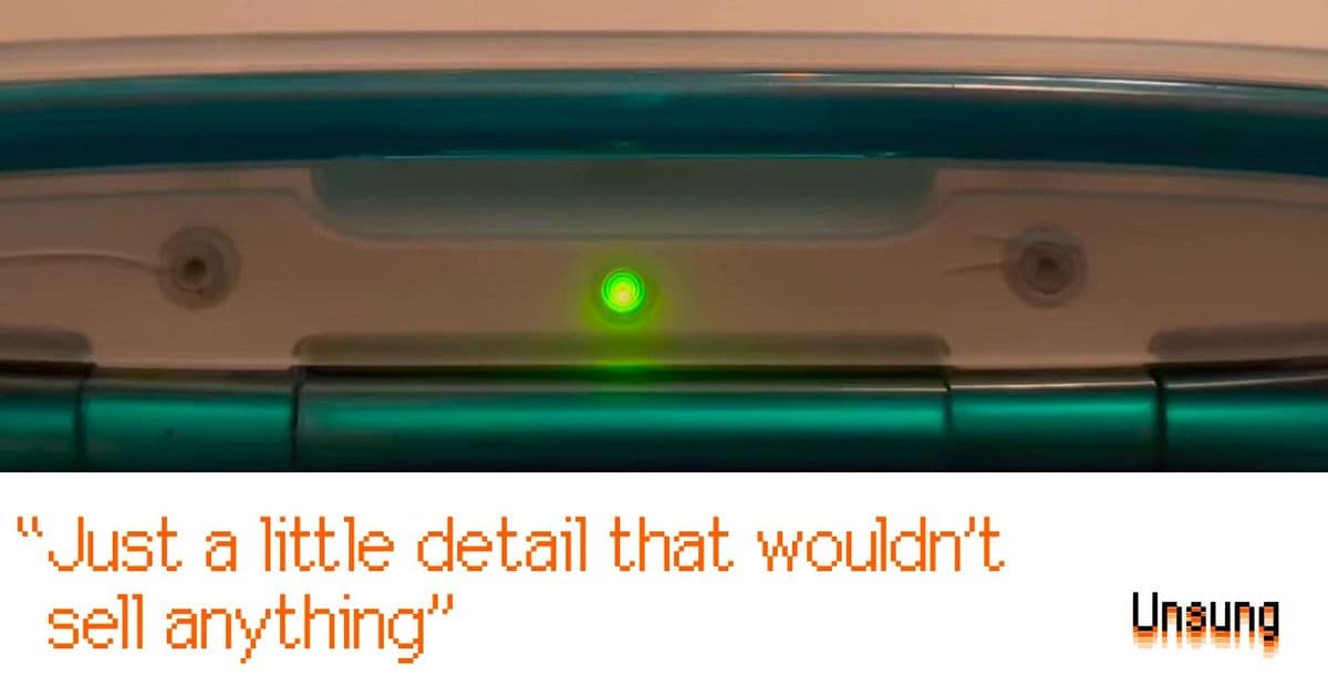
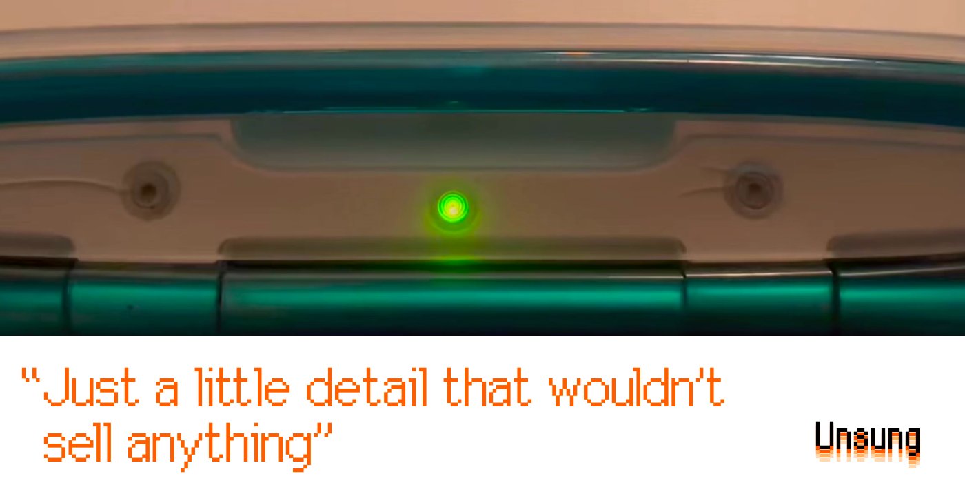
In the pantheon of Apple design innovations, few details have achieved the quiet cult status of the Sleep Indicator Light. What began as a simple green LED in the hinge of the 1999 iBook G3 evolved into something far more profound—a technological heartbeat that transformed a utilitarian status indicator into an object of emotional connection.
The genius of the breathing light lay not in its function, but in its philosophy. By programming the LED to pulse at 12 breaths per minute—the average human respiratory rate—Apple created what amounted to a digital companion. This wasn't merely a light that flashed to indicate sleep mode; it was a carefully choreographed animation designed to feel "comforting and soothing," as Apple's own documentation put it. The light became a presence, a gentle reminder that your machine was alive but resting, much like a sleeping pet curled beside you.
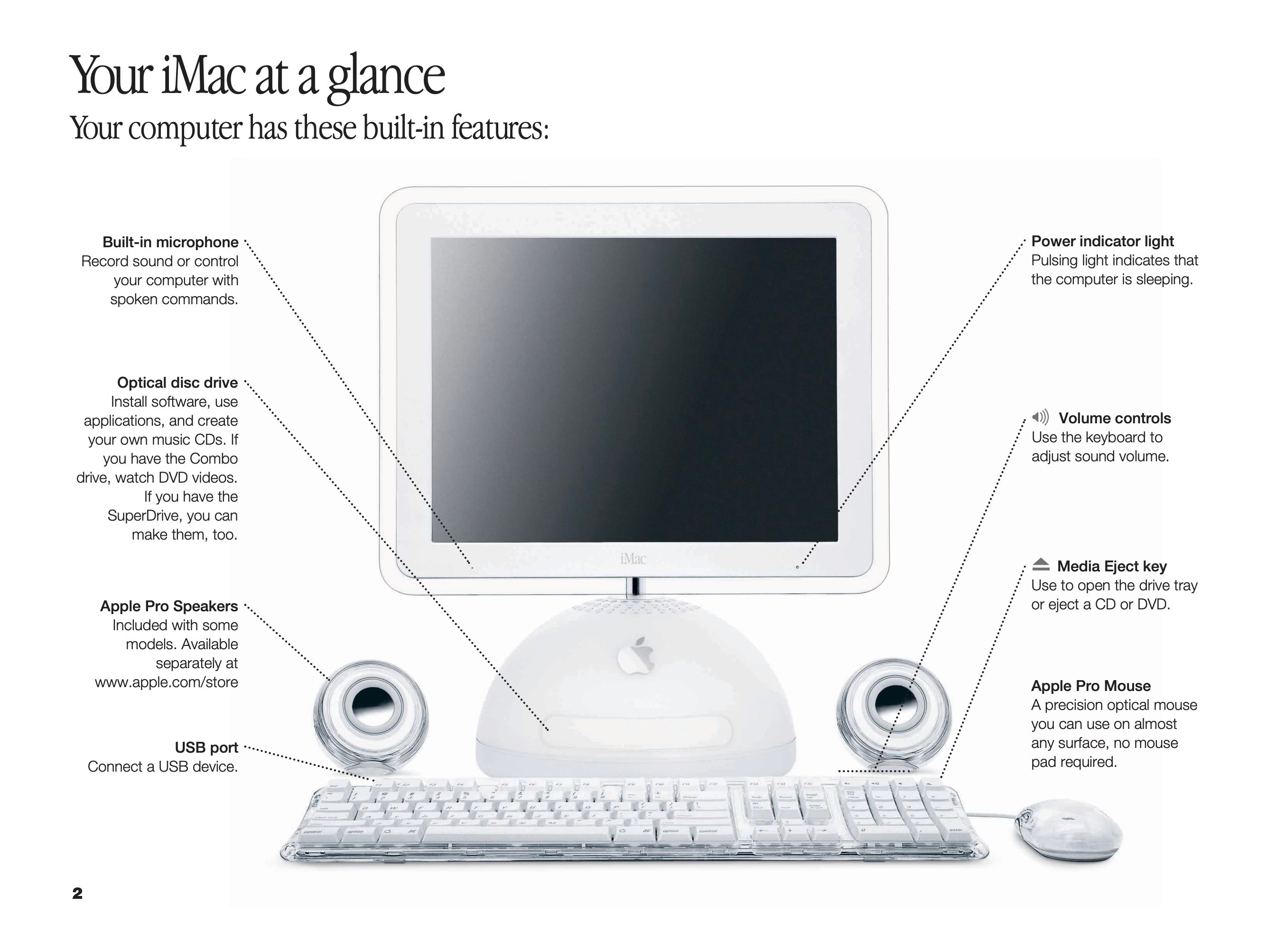
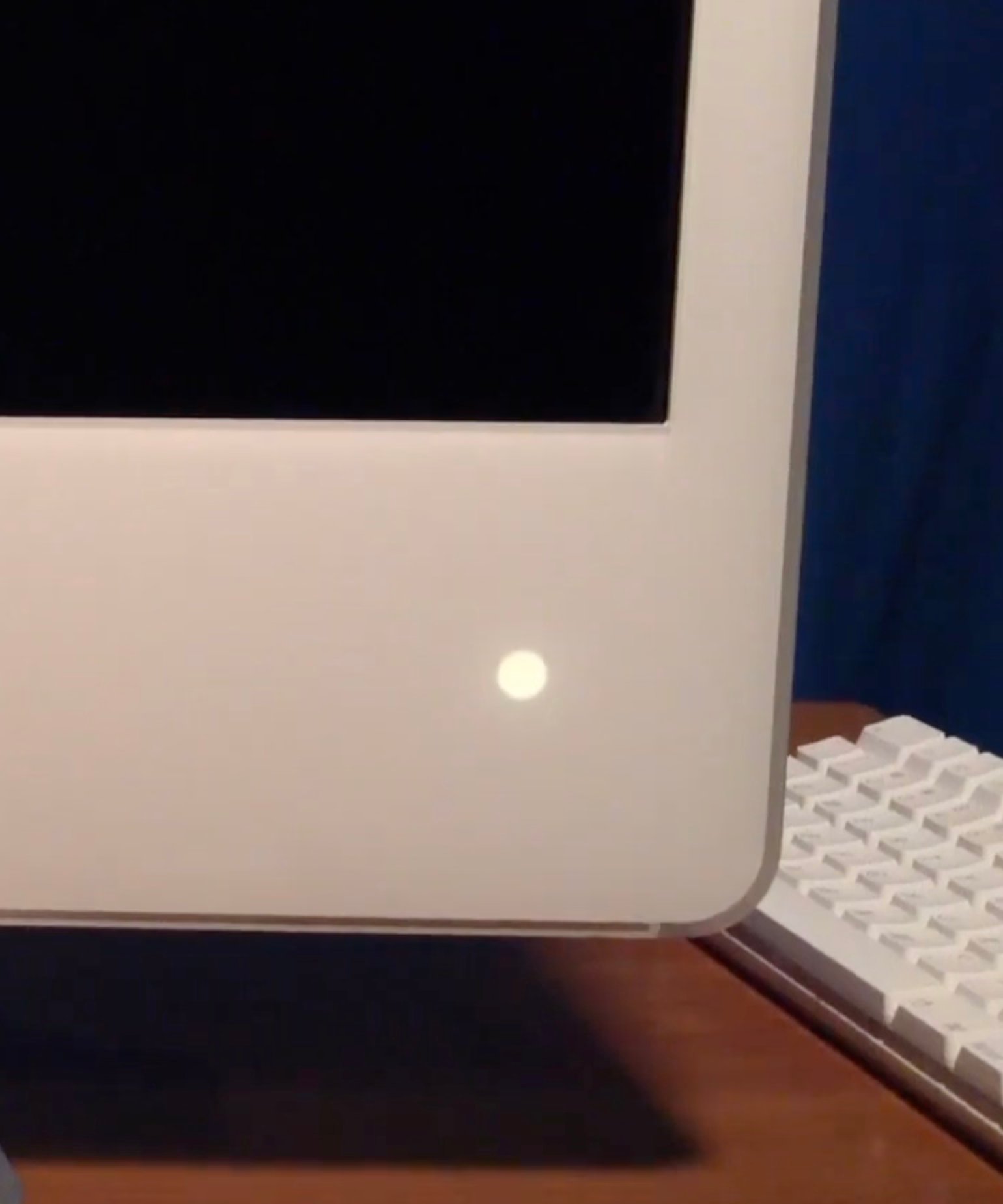
What followed was a masterclass in iterative refinement. The iMac G5 introduced a light sensor that adjusted the indicator's brightness based on ambient conditions—a practical improvement that also demonstrated Apple's attention to user experience in all contexts. Later MacBooks took this even further, embedding the light behind perforated aluminum that made it appear to shine through the metal itself. These weren't just technical achievements; they were expressions of a design ethos that valued the invisible details as much as the visible ones.
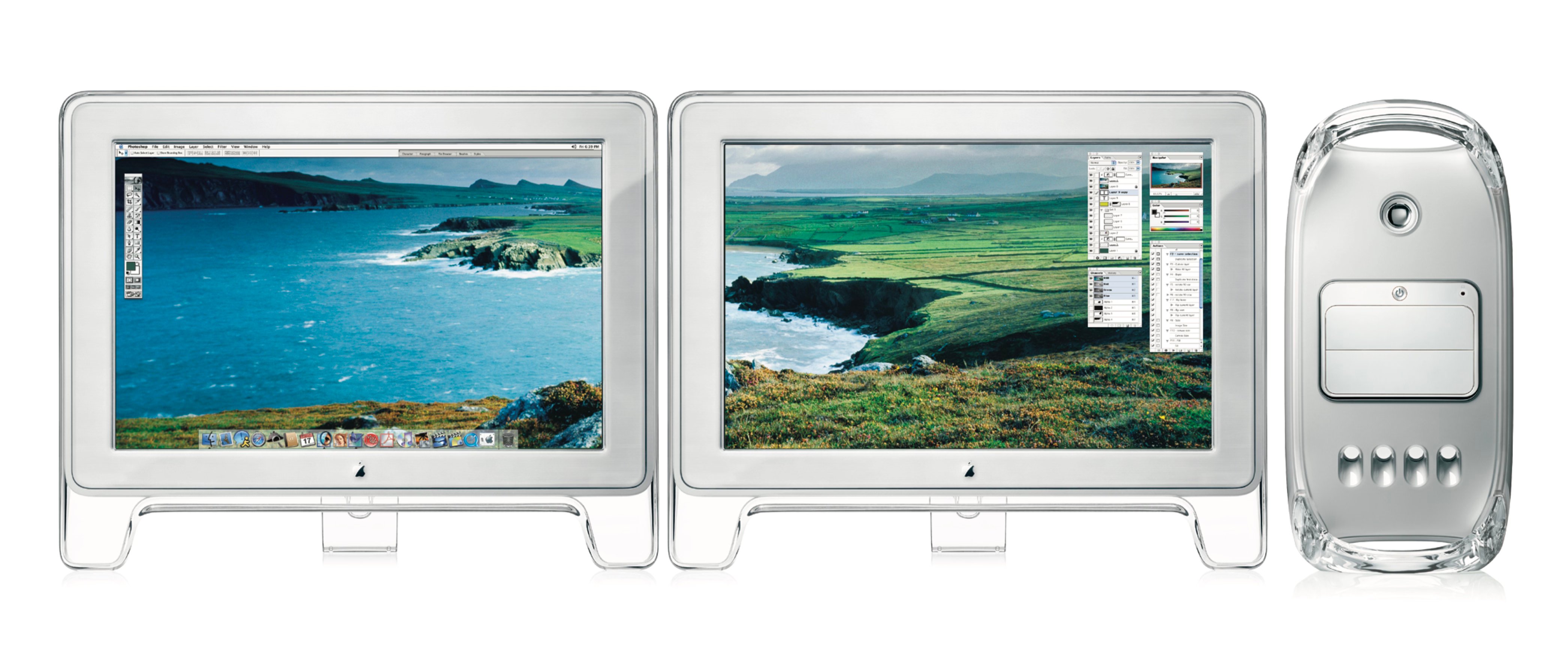
The most magical iteration, however, was never officially advertised. When a Power Mac G4 slept while connected to an Apple Cinema Display, both devices' sleep lights would pulse in perfect synchronization. This coordination between devices—achieved through the Apple Display Connector's bundled data channel—created the illusion of a unified system breathing as one. Users who discovered this feature often found themselves watching in quiet fascination, testing it repeatedly to confirm the perfect sync. It was a detail that served no marketing purpose, solved no user problem, and yet became a cherished secret among Apple enthusiasts.
The breathing light's disappearance in the early 2010s marked more than just the removal of a feature—it signaled a shift in Apple's design priorities. The same forces that eliminated the battery indicator and the illuminated logo on laptop lids also claimed the sleep light. In an era obsessed with ever-thinner devices and minimalist aesthetics, even beloved details became expendable.
Yet the nostalgia for this feature speaks to something deeper than mere sentimentality. The breathing light represented a moment when technology companies still believed in adding humanistic touches that served no purpose beyond delight. In an industry increasingly driven by metrics and utility, it stood as a reminder that machines could have personality, that they could be designed to feel less like tools and more like companions.
The practical arguments for the light's existence were sound—laptops of that era were notorious for failing to wake properly from sleep, and the indicator provided crucial feedback about whether it was safe to transport the device. But the breathing animation itself transcended utility. It was Apple's way of saying that technology needn't be cold and clinical; that even the smallest details could carry emotional weight.
Today, as we grapple with questions about our relationship with technology—its impact on our attention, our wellbeing, our humanity—the breathing light feels almost prophetic. It suggested a future where our devices might not just serve us, but understand us, where the line between tool and companion might blur in ways that felt natural rather than forced.
The irony, of course, is that in our current era of ambient computing and always-on devices, we might benefit more than ever from such gentle indicators of digital life cycles. As our homes fill with smart devices that communicate through abstract notifications and glowing rectangles, the simple, human-scaled communication of the breathing light feels increasingly relevant.
Perhaps the most fitting tribute to this feature is the community of enthusiasts who have tried to recreate it. From software simulations to hardware modifications, people continue to seek that particular blend of technical precision and emotional resonance. It suggests that while Apple may have moved on, the desire for technology that breathes—that lives and rests in ways we can understand—remains very much alive.
The breathing light may be gone, but its legacy endures in every thoughtful detail that reminds us technology can be more than just functional. It can be humane. It can be comforting. It can breathe.
Comments
Please log in or register to join the discussion