
Apple's shutdown of Dark Sky eliminates a data visualization masterpiece that transformed weather forecasting through context-sensitive design and hyperlocal precision.
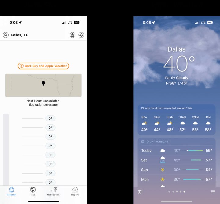
On January 1, 2023, Apple discontinued Dark Sky, the weather application acquired in 2020. While Apple integrated some forecasting technology into its native Weather app, the shutdown represents more than a feature migration—it eliminates what many considered a masterpiece of contextual data visualization. Dark Sky distinguished itself by transforming raw meteorological data into actionable insights through thoughtful interface design.
Beyond Forecasts: Contextual Weather Intelligence
Dark Sky addressed fundamental user questions differently than competitors:
- Will it rain in the next hour at my exact location?
- How should I dress for today's temperature fluctuations?
- Is this weekend suitable for outdoor plans?
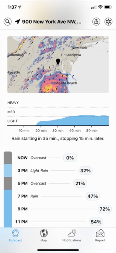
The app answered these through context-sensitive information graphics that adapted to immediate conditions. During approaching storms, precipitation probability dominated the interface. On clear days, temperature trends took priority. This dynamic presentation enabled users to grasp weather patterns within seconds.
Hyperlocal Precision and Design Innovations
Dark Sky offered neighborhood-level accuracy unavailable in city-wide forecasts. Users could compare conditions between home, workplace, and weekend destinations through simple location toggles. Several design elements contributed to its effectiveness:
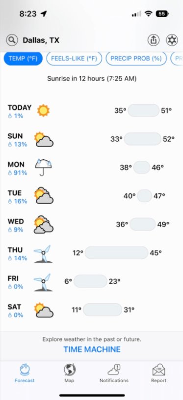
Magnitude-Preserving Temperature Charts Daily temperature ranges maintained proportional visual scaling, allowing intuitive comparison across days. A 20-degree swing appeared twice as wide as a 10-degree variation—unlike apps that compress all ranges into fixed spaces.
Categorical Weather Alerts Instead of precise rainfall measurements (e.g., 0.23"), Dark Sky used descriptive categories like "Light Rain" or "Heavy Snow." This reduced false precision perception while clarifying necessary actions.
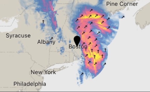
Visual Storm Tracking
Radar maps employed color gradients and directional arrows to show storm movement intensity. Wind patterns appeared as animated vectors rather than compass abbreviations, creating immediate spatial understanding.
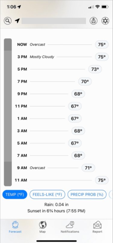
- Temporal Context All forecasts began at "Now" instead of arbitrary time blocks, emphasizing real-time relevance. Historical data required deliberate navigation via the "Time Machine" feature—a conscious choice prioritizing current needs.
User Impact and Industry Gap
Long-term users report diminished utility with Apple Weather. Reddit user TheGeckoDude noted: "The precipitation graph was super helpful for knowing when to take cover. Vague precipitation info won't cut it." Others miss the hyperlocal accuracy and efficient data presentation.
Dark Sky demonstrated how domain-specific data—when presented through thoughtful visualization—can become indispensable. Its approach holds lessons for applications beyond weather: financial planning tools could visualize spending against income fluctuations, or fitness apps might contextualize workout data against recovery needs.
The shutdown leaves a void in practical data visualization. As one user lamented: "Data alone isn't enough." Dark Sky succeeded by making meteorological data not just accessible, but actionable—a standard future applications should aspire to meet.
Featured image source: Nightingale DV Studio
Comments
Please log in or register to join the discussion