
A familiar Tailwind template look has gone from fresh to flag. After clicking through four random 'Show HN' projects, every one shared the same generated landing page, and that sameness now signals software that was prompted into existence rather than built with care.
Tailwind CSS earned its popularity honestly. It is a fast way to style a page, it stays out of your way, and the utility-class approach gives you a lot of control without writing custom stylesheets for every component. None of that is in dispute. The problem is one of pattern recognition: the framework produces a look you can spot from across the room, and that recognizability has quietly turned into a liability.
A few years ago the default Tailwind aesthetic read as clean and modern. Generous whitespace, a centered hero with a gradient, rounded cards, the same muted slate-and-indigo palette. It looked professional because not everyone was using it yet. That window has closed. Large language models overwhelmingly reach for Tailwind when asked to style a page, and they reach for the same handful of layout patterns inside it. The result is that the look no longer signals taste. It signals automation.
What the claim actually is
The argument is narrow and worth stating precisely: the issue is not Tailwind itself, and not even AI-assisted coding generally. It is that prompted marketing material has become the single clearest tell that a product was rushed out the door. When the brochure site is generated rather than designed, prospective users notice, often before they read a word of copy.
To test this, the exercise was simple. Search Hacker News for "Show HN," skip the bare GitHub repos, and click through to the actual hosted apps. The first four landing pages clicked were all variations of the same Tailwind frontpage template. Not similar in spirit. The same skeleton: hero headline, subheading, two call-to-action buttons, a feature grid, and a pricing section built from the stock three-column card layout.
The four exhibits
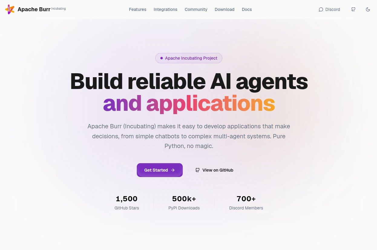
Apache Burr is a Python library that wraps something already straightforward in another layer of abstraction. The category of "library to simplify a thing that was not hard" is crowded, and the landing page does nothing to argue otherwise.
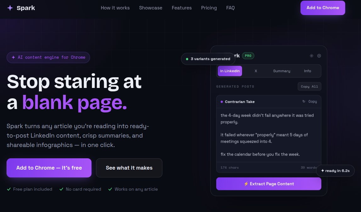
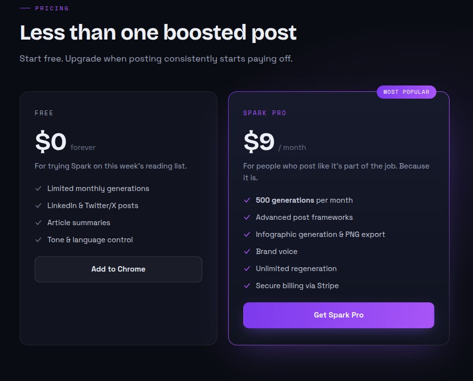
Spark generates a synopsis for LinkedIn posts, which raises the obvious question of why, given that LinkedIn already nudges you through exactly this. The functional overlap matters less than the presentation, which lands squarely in the generated-template category, pricing cards included.
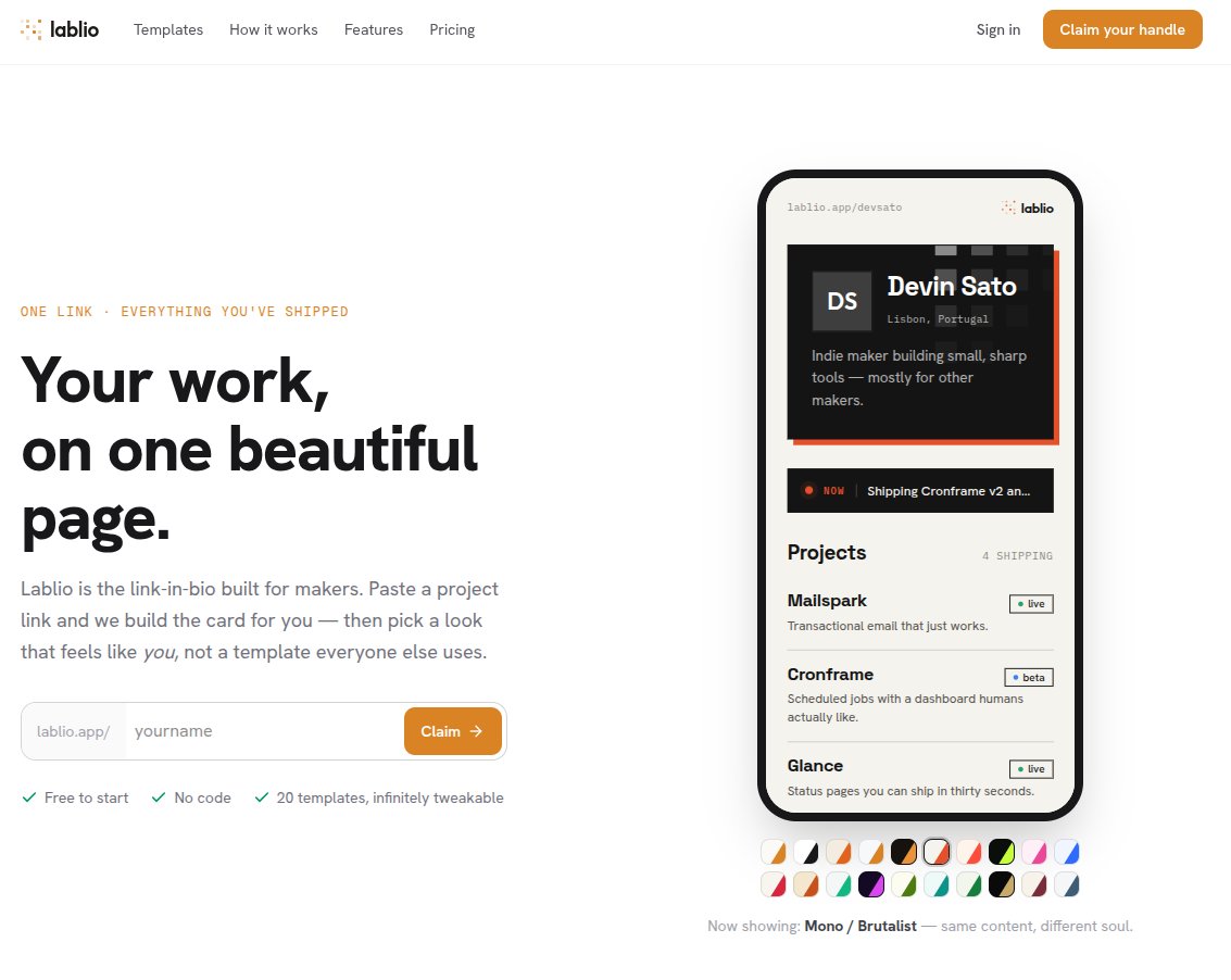
Labilo summarizes a webpage into a card, with the summarization itself free and "some extras" behind a paywall. Again, the giveaway is the pricing layout.
Artist Kit is harder to pin down. It appears to generate a webpage for DJs, with extras behind payment. And, predictably, the same price cards.
The recurring detail across all four is the pricing component: the identical three-tier card grid, one tier highlighted as "most popular," the same spacing and shadow treatment. It is the most copied UI block on the web right now, and it has become shorthand for "an LLM assembled this."
Why the pattern emerges
There is a mechanical reason the outputs converge. When you prompt a model to "make a stylish homepage for my product," you are asking it to predict the most probable arrangement of a marketing page. The most probable arrangement is, by definition, the one it has seen most often in training data. Tailwind's official component examples and the thousands of pages that copied them form a dense cluster in that data. The model lands on the center of that cluster almost every time.
This is the same dynamic that makes generated prose feel flat. The model is optimizing for the expected, and the expected is exactly what fails to distinguish your product from the next one. A landing page's entire job is to differentiate, so handing that job to a system that regresses toward the mean is self-defeating.
The trade-off worth naming
None of this is an argument against shipping fast or using these tools to scaffold. The trade-off is specific. Generated UI is fine for internal tooling, prototypes, and anything where the audience already knows why they are there. It fails on the one surface where strangers form a first impression in two seconds. A user who has seen the same hero and the same pricing cards a thousand times reads the sameness as a lack of investment, and they are usually right.
The fix costs less than it seems. You do not need a design system or a custom framework. Changing the type scale, picking a palette that is not the default, breaking the symmetrical hero, and writing pricing copy that does not snap to the three-card grid is often enough to move a page out of the uncanny valley. The signal you are fighting is uniformity, and uniformity is cheap to break.
The broader point holds beyond Tailwind. As generation gets cheaper, the artifacts of generation become more recognizable, and recognizability becomes reputation. If you care about the product, the cheapest way to show it is to spend an hour making the front door look like a person stood at it.
Comments
Please log in or register to join the discussion