CSS-Tricks demonstrates how modern CSS features—scroll timelines, view timelines, and grid layout—can recreate Apple's complex Vision Pro product animation without JavaScript, detailing the problem-solving process for responsiveness, layering, and cross-browser limitations while highlighting what this means for the future of web animation.
Apple’s product pages have long set a benchmark for immersive, scroll-driven animations that blend 3D effects with precise timing. Traditionally, achieving this level of polish required JavaScript libraries or video sequences, often sacrificing responsiveness at certain breakpoints. A recent CSS-Tricks experiment pushes the boundaries further by attempting to rebuild the Vision Pro’s signature 'teardown' animation using only modern CSS features—specifically scroll-linked animations, custom properties, and grid layout—while maintaining responsiveness across viewport sizes. The result isn’t just a technical curiosity; it reveals how CSS is evolving to handle interactions previously dominated by JavaScript, though with important caveats about browser support and performance trade-offs.
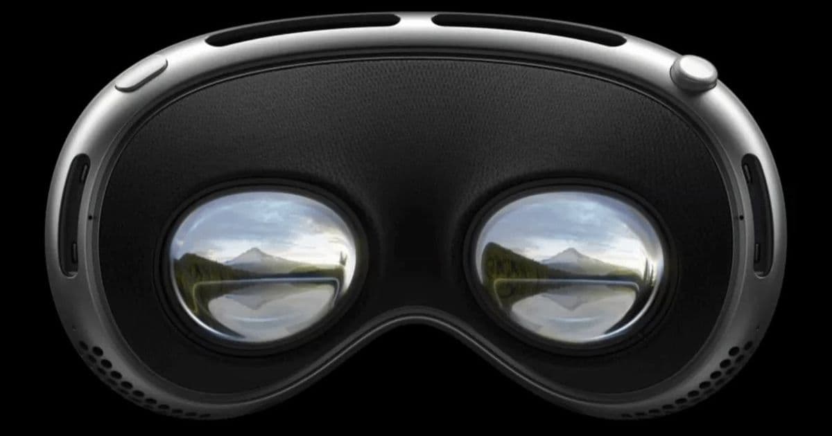
The animation consists of two distinct stages. First, three hardware components (represented as six images) rise sequentially from the device base in a layered 'exploding' effect, where each component appears to pass both in front of and behind others through strategic transparency. Second, the entire device flips upward to reveal the eyepieces—a sequence Apple implements via video playback controlled by scroll position. The CSS recreation tackles each stage separately, leveraging recent specifications to avoid JavaScript where possible.
For the exploding hardware stage, the author initially struggled with traditional positioning approaches. Using position: absolute caused responsiveness issues as images overflowed narrow viewports, while position: fixed prevented the natural scroll-in/scroll-out behavior seen on Apple’s site. The breakthrough came by treating the images as CSS grid items. By setting the container to display: grid with a single 1fr column and row, and assigning all images to the same grid area (grid-area: 1 / 1 / 2 / 2), the elements stack naturally without being removed from the document flow. This approach maintains aspect ratio via background-size: cover and allows responsive scaling through viewport units. Crucially, it keeps the images within the normal layout flow, enabling them to scroll with the page as intended.
Layering presented another challenge. Simply translating elements upward caused the browser’s rendering engine to reorder them incorrectly (placing the 'sub roll' component entirely atop the 'hot dog bun', etc.). The solution involved z-index to manually control stacking order, preserving the intended depth effect where transparent image sections reveal underlying layers. Responsiveness for the translation distances required careful math: since the base image scales with viewport width (capped at its native 960px), the author derived a custom property (--stage2-height) using calc(min(100vw, 960px) * 608 / 960) to maintain proportional vertical movement. A media query adjusts this for very short viewports where height becomes the constraining dimension, ensuring components move sufficiently clear for the second stage without exiting the viewport.
The flip-up stage highlights CSS’s current limitations. Since CSS cannot natively control video playback or frame rates, the author recreated the video sequence as a series of keyframes swapping background images—a technique that demands preloading 60+ individual frames to avoid choppiness. While functional, this approach increases HTTP requests compared to a single video file, though <link rel="preload"> mitigates initial delay by prioritizing image downloads. The animation uses a shared view timeline (--apple-vp) for both the positional movement and the image sequence, with animation-range fine-tuning the timing: contain cover ensures components animate only when fully visible, while cover 10% contain for the flip-up prevents it from cutting off prematurely as the element exits view.
Browser support reveals a significant constraint: the implementation relies on scroll-driven animations (specifically view() timelines), which remain unsupported in Firefox as of this writing and require experimental flags in Safari. Apple’s original JavaScript-based version works universally, underscoring that CSS-only solutions aren’t yet a complete replacement for complex interactions. However, the experiment showcases how emerging CSS capabilities are closing the gap—features like scroll timelines, view timelines, and advanced calc() expressions enable effects that would have required JavaScript just a few years ago.
From a developer experience perspective, this approach shifts complexity from scripting to stylesheet architecture. Managing 60+ image frames for a simple animation illustrates the maintenance burden of pure-CSS alternatives, though techniques like CSS sprites could reduce requests at the cost of flexibility. The use of custom properties for responsive calculations demonstrates how CSS variables can encapsulate complex logic, making adjustments more centralized than scattered JavaScript constants. For user impact, the CSS version maintains the visual fidelity of Apple’s animation while potentially reducing JavaScript execution time on scroll—a meaningful consideration for pages where scroll handlers often cause jank. The trade-off lies in increased image payload and browser compatibility gaps, suggesting this technique suits progressive enhancement scenarios where a static fallback serves unsupported browsers.
This experiment reflects a broader maturation of CSS as a language for interactive design. Where once scroll-linked animations demanded JavaScript orchestration, specifications like Scroll-Driven Animations now allow declarative, timeline-based interactions directly in stylesheets. Combined with container queries and subgrid, these features enable more resilient, responsive interactions that adapt to both viewport size and user behavior. While not yet ready to replace JavaScript for all animation needs—particularly those requiring precise media control—the Vision Pro recreation proves CSS is increasingly capable of handling sophisticated, scroll-triggered visual storytelling. As browser support expands, we may see more product pages adopt similar techniques, reducing JavaScript overhead while preserving the polished, immersive experiences users expect from premium brands.
Comments
Please log in or register to join the discussion