A developer's walkthrough of Ryanair's 2026 check-in flow counts nine separate decision points engineered to extract extra payment. It's a reminder that dark patterns haven't gone away, even as regulators sharpen their tools and the broader community keeps arguing about whether anyone actually minds.
Dan O'Sullivan's recent blog post walking through Ryanair's summer 2026 check-in process landed at an interesting moment. Dark patterns, the deliberate interface tricks that nudge users toward choices they didn't intend to make, have been a named concept since Harry Brignull coined the term back in 2010. Sixteen years later, the airline that O'Sullivan calls a master of the form is still running what he counts as nine distinct stages a passenger must navigate to avoid paying for things they never asked for.
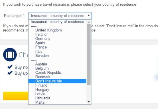
The canonical example he reaches for is almost folklore among interface designers now. To decline travel insurance, you don't click a button labeled "No insurance." Instead you scroll an alphabetical country dropdown and select "Don't Insure Me," tucked between Denmark and Finland, exactly where a hurried user scanning for their own country would never think to look.

The pattern catalog, fully stocked
What makes O'Sullivan's writeup useful is that it's essentially a field taxonomy. Each stage maps to a documented pattern type. The return-flight check-in that quietly costs money is a sneak-into-basket variant. The "random seat" option dressed up with warnings about its "precarious and unsettling nature" is confirmshaming, where declining the paid choice is framed as reckless. The priority-bags upsell with no "No" button, forcing you to dismiss the window instead, is a textbook example of asymmetric choice architecture: the path the company wants is a button, the path you want is a chore.
The single-bag warning about gate charges sits in a grayer zone. O'Sullivan, to his credit, notes he watched a couple get caught at the gate and sided with the staff. Not every friction point is malicious. Some warnings are genuine. That ambiguity is precisely what makes the category hard to legislate, because the same modal can be a fair disclosure or a scare tactic depending on framing and intent.
Why this keeps working
The uncomfortable counter-argument, and the one that gets less airtime in design circles, is that Ryanair is Europe's most profitable airline partly because of all this, not despite it. The friction is the business model. Unbundling every conceivable add-on and then defending the base fare as genuinely cheap is a strategy that survives because enough passengers either pay the upsells or tolerate the gauntlet to reach the low price underneath.
That creates a real tension the developer community tends to gloss over. The Deceptive Design project and academics like Brignull frame these patterns as straightforwardly unethical. But from a pure outcomes view, a transparent airline that bundled everything into a higher fixed price might serve fewer price-sensitive travelers. The patterns are extractive, yet the company would argue they subsidize a fare structure people demonstrably choose. Both things can be true at once, which is why "just ban it" runs into trouble fast.
The regulatory tide
The legal picture has shifted more than the interfaces have. The EU's Digital Services Act explicitly prohibits dark patterns on the platforms it covers, and the Digital Markets Act adds constraints for designated gatekeepers. In the US, the FTC has brought enforcement actions over subscription dark patterns and tricky cancellation flows. The GDPR already constrains consent interfaces, which is why cookie banners got their own redesign wars.
The gap O'Sullivan's post illustrates is that airline booking flows have largely escaped the sharpest edges of this enforcement so far. The DSA targets intermediary and platform services. A carrier selling its own seats occupies different regulatory ground than a marketplace or a gatekeeper. So the patterns persist in plain sight while the legal machinery focuses elsewhere.
What the community actually disagrees about
Dig through the threads on Hacker News whenever a post like this surfaces, and the split is consistent. One camp treats every upsell as a moral failing and wants strict liability for confusing flows. Another camp, often including people who build commerce software, points out that defining a dark pattern precisely enough to regulate is genuinely hard. A confirmation step that protects users from a costly mistake and a confirmation step engineered to wear them down can look identical in the DOM.
The more interesting position sits between those poles. The problem isn't friction itself, it's intent encoded in asymmetry. When the desired-by-the-company action is always one tap and the desired-by-the-user action is always buried, scrolled past, or alphabetized into oblivion, the aggregate signal becomes unmistakable even if no single screen is provably abusive. Nine stages is the tell. One disclosure is prudence. Nine is a design philosophy.
O'Sullivan ends on something genuinely practical, and it doubles as a small act of resistance: check in for Ryanair at the last possible moment, because once the bad seats are gone the algorithm has to hand you a good one. He scored an exit aisle that way. For Lufthansa, he advises the opposite, check in early, because they assign visibly and fill front to back in what he calls a refreshingly old-fashioned manner. That asymmetry between the two carriers is the whole story in miniature. One airline shows you what you're getting and lets you optionally pay to improve it. The other turns the same transaction into a maze and counts on you taking a wrong turn.
Comments
Please log in or register to join the discussion