A Fable-led study running the same usability tasks past cognitive and general-population testers found that participants with cognitive disabilities surfaced nearly twice as many issues and suggestions. The takeaway for product teams: cognitive inclusion isn't a niche accessibility line item, it's a faster path to clearer content and simpler flows for everyone.
Kate Kalcevich, VP of Innovation at Fable, set out to test a hunch that had been forming over years of accessibility work: that participants with cognitive disabilities would surface more usability problems than the general-population testers most product teams rely on. The resulting exploratory study, run in collaboration with researchers at the University of California, Irvine, put numbers behind the instinct. Across three websites and 30 user interviews, cognitive participants identified 1.8 times more issues and made 1.8 times more suggestions than their gen-pop counterparts.
For anyone building interfaces, that ratio is the headline. It reframes cognitive inclusion from a compliance checkbox into a research multiplier, and it has direct consequences for how teams recruit testers and interpret what comes back.
What the study actually measured
Cognitive disability is an umbrella term covering conditions that affect how people process information, typically touching memory, focus, and learning. Per the CDC, it's the most prevalent disability in the U.S. at 13.9% of the population, and the category includes neurodivergence: dyslexia, ADHD, and autism among them. The study screened participants on self-identified challenges with memory, focus, and learning, then split them into two groups based on whether they reported cognitive challenges or not.
To avoid testing on a single design pattern, the team generated three distinct sites with an AI prototyping tool, each with different goals and content:
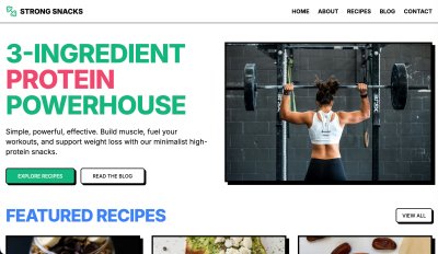
- Strong Snacks, a brutalist, image-heavy site for three-ingredient high-protein recipes, with category filtering and a newsletter signup.
- Turning Pages, a moody bookstore with the most varied functionality of the three: genre filtering, a book-swiping feature, custom lists, a cart, and checkout.
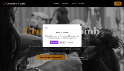
- Crown & Comb, a deliberately complex hair-salon booking site, with one task (finding the bridal package) built to be extremely hard.
Each site got 10 sessions, evenly split 5/5 between cognitive and gen-pop participants. Every participant ran all the tasks for their assigned site and finished with an Accessible Usability Scale (AUS) survey, a free, Creative Commons-licensed 10-question instrument scored 0 to 100, where higher means better usability.
Kalcevich counted every concern, question, difficulty, or point of confusion as an issue, including things participants missed without noticing, like a required P.O. Box checkbox. Suggestions were tallied separately. Critically, all the counting was done by one person across all sessions, which controls for one obvious source of noise even as other variables stay loose.
The numbers
The aggregate result: cognitive participants flagged 197 issues against 113 for gen pop, and offered 93 suggestions against 54. The per-site breakdown is where it gets interesting for designers.
On Strong Snacks, the simplest site, cognitive participants averaged 3.4 more issues and rated the experience 13.7 AUS points lower (median 73.0 vs 97.5). Even on an easy, well-built page, the extra scrutiny found more.
On Turning Pages, the functionality-heavy site, the gap widened to 6 more issues on average and a 17.2-point lower AUS score. Much of that concentrated in buttons and links: cognitive participants logged 20 issues there against gen pop's 7. The interactions, not the visuals, were the dominant friction.
Crown & Comb produced the study's most counterintuitive result. Cognitive participants found 7 more issues on average, yet scored the site higher than gen pop did (median 68.0 vs 35.0). They also scored Crown & Comb higher than Turning Pages, while gen pop did the reverse. Kalcevich's read is that the sheer volume of interaction problems on Turning Pages dragged down cognitive participants' perception of usability more than it did for gen pop. It's a useful reminder that issue counts and satisfaction scores don't move in lockstep, and that perceived usability is its own signal worth tracking.
The qualitative gap is the real story
Issue counts are easy to put in a table. The harder-to-quantify difference is in the texture of the feedback. Gen-pop participants tended to give shorter responses and stop once a task was done. Cognitive participants explained why something was hard to find or confusing, and they flagged conceptual and comprehension barriers that the other group simply didn't raise.
The two lowest-scoring participants on Crown & Comb illustrate it. The gen-pop tester described the booking flow as frustrating and not engaging, focused on the broken interaction of seeing a service repeated but being unable to select it. The cognitive tester described the same experience in terms of mental energy: cookies, ads, pop-ups, too many options, the cumulative effect being that they felt drained and less able to focus. One is a bug report. The other is a description of cognitive load as lived experience, and it points at a class of problem that conventional task-completion metrics never capture.
Grouped by category, cognitive participants surfaced more issues with content, buttons and links, icons and visual elements, and media. Navigation was the one near-tie (45 vs 46). That distribution matters because none of those categories is exotic. They're the bread and butter of everyday UX work, which is exactly Kalcevich's point.
Why this generalizes beyond accessibility
The cognitive-load issues these participants raised don't stay confined to people with diagnosed disabilities. Kalcevich connects them to three large and growing audiences: Gen Z users accustomed to short-form video and prone to struggle with long written content, seniors experiencing age-related cognitive decline, and busy working adults whose attention is perpetually fragmented. The U.S. Census projects the over-65 share of the population rising from 17% to 25% by 2060. Designing for cognitive clarity is, increasingly, designing for the median user.
The site-by-site findings read like a catalog of revenue and trust risks that a team without cognitive testers might have shipped:
- On Strong Snacks, participants wanted source links for health claims to trust the content, clearer headlines, a clarified "Add-ons" label, and recipe snippets moved out of the article flow into a distinct sidebar. They also flagged how continuous animation and ads pulled focus away from reading.
- On Turning Pages, the "Add to book bag" button behaved unpredictably and the provenance of reviews and recommendations was unclear. Both erode trust, and ambiguity in a purchase flow compounds into lost revenue across thousands of users.
- On Crown & Comb, testers questioned why a service was "subject to stylist consultation," couldn't tell near-identical service labels apart, and were unsure when or how they'd pay. Date selection arriving late in the booking flow was a recurring stumble.

The through-line is predictability. Gen-pop users muddle through ambiguous interfaces; cognitive participants articulate exactly where the interface stops behaving in ways they can anticipate. Kalcevich draws the boundary this way: when ambiguity, decision count, missing feedback, and effort-to-find stack up high enough, a usability annoyance crosses into an accessibility barrier, the point where some users can't complete the task at all rather than merely disliking it.
Practical takeaways for product teams
The study lands on four recommendations that are straightforward to act on:
- Recruit cognitive participants into general usability research, not just dedicated accessibility studies. They find the everyday issues your team already cares about, plus the cognitive-load dimension you're probably missing.
- Treat cognitive issues as both usability and accessibility problems. Tasks heavy on memory, focus, and decision-making sit on a continuum from difficult to impossible depending on the user.
- Track more than task completion. Ask how a task affected someone's energy, how distractions hit their focus, how hard it felt. Those questions surface the wellbeing impact the AUS scores only hint at.
- Start small. Even a handful of sessions builds the practice. One UX manager at Bell Media quoted in the study put it as "2 sessions with cognitive users feel like 200 because of the volume of insights we get."
Kalcevich frames cognitive accessibility as an on-ramp to broader accessibility work. Teams that don't yet know how to test with screen reader, magnifier, or alternative-navigation users can begin with cognitive load, clarity, and predictability, which map onto familiar UX concerns, and build the muscle for harder assistive-technology research later.
Read the caveats
To her credit, Kalcevich is direct about the study's limits. The sample is small, making the findings more qualitative than statistically validated. The two groups were run on different platforms, cognitive sessions on Fable Engage and gen-pop sessions on UserFeel, which she discloses was a cost decision, and different platforms carry different participant panels and comfort levels. Different facilitators ran the interviews, though all used the same task structure and discussion guide, and a single person did all the issue counting to keep that consistent. The sites themselves were AI-generated prototypes rather than production products, though Kalcevich notes she has seen comparable results in research on Fable customers' real sites.
None of that undoes the central observation. Whether the true multiplier is 1.8x or something else in a larger sample, the qualitative pattern is hard to dismiss: cognitive participants describe a layer of experience that standard testing leaves invisible, and that layer maps onto problems affecting a large and expanding share of every product's actual audience. For frontend and UX teams weighing where to spend limited research budget, that's a strong argument for widening who sits in the testing seat.
For teams ready to start, Kalcevich points to the W3C supplemental guidance on cognitive accessibility, the cognitive accessibility task force, and MDN's overview of how WCAG maps to cognitive supports as places to begin.
Comments
Please log in or register to join the discussion