Daniel Stenberg reflects on creating a comprehensive dashboard that visualizes curl's development through 100 graphs, transforming raw data into insights about the project's health and growth.
When Daniel Stenberg launched the curl project's dashboard in March 2020, he envisioned something more sophisticated than GitHub's basic graphs. The goal was to create a comprehensive visualization system that would serve as a "medical device" for monitoring the project's health, allowing developers to quickly assess curl's development status from multiple angles.
From Twenty to One Hundred: A Visual Journey
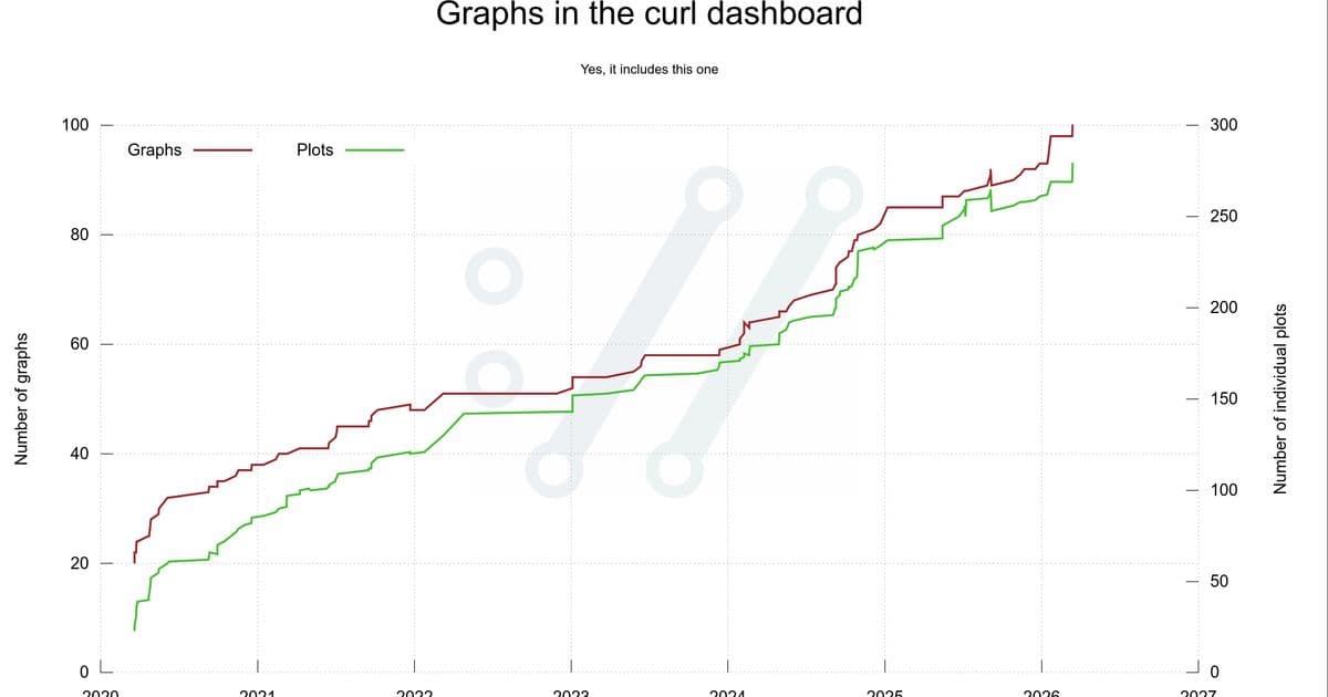
The dashboard debuted with twenty graphs on March 20, 2020, but has since grown to one hundred graphs featuring nearly 300 individual plots. This expansion reflects not just the project's growth, but Stenberg's evolving understanding of what data could reveal about curl's development patterns.
Initially, Stenberg imagined simple timeline graphs showing code growth and command-line options over time. "I imagined that it would be a small number of graphs mostly showing timelines with plots growing from lower left to upper right," he recalls. "It would turn out to be a little naive."
The Technical Foundation
Stenberg chose gnuplot, a 40-year-old command-line tool, as his visualization engine. Despite its age, gnuplot proved powerful enough to handle virtually any graph, plot, or curve configuration needed. The decision to generate static SVG images rather than using JavaScript frameworks aligned with curl's website philosophy of minimal JavaScript usage.
The data pipeline involves two distinct steps: first, gathering and formatting data with custom scripts, then rendering images using gnuplot. This separation makes it easy to work on individual graphs, tune them independently, and examine the underlying data when needed.
Open Data, Open Insights
All data powering the graphs comes from open sources: the git repository, GitHub issues, mailing list archives, curl vulnerability data, HackerOne reports, and historic curl details. This transparency aligns with curl's open development philosophy.
The 100th Graph and Beyond
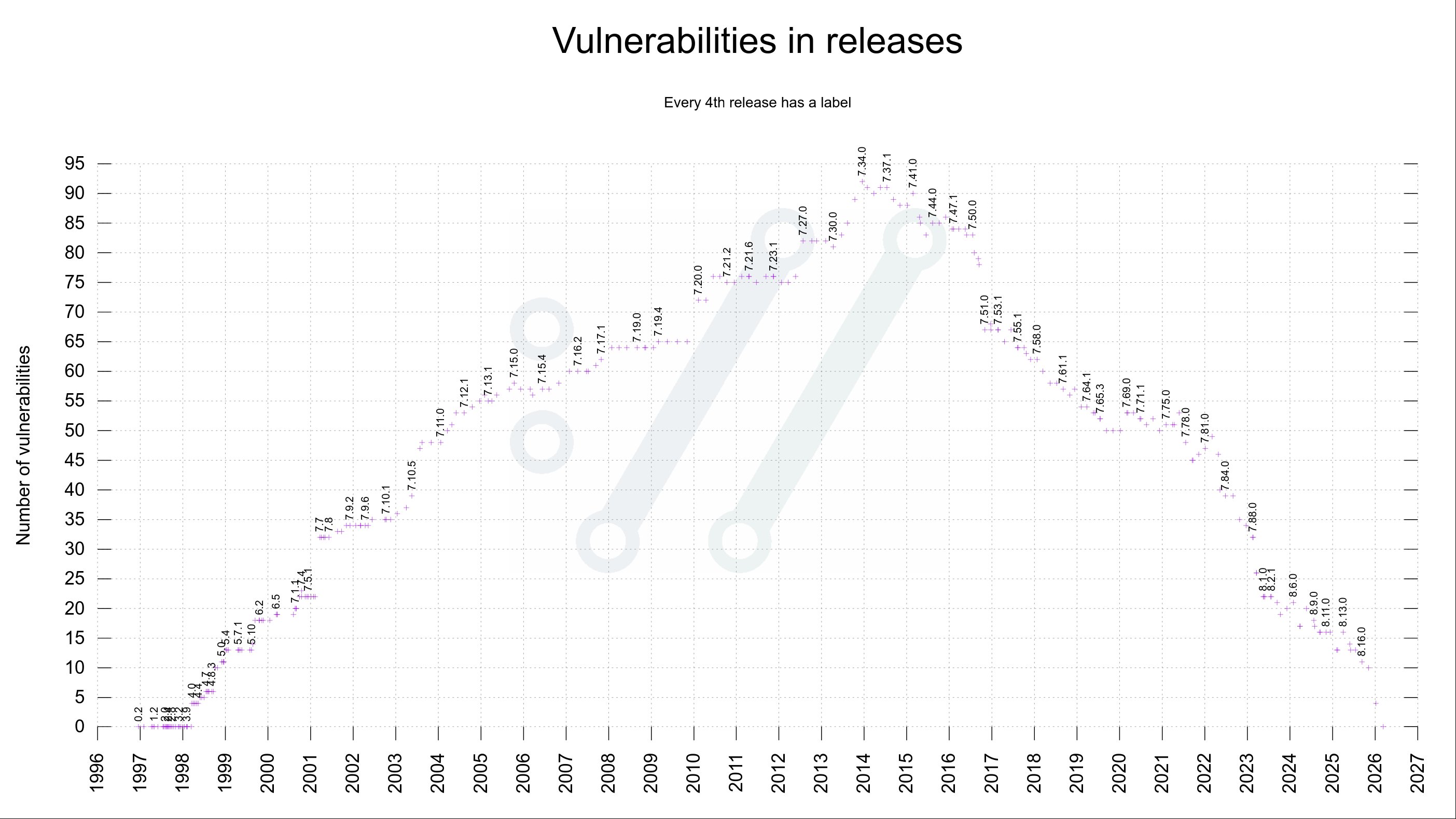
On March 15, 2026, Stenberg added the 100th graph: a visualization of vulnerabilities in past releases. This graph had been removed previously due to readability issues but returned with a new design showing labels only for every fourth release. The same day also introduced an 8-column display mode for better dashboard organization.
Meta-Visualization: The Graph of Graphs
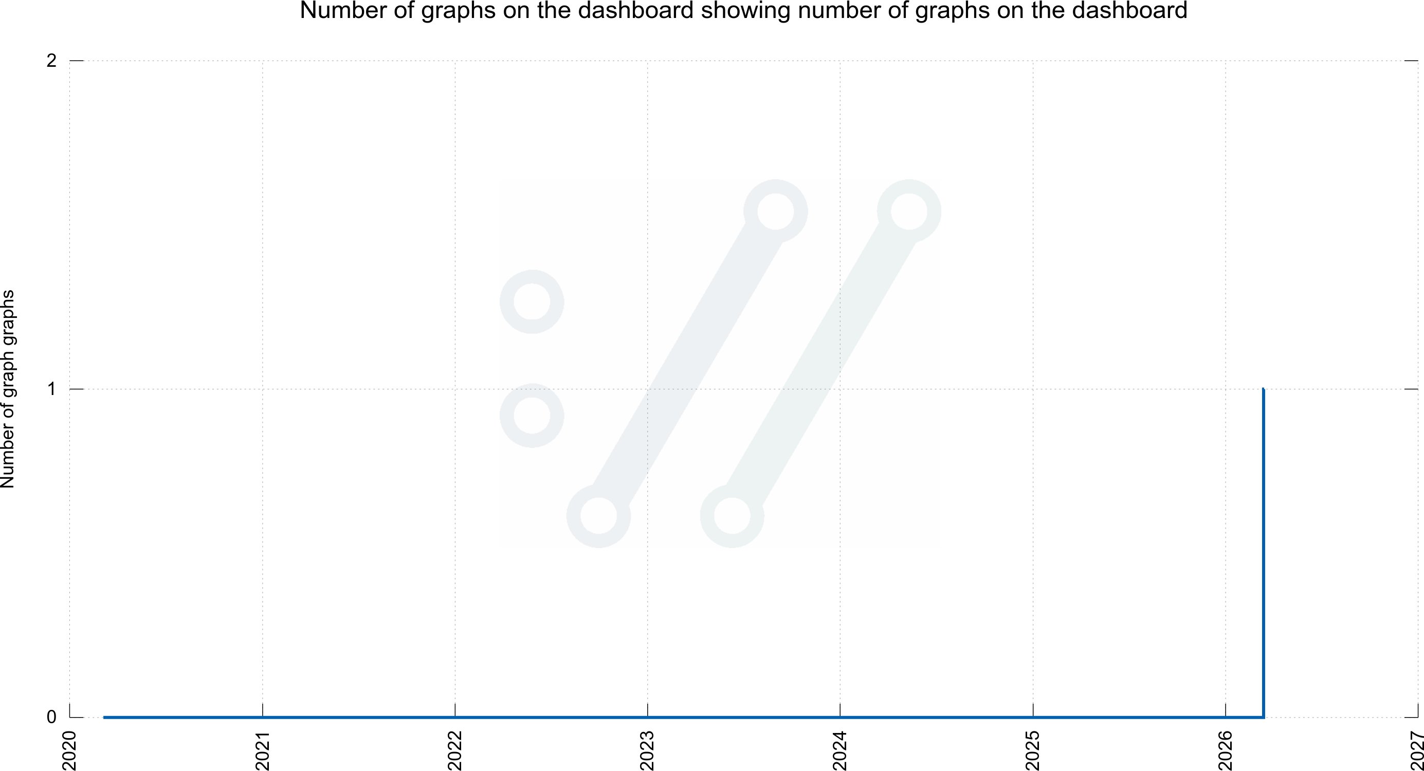
One of the dashboard's most popular features emerged from community jokes on Mastodon. When users repeatedly asked for a graph showing the number of graphs on the dashboard, Stenberg created exactly that. Taking it further, he even produced a graph showing the number of graphs for graphs—a meta-level visualization that, while not on the main dashboard, demonstrates the playful spirit behind the project.
Practical Applications
Beyond entertainment, these visualizations serve serious purposes. They help the curl team assess development patterns, identify trends, and make informed decisions about the project's future. Stenberg has used these graphs extensively in blog posts, Mastodon threads, and public presentations to communicate curl's development progress.
Looking Forward
The dashboard continues to evolve. While the scripts and setup are specifically tailored to curl's circumstances and data, they remain open and available for others to adapt. Stenberg welcomes suggestions for new visualizations that could reveal interesting aspects of curl's development or potentially be applied to other open-source projects.
The journey from twenty to one hundred graphs represents more than just data visualization—it's a testament to how creative approaches to project metrics can transform raw numbers into meaningful insights about software development's evolution.
Comments
Please log in or register to join the discussion