
Apple spent macOS 26 Tahoe slapping an icon on every menu item, a move it explicitly warned developers against in its own guidelines back in 1992. With macOS 27 Golden Gate now in developers' hands, the company has quietly reversed course and updated its Human Interface Guidelines to say what it said three decades ago: use menu icons sparingly.
Apple is telling developers not to do the thing Apple did in macOS 26 Tahoe. That is the short version of a small but telling design correction landing in macOS 27 Golden Gate, now available for developers to test.
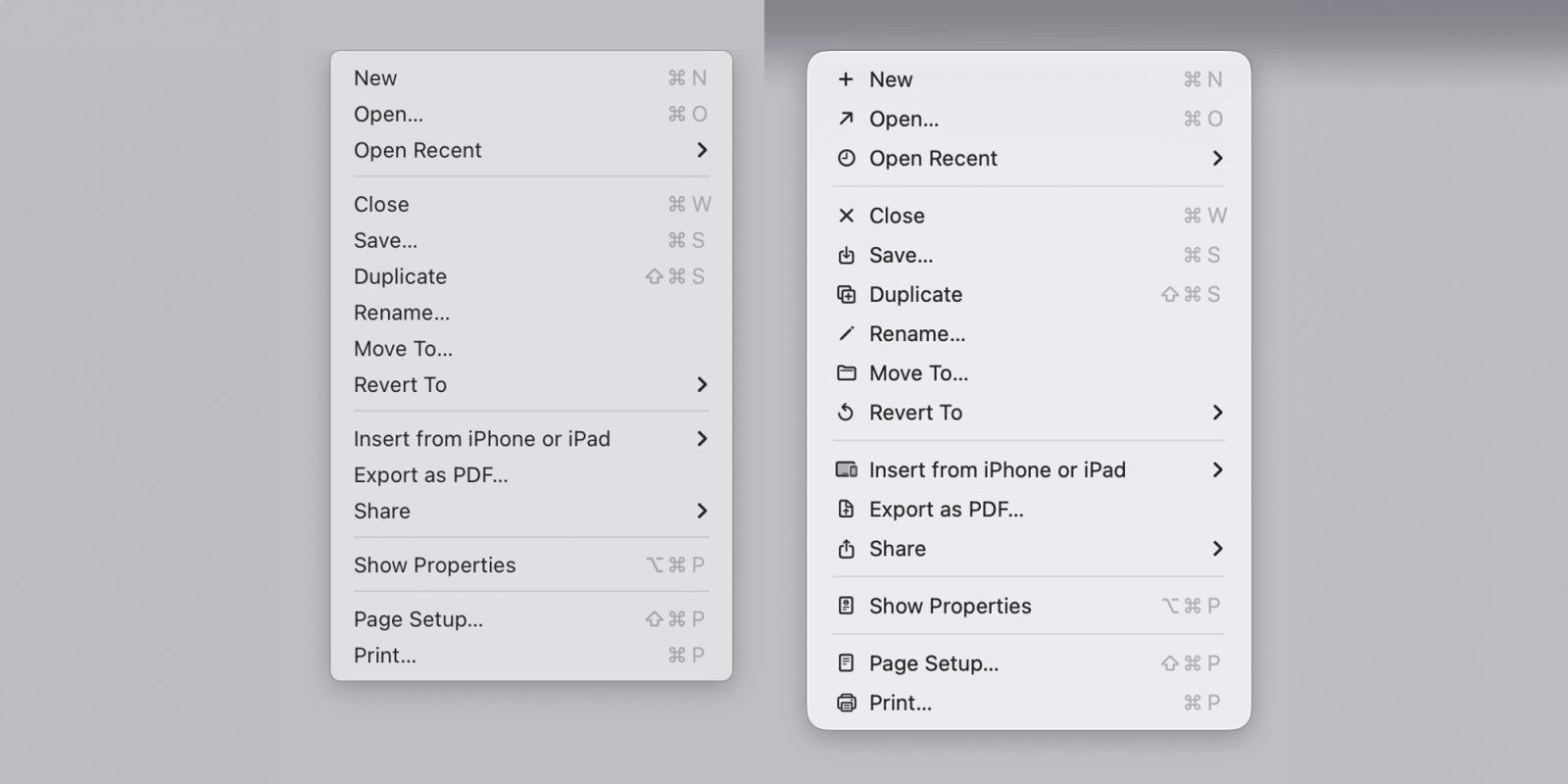
The context matters. When Tahoe shipped, Apple added an icon next to nearly every item in nearly every menu. The reaction was not subtle. Readers were split on the redesigned app icons, but on the menu icons there was broad agreement that decorating every menu row was a mistake. Software engineer Nikita "Tonsky" Prokopov dug up Apple's own Macintosh Human Interface Guidelines from 1992, which described exactly this practice in unflattering terms: ugly, unpleasant, distracting, illegible, messy, cluttered, confusing, and frustrating. Apple had warned against its own decision 34 years before it made it.
What actually changed
With macOS 27, Apple has pulled icons out of most menus and updated its current Human Interface Guidelines to spell out the rule again. The new wording:
Use menu item icons sparingly and with purpose. Icons allow people to find menu items more quickly, and help clarify what selecting an item does. Use an icon to highlight the most common actions and key features of your app, file system locations, connected devices, visual concepts like rotating or flipping an image, and user-generated content like folders and documents. Don't display an icon if you can't find one that clearly represents the menu item.
That last sentence is the operative one. The Tahoe problem was not that icons existed, it was that Apple forced one onto every row, including abstract commands where no glyph could honestly represent the action. A reader scanning a menu for "Paste and Match Style" gains nothing from a generic clipboard mark next to it, and loses scanning speed because every adjacent row is competing for attention with its own picture.
Why this is a developer story, not just an Apple story
The Human Interface Guidelines are not Apple's internal style notes. They are the document third-party developers are expected to follow, and the one Apple's own reviewers lean on when they have opinions about your app. When Tahoe shipped with icon-stuffed menus, a lot of Mac developers reasonably read that as the new house style and started adding icons to their own NSMenu and SwiftUI Menu items to match the system. Matching the platform is usually the right instinct on the Mac, where consistency with system chrome is a real value.
So the reversal creates a concrete migration question. If you added menu icons in your Tahoe-era release specifically to look native, the macOS 27 guidance now says to strip most of them back out. Practically:
- Audit any menu where you attached an
imageto items wholesale. Keep icons only on the genuinely common actions, file system locations, connected devices, transform-style commands like rotate or flip, and user content like folders and documents. - Remove icons from abstract or text-only commands where the glyph does not clearly map to the action. The new guideline explicitly tells you to drop the icon rather than invent a vague one.
- If you build a single codebase that runs across Tahoe and Golden Gate, the conservative path is to follow the macOS 27 rule everywhere. Sparse, purposeful icons looked fine on Tahoe too; it was the maximalist version that drew complaints.
For cross-platform developers this rhymes with a pattern you already know from iOS and the SF Symbols system: an icon should carry meaning, not decoration. The same restraint that keeps a tab bar legible keeps a menu legible.
The broader signal
John Gruber framed the change as evidence of a culture shift on Apple's design team, calling the menu-icon walk-back "a necessary first step" and tying the original misstep to design leadership that has since departed. Whether or not you buy the personnel narrative, the substantive point for developers is that Apple is willing to publicly reverse a high-visibility default and re-anchor its guidance to long-standing usability principles rather than to whatever shipped last year.
That is worth tracking beyond menus. The lesson Tahoe taught, expensively, is that a guideline survives precisely because it encodes something true about how people read interfaces. Apple wrote the 1992 version because dense decorative icons slow down scanning and add visual noise. That was true in 1992, it was true in Tahoe, and it is true in macOS 27. The platform changed its mind. The underlying ergonomics never did.
If you maintain a Mac app, the action item is small and clear: open your menus, count how many icons earn their place, and delete the rest before you ship against macOS 27 Golden Gate. You will be following Apple's current advice and, as it turns out, Apple's advice from three decades ago.
Comments
Please log in or register to join the discussion