
Hugo Daniel explains Oklch through a familiar color picker, then uses hue, chroma, and lightness to show why color tools need better controls.
Hugo Daniel’s article, "Color picking Oklch for mortals", takes a color model many developers treat as design jargon and puts it inside a tool they know: the classic hue wheel and triangle picker.
Daniel starts from a developer’s frustration. Hex colors feel direct. Oklch feels like a lab instrument. Designers praise it because it lets them manage color through lightness, chroma, and hue, while many coders still reach for #ff0000 and move on. His argument has force because he does not ask readers to admire Oklch as theory. He asks them to test whether Oklch can improve the color picker they already understand.
The key concept is perceptual control. In a familiar RGB or hex workflow, you may change a color and get a surprise: two colors with similar numeric values can look mismatched, and two colors that sit far apart in code can look close to the eye. Oklch gives designers a different handle. You can hold lightness steady, adjust hue, and keep colors closer in perceived brightness.
That matters in interface work. A button palette, chart series, syntax theme, or brand system needs contrast that users can read, not numbers that look tidy in source code. Oklch helps because it gives you separate controls for the qualities your eye already tracks: how light the color feels, how much color it carries, and which hue family you chose.
Daniel uses chroma as the bridge between math and intuition. He calls it the amount of color, which gives developers a plain mental model. A gray has no chroma. A saturated green has more. At full black or full white, your eye loses the ability to distinguish color, so chroma falls away. In the middle range, under better lighting, your eye can distinguish more color.
This explanation gives the article its strongest practical insight: Oklch does not make all hues behave the same. Human vision sees some colors with more range than others. Greens can carry high chroma under the right conditions, while other hues may run out of displayable color sooner. That difference also depends on the screen. A wide-gamut Apple display can render colors that a cheaper monitor cannot.
Developers can test part of that hardware boundary with browser gamut queries and modern CSS color syntax. The MDN guide to color() and the CSS Color Module Level 4 specification give the technical background for color spaces, gamut, and modern CSS color functions. Daniel’s contribution sits closer to the tool layer: he asks how a picker can make those limits visible during selection.
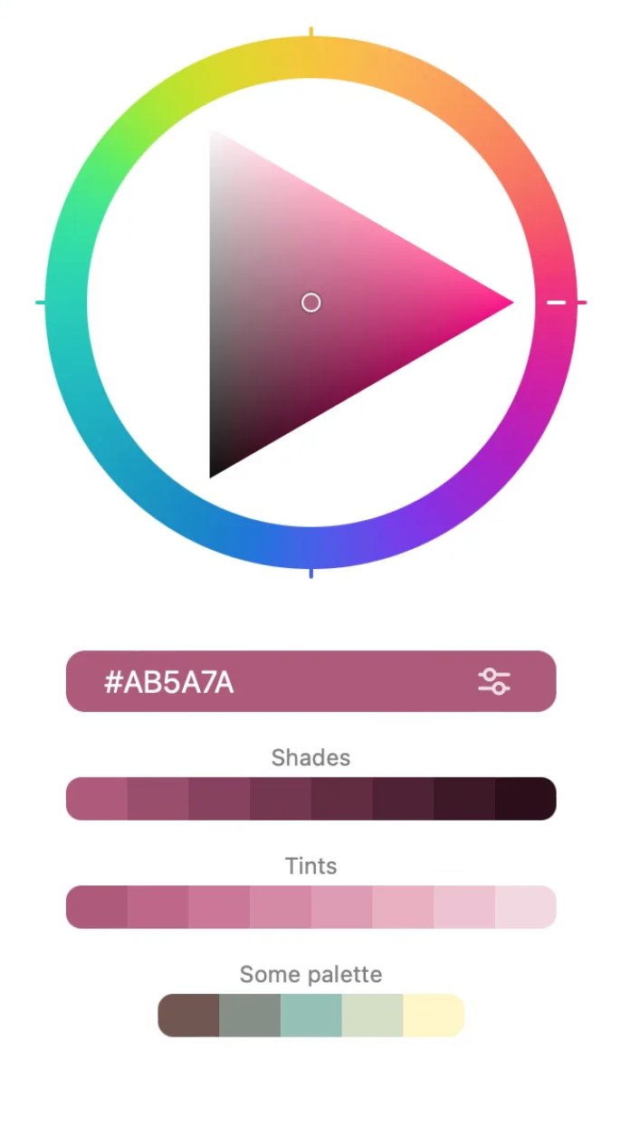
His answer keeps the classic picker’s shape. The wheel still handles hue. The triangle still gives a compact surface for selecting variations. But Daniel changes what those shapes communicate.

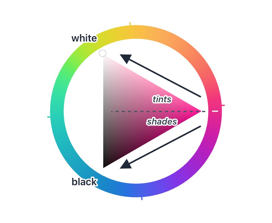
In a traditional picker, the triangle gives you a neat path from saturated color to white or black. That model works well enough for HSV-style interaction, where the geometry feels balanced and predictable. Oklch breaks that neat picture because human perception does not follow a straight, balanced map. Daniel accepts the distortion and uses it as information.
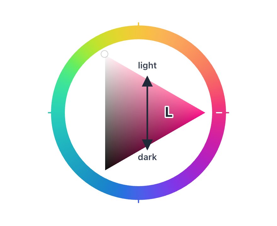
He stretches the triangle so users can see available tints and shades for the chosen hue and lightness. The result sacrifices geometric purity, but it gives the user a clearer view of the colors they can pick. The triangle no longer promises symmetry. It tells the truth about the available range.
Daniel also makes lightness the anchor. You move up and down through the triangle to change lightness, while chroma and hue respond within the limits of human vision and the display. That choice matters because many design tasks start with contrast and hierarchy. You need a surface color, a border color, a text color, and a hover state that keep the interface readable. Lightness sets that structure.
A chroma-first workflow still has value. Daniel describes a locked-chroma mode where chroma becomes the fixed value and the picker adjusts lightness instead. That mode helps when you want a palette to maintain a shared intensity across hues. It also exposes unavailable colors by fading choices that cannot reach the requested chroma.
This design makes Oklch less mystical because it turns constraints into visible UI. Users do not need to memorize gamut math. They can drag, compare, and see the available range change as they move. The picker teaches through feedback.
The trade-off sits in the metaphor. Daniel treats lightness as if it were room lighting, even though Oklch lightness describes the color rather than the environment. That simplification works for an introductory tool because it points users toward the right habit: start with perceived brightness, then choose color amount and hue. A color scientist may want more precision, but a developer building a palette needs a handle they can use.
Daniel leaves several technical issues outside the main path, including gamut mapping, illuminants, color management, and correction. That restraint helps the article. A complete color science lesson would bury the product idea. The picker succeeds because it reveals one layer at a time.
The broader lesson reaches beyond Oklch. Developers adopt complex tools when someone translates the model into controls that match the work. Hex codes won because they fit code. Oklch can win interface design tasks when tools expose its strengths without asking users to think like color scientists.
Daniel’s picker points in that direction. It keeps the wheel, keeps the triangle, and changes the meaning under your hand. That makes Oklch feel less like a trend from design social media and more like a practical way to build colors that hold together on screen.
Comments
Please log in or register to join the discussion