Apple's iOS 26 update introduces a subtle but significant change to the iPhone's Always On Display, defaulting to a blurred wallpaper effect that alters the visual experience. While the change aims to improve text legibility, it represents a departure from the feature's original implementation that many users have grown accustomed to.
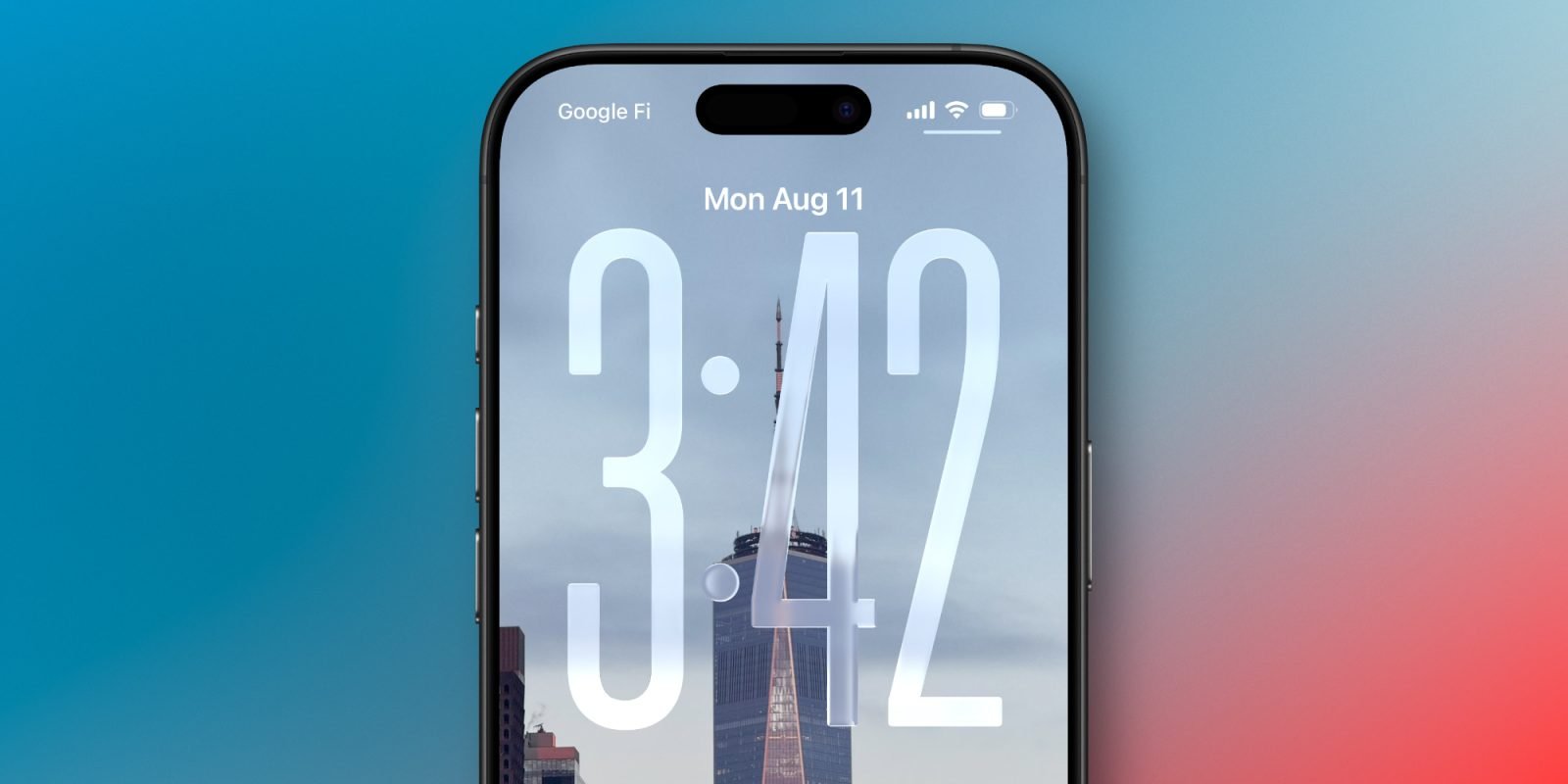
Apple's Always On Display has remained remarkably consistent since its debut with the iPhone 14 Pro in 2022. The feature, which keeps essential information visible while conserving battery life, has typically worked by dimming your Lock Screen wallpaper while keeping the clock, date, notifications, and widgets clearly visible. This approach maintained the visual personality of your chosen wallpaper while providing utility.
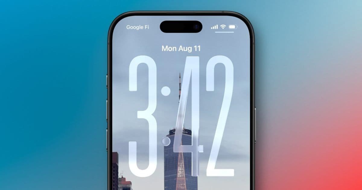
With iOS 26, Apple has quietly changed this default behavior. Instead of simply dimming the Lock Screen wallpaper, the system now applies a blur effect by default. This visual tweak is designed to make the clock and widgets stand out more prominently against the background, potentially improving readability in various lighting conditions. However, this change fundamentally alters the aesthetic experience of the Always On Display.
The blur effect presents a particular challenge for users who specifically enjoy seeing their chosen wallpaper as part of the Always On Display experience. For photography enthusiasts or those who select wallpapers with personal significance, a blurred version of their image may defeat the purpose of displaying it at all. The effect can make carefully chosen wallpaper details disappear into a soft, indistinct background.
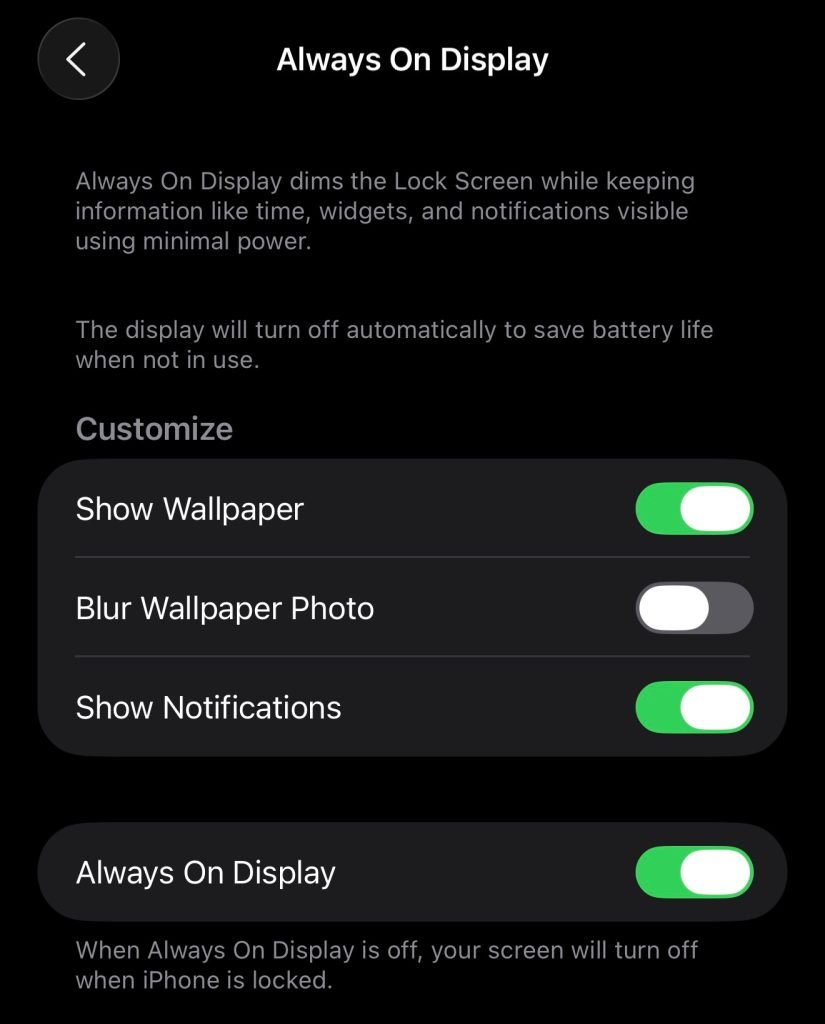
Fortunately, Apple has provided a toggle to restore the original behavior. Users who prefer the unblurred, dimmed wallpaper can navigate to Settings > Display & Brightness > Always On Display and disable the "Blurred Wallpapers" option. This setting returns the Always On Display to its previous implementation, where wallpapers are simply dimmed rather than blurred.
The Always On Display feature has always offered limited but meaningful customization options. Users can choose whether to show the wallpaper at all, whether notifications appear, and whether the display turns off in specific scenarios like when the phone is face down, covered, in CarPlay, using Continuity Camera, in Low Power Mode, during Sleep Focus, or at bedtime. The addition of the blur toggle represents another layer of user control, albeit one that comes with a changed default.

From a practical standpoint, the blur effect does have potential benefits. The increased contrast between the blurred background and the sharp text of the clock and widgets could make information more readable at a glance, particularly in challenging lighting conditions. For users who prioritize utility over aesthetics, this change might be welcome.
However, the shift also raises questions about Apple's design philosophy for the Always On Display. The original implementation balanced utility with visual appeal, allowing the Lock Screen's personality to remain visible. The new default suggests Apple is prioritizing information clarity over visual continuity, a subtle but meaningful shift in priorities.

For developers and designers working with iOS, this change serves as a reminder of how Apple continues to refine system-level features. The Always On Display API remains consistent, but the visual presentation has evolved. Apps that interact with the Lock Screen or Always On Display should be aware of these changes, particularly if they provide custom widgets or notifications that appear in this context.
The toggle to disable the blur effect demonstrates Apple's approach to user customization: introduce new defaults that align with their design vision while providing options for users who prefer the previous behavior. This pattern is common in iOS updates, where Apple often changes default settings while maintaining backward compatibility through toggles and settings.
Ultimately, the preference between blurred and dimmed wallpapers comes down to individual use cases. Users who primarily use the Always On Display for quick information checks might appreciate the improved legibility of the blurred version. Those who enjoy seeing their chosen wallpaper as part of the phone's visual identity will likely prefer the original dimmed approach and should disable the blur setting.
The change is subtle enough that many users might not immediately notice it, especially if they don't frequently change their Lock Screen wallpaper. However, for those who pay close attention to the visual details of their iPhone experience, this represents a noticeable shift in how the Always On Display presents information and aesthetics.
As iOS 26 continues to roll out, it will be interesting to see how users respond to this change and whether Apple provides any additional customization options for the Always On Display in future updates. The feature has evolved significantly since its introduction, and this latest adjustment shows that Apple continues to refine how information is presented when the iPhone is locked.
For now, the choice is clear: accept the new blurred default or revert to the familiar dimmed wallpaper through the settings toggle. This level of control allows users to tailor the Always On Display to their specific preferences, whether they prioritize visual clarity or visual continuity.
Comments
Please log in or register to join the discussion