
The mobile-first design philosophy has been a cornerstone of modern web development for years, but its implementation in CSS—through a cascade of overrides—may be creating more complexity than it solves. This article examines the trade-offs of classic mobile-first CSS and explores an alternative approach using closed media query ranges and separated stylesheets, which can lead to cleaner, more maintainable code and better performance.
The mobile-first design methodology is a well-established and sensible approach. It focuses on core user journeys, prioritizes the most common devices, and prevents the all-too-common pitfall of building a desktop-centric site only to awkwardly retrofit it for mobile. Given this, developing your CSS in a mobile-first manner should be a natural extension of the philosophy. However, the classic implementation of mobile-first CSS—writing styles for the smallest viewport and then overwriting them with min-width media queries for larger screens—introduces a hidden tax of complexity and inefficiency that is often overlooked.
The core issue lies in the inheritance of style declarations. In a classic mobile-first workflow, you establish a baseline of styles, and as you add breakpoints for tablets, laptops, and desktops, you repeatedly override those baseline styles. This creates a chain of dependencies where a change to a mobile style can have unforeseen consequences at larger breakpoints, requiring extensive regression testing. Furthermore, when you need to reset a style back to its browser default value at a larger breakpoint, you often increase the CSS specificity of that rule, which can lead to conflicts and maintenance headaches, especially when integrating utility classes or bespoke CSS. The browser itself is also disadvantaged; with all styles bundled into a single file, it cannot prioritize the download of CSS needed for the current viewport, potentially delaying the rendering of the page.
A more elegant alternative is to treat each breakpoint as a distinct context, using closed media query ranges to define styles only where they are needed. Instead of setting a default padding of 20px and then overriding it to 40px for tablets and back to 20px for desktops, you can define the 20px padding as the default, and only apply the 40px padding within a specific range, such as @media (min-width: 768px) and (max-width: 1023.98px). This approach ensures that styles are set explicitly for their intended context, eliminating the need for overwriting and the associated specificity wars. It encourages developers to think about components holistically across all breakpoints from the outset, which can surface design inconsistencies earlier in the development process.
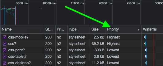
This methodology pairs powerfully with the separation of CSS into multiple files, a practice made viable by modern protocols like HTTP/2 and HTTP/3. By linking separate stylesheets for mobile, tablet, and desktop with appropriate media attributes, you allow the browser to prioritize the download of the CSS it needs immediately. For a mobile user, the mobile and default stylesheets are fetched with the highest priority, while tablet and desktop styles are downloaded in the background with a lower priority. This reduces the critical rendering path and improves perceived performance, especially on slower connections. In contrast, a single bundled stylesheet forces the browser to download and parse all CSS upfront, regardless of the viewport.
Adopting this approach requires a shift in mindset. It demands a thorough understanding of a component's behavior across all breakpoints before writing a single line of CSS. Tools like Responsively App or Blisk can facilitate this concurrent development by allowing you to preview multiple viewports simultaneously. The goal is not to discard the mobile-first philosophy but to refine its implementation. The philosophy's greatest contribution is its insistence on starting with the essentials; the technical execution can evolve to be more precise and less entangled.
Ultimately, the choice of methodology should be dictated by the project's specific needs. For simpler projects, the classic mobile-first approach may remain perfectly adequate. However, for complex applications with intricate layouts and a wide range of breakpoints, a strategy centered on closed media query ranges and separated stylesheets can yield a cleaner, more maintainable, and higher-performing codebase. The key is to move beyond dogma and critically evaluate the trade-offs, ensuring that the tool serves the project, not the other way around.
Comments
Please log in or register to join the discussion