Apple is cleaning up one of Apple Pay’s most common checkout annoyances in iOS 27, making card switching clearer while surfacing more wallet details before you pay.

Apple is redesigning the Apple Pay checkout sheet in iOS 27 for purchases made in apps and on the web, with the biggest practical change aimed at a small but frequent pain point: choosing the right card before you authorize a payment.
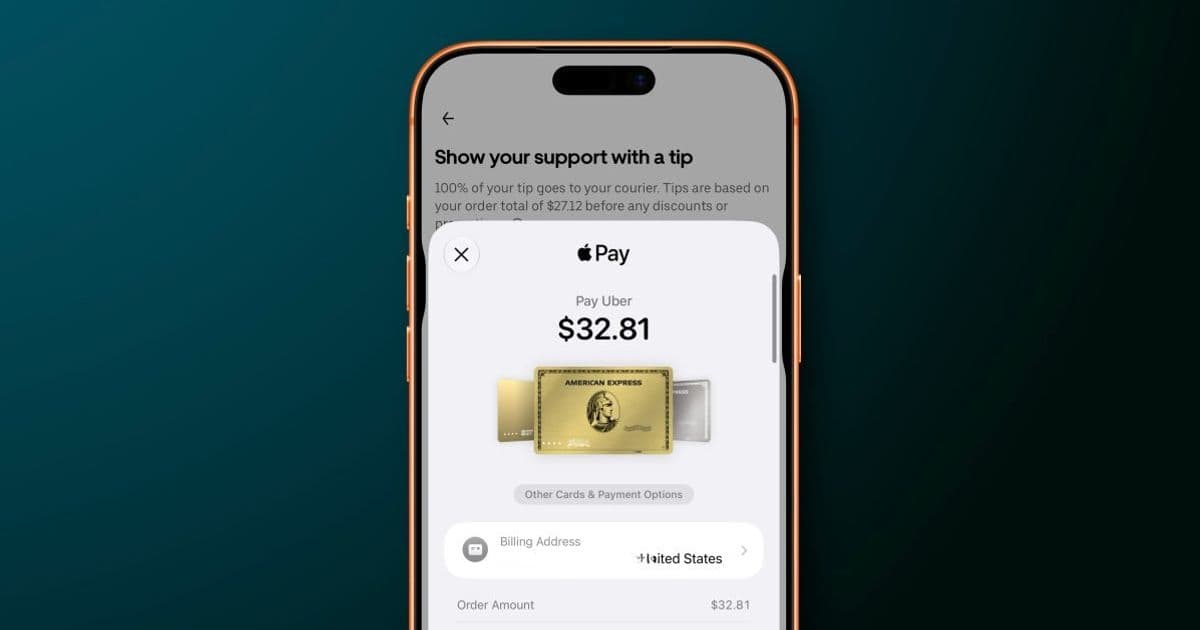
In iOS 26, switching cards during Apple Pay checkout can feel oddly indirect. Many users instinctively tap the visible card, expecting that action to open card selection. Instead, that tap can lead into address or order-detail editing, while the actual card-switching control sits elsewhere on the sheet. That is the kind of interface mismatch that only takes a second to fix once you know it, but it creates hesitation at the exact moment checkout should feel calm and predictable.
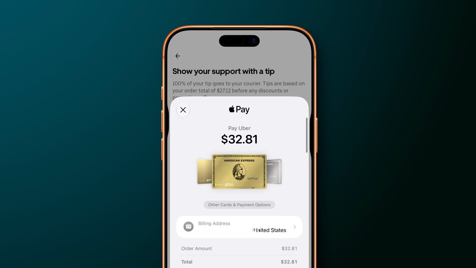
In iOS 27, Apple is changing the interaction model. Users will be able to swipe between payment cards directly on the main Apple Pay interface. Tapping a card can also bring up a grid-style card picker showing the available Apple Pay cards in one place. That sounds like a modest interface adjustment, but for anyone who keeps separate cards for travel, groceries, subscriptions, business expenses, rewards categories, or debit purchases, it could be one of the more useful quality-of-life changes in the update.
Apple Pay already works as Apple’s payment layer across iPhone, iPad, Apple Watch, Mac, apps, and Safari through Apple Pay, with developer support documented through Apple’s Apple Pay developer resources. The iOS 27 change is not about adding a new payment network or replacing the biometric approval flow. It is about making the payment sheet smarter before the Face ID, Touch ID, or passcode confirmation step.
Key Features
The headline feature is direct card switching. Instead of hunting for a separate control, users can move between cards by swiping on the Apple Pay sheet itself. This matches the mental model many people already bring to Wallet: visible cards behave like cards, and moving through them should feel physical and immediate.
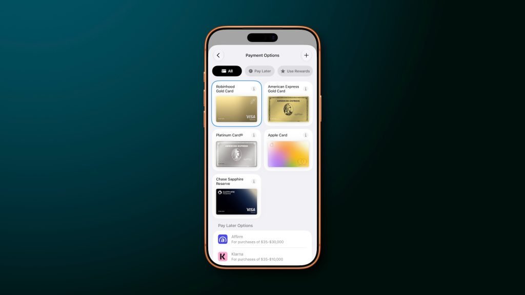
The second change is the grid view. A grid-style picker matters because Apple Wallet has become more crowded over time. A user might have multiple credit cards, a debit card, transit cards, store cards, Apple Account balance, and financing options tied into the same ecosystem. A horizontal stack is fine when you have two cards. It becomes slower when you have six or eight and need to identify the one with the right rewards, billing account, or spending category.
Apple is also surfacing more payment-relevant information on eligible cards. The updated sheet can show details such as rewards, balances, debit account balance, and pay later options. That turns Apple Pay from a simple authorization sheet into more of a decision point. For example, a user might choose a card because it has better rewards for dining, avoid a debit card because the account balance is low, or select a pay later option when the merchant supports it.
The merchant side matters too. Apple says merchants and developers can control what appears on the Apple Pay payment sheet depending on what information is needed to complete the order. That is important because checkout is not one-size-fits-all. A food delivery app, airline, retail store, and subscription service may need different combinations of shipping address, billing contact, pickup details, loyalty data, or payment method information.
For developers, this keeps Apple Pay within its familiar role: a controlled, system-managed checkout interface that apps can configure without designing their own payment UI from scratch. The trade-off is the same one Apple has always preferred. Developers get consistency, trust, biometric confirmation, and reduced payment friction, but Apple keeps tight control over the final payment presentation and Wallet integration.
OS Versions And Device Context
This change is tied to iOS 27, while the older behavior described here applies to iOS 26. Apple has not detailed specific iPhone model requirements in the provided report, so the safest read is that this is an operating-system-level Apple Pay interface update rather than a feature dependent on a new iPhone model.
That distinction matters. Some mobile features depend on new hardware, such as camera sensors, modems, displays, or on-device AI accelerators. This Apple Pay update appears different. It is centered on the Apple Pay sheet, Wallet data presentation, and checkout flow behavior. If a device supports iOS 27 and Apple Pay in apps or on the web, the redesigned checkout experience is likely the relevant change users will notice.
The underlying Apple Pay security model remains the bigger technical story. Apple Pay does not simply hand merchants a raw card number. It uses tokenized payment credentials, device authentication, and Apple’s Wallet infrastructure to approve transactions. On iPhone, the visible card selection step happens before the final biometric or passcode authorization. That is why improving the selection UI matters: the chosen card determines which account, rewards program, balance, and repayment option will be used once the user confirms.
A checkout sheet is easy to underestimate because it is small, but it sits at a high-pressure moment. The user is about to spend money. A confusing tap target can lead to the wrong card, a missed reward category, an unwanted debit transaction, or extra time backing out of checkout. The iOS 27 redesign addresses that by making the most common action, choosing the card, available directly where the user is already looking.
Ecosystem Context
This is also a classic Apple ecosystem move. Apple Pay becomes more useful as more of your financial life sits inside Apple Wallet. The more cards, balances, rewards programs, transit passes, financing choices, and account details Wallet can display, the more valuable the Apple Pay sheet becomes at checkout.
That convenience comes with lock-in considerations. If you rely heavily on Apple Pay for online purchases, in-app payments, transit, and card management, switching away from iPhone is not just a matter of moving apps. You also have to rebuild payment habits, re-add cards elsewhere, lose some Wallet-specific presentation, and adjust to a different checkout flow on Android or desktop platforms. Apple’s advantage is not only that Apple Pay is fast. It is that it is integrated into the device, browser, apps, biometric authentication, and Wallet data layer.
The iOS 27 update strengthens that integration by making Wallet information more visible at the moment of purchase. Instead of opening a banking app to check a debit balance or remembering which card has the right rewards, Apple wants that context to appear inside the payment flow. For users, that can be genuinely helpful. For Apple, it makes the Wallet and Apple Pay combination harder to replace.
There is a practical upside for merchants as well. Cleaner card selection can reduce checkout errors and hesitation. If users can quickly pick the intended card and see relevant order or payment details, they are less likely to abandon checkout because the interface feels unclear. Apple Pay has long competed on speed and trust. With iOS 27, Apple appears to be tuning the part of checkout that happens just before authorization, where clarity can matter as much as speed.
The change is not flashy, but it targets a real everyday problem. People do not need Apple Pay to look dramatically different. They need it to stop getting in the way when they are trying to choose the right card. iOS 27 seems to move the Apple Pay sheet closer to that goal: more glanceable, more direct, and better suited to a Wallet that now holds much more than one default credit card.
Comments
Please log in or register to join the discussion